
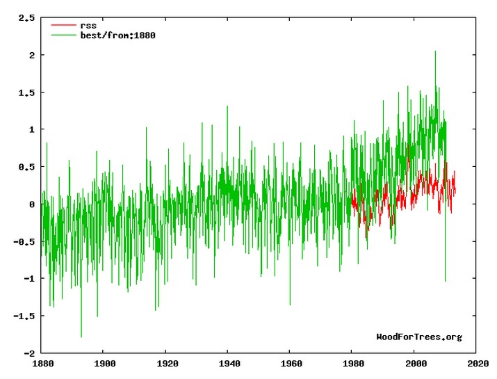
The graph below shows how misleading Muller’s data set is post 1980
Wood for Trees: Interactive Graphs
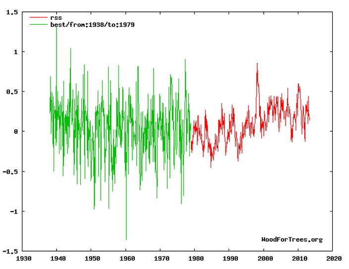
Let’s lose the post-1980 hockey stick, and do a more meaningful merge. No net global warming for 75 years.
The graph below shows how misleading Muller’s data set is post 1980
Wood for Trees: Interactive Graphs
Let’s lose the post-1980 hockey stick, and do a more meaningful merge. No net global warming for 75 years.

When all the feedback effects set in from nothing happening, nothing will happen. Just you wait!
Science and general historians will look back to this time and wonder, “How could they–the whole civilized world–take their ‘global temperature’ measurements so seriously, especially when they flew in the face of the well-confirmed Standard Atmosphere, with its stable surface temperature?”
Yeah but, Steve Mosher says SAT is golden, and BEST is best.
The first graph is actually very damaging if you believe alarmist/sceptic/alarmist/skeptic/alarmist Muller’s BEST data is accurate. It shows that the troposphere is warming much more slowly than the surface. As we all know from the climate experts, water vapor feedback will cause the troposphere to warm at a different rate than the surface. This key signature is proof of CACC.
The graph demonstrates that water vapor feedback is strongly negative.
🙂
Your splicing looks silly but that is what climate scientists do!
Your second diagram is exactly what they do with sea level data.
What do you expect from a guy who lies about being a skeptic?