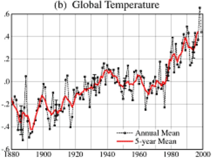
In 1999, Hansen’s global temperature graph looked like this –
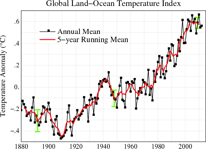
But the past changed between 1999 and 2013. Now his global temperature graph looks like this :
The graph below superimposes his current graph (blue line) on top of the 1999 version (red line.) Note how he retroactively cooled 1910 by 0.20 degrees.


In a word? Fraud.
are you really that dumb?
Piers Corbyn has a new item about CO2 levels in the last two centuries being higher than they are today.
http://www.weatheraction.com/docs/WANews13No15.pdf
The modified graph is a point against CO2 driving the climate bus, since the rise from 1910-ish is steeper than the rise from CO2, which wasn’t a problem until post WWII.
i keep seeing variations of this post on this site, but never with a link to Hansen’s work. I don’t take anything at face value unless I can check the source.
The links are in the article. The way web browsers work is that you have to actually click on the link to see it.
Geezer117,
http://www.giss.nasa.gov/research/briefs/hansen_07/
http://data.giss.nasa.gov/gistemp/graphs_v3/
This is really no different than those that claim the Earth is only 10,000 years old, it is simply denying the facts, to meet your beliefs.