
Disrupting the Borg is expensive and time consuming!

Google Search
-
Recent Posts
- The Real Hockey Stick Graph
- Analyzing The Western Water Crisis
- Gaslighting 1924
- “Why Do You Resist?”
- Climate Attribution Model
- Fact Checking NASA
- Fact Checking Grok
- Fact Checking The New York Times
- New Visitech Features
- Ice-Free Arctic By 2014
- Debt-Free US Treasury Forecast
- Analyzing Big City Crime (Part 2)
- Analyzing Big City Crime
- UK Migration Caused By Global Warming
- Climate Attribution In Greece
- “Brown: ’50 days to save world'”
- The Catastrophic Influence of Bovine Methane Emissions on Extraterrestrial Climate Patterns
- Posting On X
- Seventeen Years Of Fun
- The Importance Of Good Tools
- Temperature Shifts At Blue Hill, MA
- CO2²
- Time Of Observation Bias
- Climate Scamming For Profit
- Climate Scamming For Profit
Recent Comments
- Bob G on The Real Hockey Stick Graph
- arn on The Real Hockey Stick Graph
- Bob G on The Real Hockey Stick Graph
- arn on The Real Hockey Stick Graph
- Bob G on The Real Hockey Stick Graph
- Bob G on The Real Hockey Stick Graph
- Gordon Vigurs on The Real Hockey Stick Graph
- arn on The Real Hockey Stick Graph
- arn on The Real Hockey Stick Graph
- Gordon Vigurs on The Real Hockey Stick Graph
Reblogged this on Health Science Watch.
You are Cherry Picking again! 😉
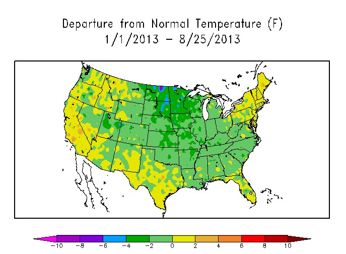
I love that stacked temperature scale. That colour scheme is the the real “cherry picking”.
To me, the +/- 2 range should be the deep green and perhaps a blue-green on the minus. +4 should be pale green, and only then start into the yellow-orange-red sequence. A series of blues on the negative side would serve nicely.
This very “progressive” colour scheme makes the cool temperatures seem normal. And would make dirt-standard, normal temps appear alarmingly hot!
So – question (so I can respond to a AGW supporter): all trend lines show either flat (RSS) or lowering of temperatures. Fine. I accept that. But, if someone says, “Well, if 2012 is an outlier on the high side, why not 2013 on the low side?” So, how does one answer such a person?
Thanks, Steve – you have a great blog!
My responses would be as follows.
First, 2012 should not appear as a genuine outlier if you use actual data instead of fabricated ones.
Second, in statistics, when there are major outliers, it is common to remove them from the series and see what that does to the results. If the results (trend in this case) are substantially the same, then it makes no difference to anything. If they’re not the same, that might argue for leaving them out. But the change in trend could go in either direction! If one removes one high outlier and one low outlier from the last two years of a temperature series, the effect of that could just as easily go in either direction. You have to actually calculate it.
Third, if one smooths a temperature series with say a 3- to 5-year centered moving average, then that can give a more realistic picture of the trend, even if the outliers are left in. Steven doesn’t use moving averages in his posts (as far as I’ve seen), but in my experience they can be quite valuable in revealing what’s really going on.
The 3- to 5-year moving averages right now are such that even with the outliers included, they are still far from flat. I’m not sure if I can lay my fingers on some proof of that at the moment, but that’s been my observation since 2006, and it’s been quite consistent since then.
If I have time to assemble something more concrete, I’ll post it at my blog and link here. However, others might know where supporting data and graphics can be found more quickly.
RTF