
Disrupting the Borg is expensive and time consuming!

Google Search
-
Recent Posts
- Analyzing The Western Water Crisis
- Gaslighting 1924
- “Why Do You Resist?”
- Climate Attribution Model
- Fact Checking NASA
- Fact Checking Grok
- Fact Checking The New York Times
- New Visitech Features
- Ice-Free Arctic By 2014
- Debt-Free US Treasury Forecast
- Analyzing Big City Crime (Part 2)
- Analyzing Big City Crime
- UK Migration Caused By Global Warming
- Climate Attribution In Greece
- “Brown: ’50 days to save world'”
- The Catastrophic Influence of Bovine Methane Emissions on Extraterrestrial Climate Patterns
- Posting On X
- Seventeen Years Of Fun
- The Importance Of Good Tools
- Temperature Shifts At Blue Hill, MA
- CO2²
- Time Of Observation Bias
- Climate Scamming For Profit
- Climate Scamming For Profit
- Back To The Future
Recent Comments
- Bob G on Analyzing The Western Water Crisis
- arn on Analyzing The Western Water Crisis
- Bob G on Analyzing The Western Water Crisis
- Bob G on Analyzing The Western Water Crisis
- Bob G on Analyzing The Western Water Crisis
- Hank Phillips on Analyzing The Western Water Crisis
- Hank Phillips on Analyzing The Western Water Crisis
- Hank Phillips on Analyzing The Western Water Crisis
- Hank Phillips on Analyzing The Western Water Crisis
- Bob G on Analyzing The Western Water Crisis
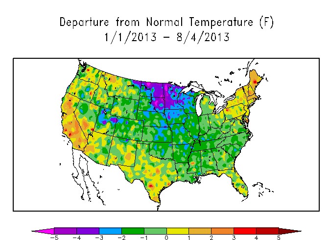
That map is reading too hot for my area. We are cooler than the graphic shows.
Haha, what are you talking about? Do you know the average temperature for your area in the months listed?
Ask NOAA
“Haha, what are you talking about? Do you know the average temperature for your area in the months listed?”
Yep. I have lived within fifty miles of where I am now for over three decades, and was a climatology student, so I indeed know.
Now go back to playing in the sandbox junior.
Here in the northern San Joaquin valley our temperatures have been running a little below normal, not above normal as the map shows.
Yes, and around here we have run WELL below (3-7F) the observed average, and they show us barely 1 degree below. Shysters.
More data, please. How did you determine “normal temperature” and where did you get the average temperatures in your time span?
Ask NOAA
Follow the link next to the map. It’s all there for anyone to read.
Oops on the link- but it is at NOAA.
Reblogged this on Health Science Watch.
Bet if we compare to population density, the hot areas strongly correlate with dense population centers. UHI much?
This coming winter could well be a cold affair for much of the nation. With a cool base like that to start with, temperatures could move rapidly downwards depending on how this winter shapes up.
That extra sea ice in the south looks like it should have a cooling effect on ocean currents, especially in the strait between South America and Antarctica. Looking at the daily southern sea ice extent shows close to half of that strait ice covered, a record extent at that point…http://nsidc.org/data/seaice_index/#