
Alabama cooled dramatically from 1920 to 1970. NASA got rid of this inconvenient decline, by cooling the past and warming the present a total of 1.5C. Note how NASA magically turned the 1895-1940 cooling trend into a warming trend.
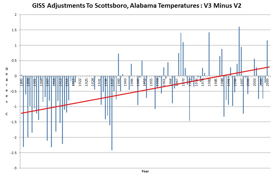
Alabama cooled dramatically from 1920 to 1970. NASA got rid of this inconvenient decline, by cooling the past and warming the present a total of 1.5C. Note how NASA magically turned the 1895-1940 cooling trend into a warming trend.

So is V2 Raw and V3 Adjusted?
v3 adjusted – v2 adjusted
Their TOB rationalizations are found wanting.
1. Decadal comparison reveals bias: Its amazing that people could read thermometers in the 1850s just fine, but something happened to thousands of independent observers in the 1920s-1930s. According to the TOBs adjusters, thousands of independent observers got sleepy in the 1930s and forged data. However, observers were as pure as driven snow in the 1850s.
2. Non-constant TOBs adjustment reveals bias. The TOBs adjustment differs by year, increasing in magnitude. It should be constant throughout the temperature record, instead it is linear.
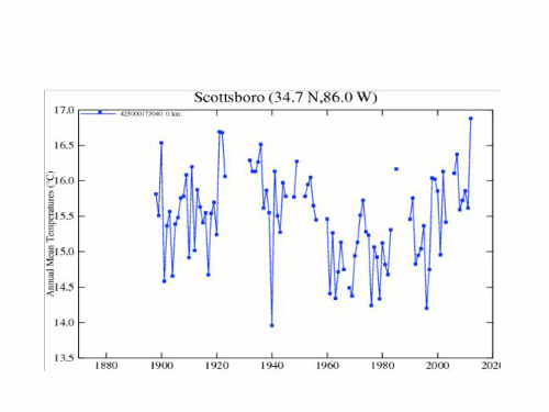
The Scottsboro charts (in the animated gif) are not (imho) lined up correctly: 17.5C on the back one lines with 17C on the front one.
So now it look like I was wrong! Thanks, Steve.
Cheat, cheat, never beat!
Reblogged this on Climate Ponderings.