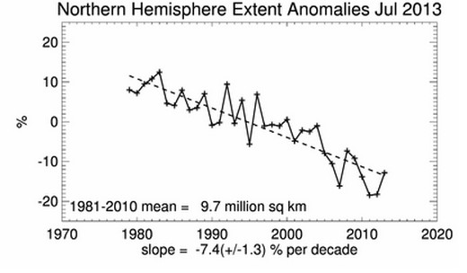
NSIDC wants you to believe that Arctic ice has been steadily decreasing due to man-made CO2, and was 12% below the mean at the end of July.
What they don’t want you to think about is that in the decade prior to 1975, Arctic ice expanded by 12% and was blamed for every imaginable kind of bad weather.
h/t to John B., M.D.


They certainly don’t want you looking at the past. That might show you that it’s all happened before and is fully natural. However, they did have a point back then that cold is and would be devastating but today’s warming from a realistic point of view is to be welcomed, not feared in the same way that the cooling was.
There was some good news, armadillos were losing ground.
Highest July Mean in 4 years isn’t very scary.
2012 7.67
2011 7.73
2007 7.94
2010 8.08
2013 8.23
I well remember the convulsion in the wheat market of 1973. Very severe frosts had destroyed the Soviet Autumn-sown wheat crop almost completely. The comrades led a very well co-ordinated buying raid on the Chicago market and we woke up one morning to a wrld that was apparently very short of wheat. In Britain we had entered the Common Agricultural Policy of the European Economic Community on January 1 1973. That cut us off from our Canadian and US suppliers behind a high tariff barrier. In round terms, prices doubled and there were tons more of bureaucracy to deal with, including a new breed of inspector crawling round our mill to make sure we only used European wheat. The, very quickly, prices doubled again as the panic over the Soviet frost-created shortage set in.
Great find. How do the professional liars at NSIDC sleep at night?
If I am not mistaken, those blood suckers only come out at night.
Don’t forget the 1990 IPCC report: http://www.ipcc.ch/ipccreports/far/wg_I/ipcc_far_wg_I_full_report.pdf
Figure 7.20 (p. 224) shows polar ice coverage before satellite era.
Arctic ice coverage increased 12% in the decade prior to 1975, so in roughly 1965, look how low it was in relation to the present. One problem is we don’t know if this number refers to the spring peak or autumn nadir – wish I had the original scientific source for the info. That the article was published in March 1975 and refers to “ships making for Iceland ports” might indicate that the 12% increase refers to the spring peak.
Unfortunately also, Figure 7.20 is anomaly data. It would be nice to know the absolute ice coverage area back then.
Reblogged this on CraigM350.
There is comparable data from 1964.
See here: http://polarbearscience.com/2013/06/16/nsidc-says-the-sea-ice-minimum-in-1964-was-not-different-from-1979-1981-or-2001/