
One theory which alarmists used to talk about (before they went full criminal) was that global warming causes stratospheric cooling, and they used the trend below.
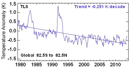
This is a very clever graph – for the brain damaged. What actually happened was that two volcanic eruptions pushed particulates up into stratosphere. The particles absorbed sunlight and warmed the upper atmosphere. When the particulates settled out, temperatures cooled and flattened. There is no “CO2 footprint”

Steve, I was thinking about this yesterday in a different way.
The more gasses in the atmosphere and in the air would push the stratosphere higher? Kinda like filling a balloon with air, the more air/ gas in the balloon the larger it gets. I know earth is large but could the more gases in the atmosphere push the stratosphere and troposphere higher up away from earths surface?
Reblogged this on Climate Ponderings.
My understanding is that the atmosphere varies in height naturally anyway but that this does not impact the “hot spot” in the troposphere.
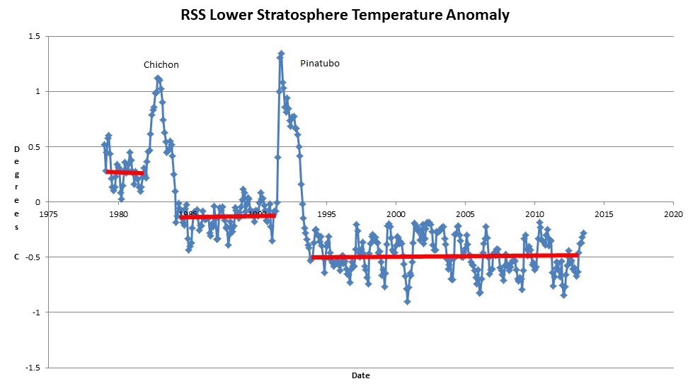
Another good one Steve, Chichon was a VEI5 and I think we should also include S. Helens (VEI5) in 1980 to explain the first peak. This is in fact the first time that I noticed that the oscillations after the two peaks of these charts actually have a flat average, but I’m finding this chart a bit strange because if the stratospheric temps have flattened after the eruptions, why would they reach sequentially lower levels?
Does this mean that the aerosols are still there cooling that region of the atmosphere? I’d be surprised if this turns out to be true.
ps.: the “lower levels” cannot be a CO2 footprint because they’re flat, right?
Then, why the trend to lower temps? Notice that the first part of the graph also shows a flat average with higher anomalies in agreement with the general cooling trend.
I’ve seen these graphs so many times and never noticed that before…