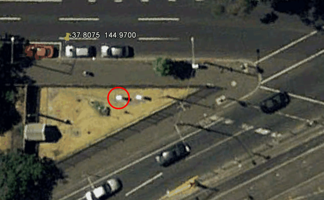
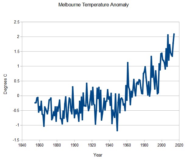
The BOM Melbourne thermometer is cleverly situated adjacent to many lanes of asphalt in downtown Melbourne, and shows a hockey stick of warming, with last year as the hottest year ever.
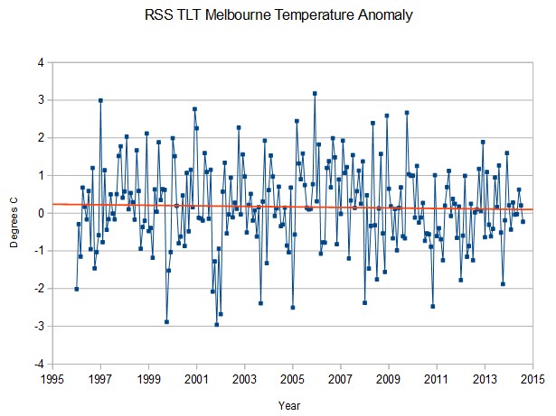
By contrast, satellite temperatures of the lower troposphere over Melbourne show a slight cooling trend for the past 18 years, with last year pretty close to the long term mean.
BOM then takes the severely tainted urban data, and contaminates surrounding rural stations through a process known as “homogenisation”


If any Australian media ever report on this conflict in data I would love to see any links to the reports including any comments from the bureaucrats who control the numbers.
Jo Nova’s site, posts on the BoM:
http://joannenova.com.au/tag/bom/
This is an excellent analysis – a very good way to demonstrate how “homogenisation” corrupts the information.
If your theory is right, they have reached the limit of how much asphalt they can lay down, so temperature should start levelling off.
They could add a few of these to that piece of grass to keep things on the upswing:
http://latriciasmith.com/wp-content/uploads/2011/06/grill-300×225.jpg
Cool.
Australia must be adjusting them faster then rest of earth! http://www.dailymail.co.uk/wires/reuters/article-2927477/Australia-temperatures-rising-faster-rest-world-official-report.html