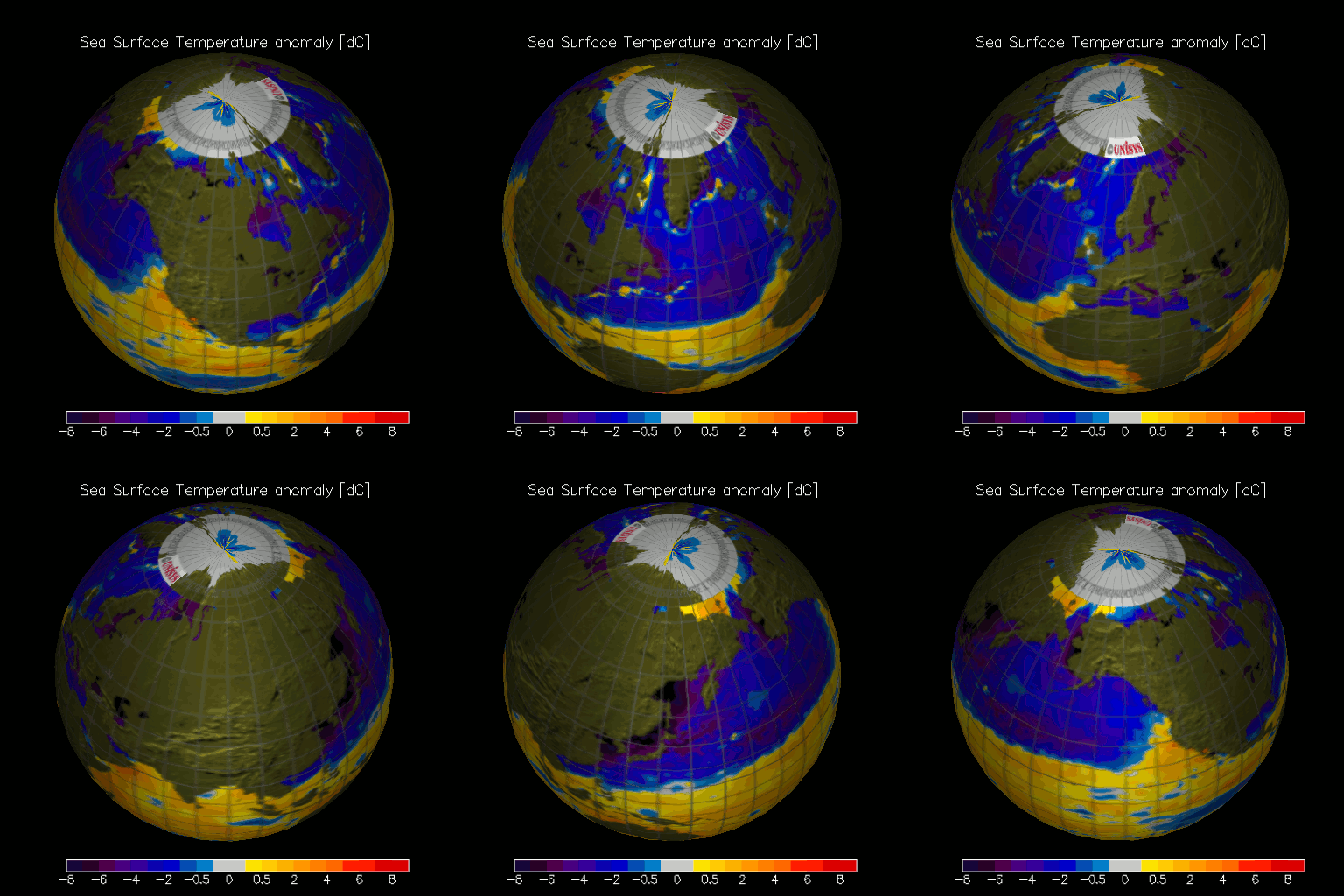
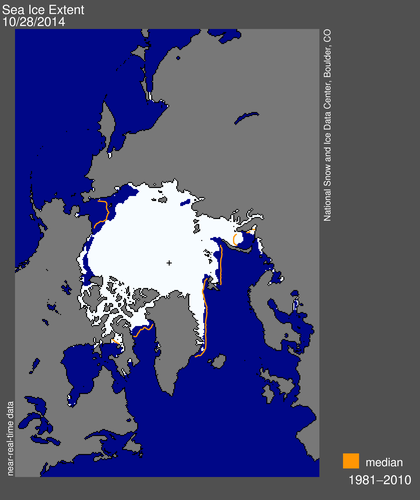
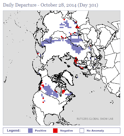
While NASA and NOAA are busy lying about record heat, something remarkable is happening in the Northern Hemisphere. It is turning very cold.
Sea surface temperatures have plummeted.
Arctic sea ice is about to return to “normal”
And Northern Hemisphere snow cover is at a record high.
Rather than doing any actual climate science at Real Climate, look for them to continue ramping up the propaganda, and hiding the decline.


If NASA had spent less time and money on “Muslim outreach” and “Global Warming/Climate change” and altering facts, maybe they could have had a successful rocket launch . I mean, I thought that is what NASA job was to, launch rockets.
Rocket launches release CO2, so they must be abandoned or outsourced to Russia and China.
Besides, what point is there in launching rockets if anthropogenic CO2 emissions are going to kill us all?
I think tax payers, via NASA, paid for this rocket. The launch was by Orbital Sciences Corp., a private company. The launch was from “NASA’s Wallops Flight Facility” near New Church, VA. The company has a $200 million insurance policy on the mission. That probably wasn’t cheap. Folks on the space station may miss a few meals.
The rocket they mislaunched was from Russia.
We don’t make stinking rockets anymore.
BTW, my daddy is one of the original NASA people…I grew up in it and am horrified at how it has been degraded.
My neighbor is a retired NASA engineer (super nice guy). I am sure he would agree with you. Sad, very sad indeed.
Reblogged this on the WeatherAction News Blog and commented:
But it’s rotten cold!!!
Hawkeye speak with forked tongue.
But. Seriously. What’s happened to the Gulf Stream?
Obama is playing Gulf Stream every chance he gets. 🙂
There are so many things I want to say, but when I open my mouth all that comes out is ‘wow’…
I think there may be a problem with the sea surface temp data. Bob has a link to another source for the data and he’s has a link to another data set. It does not show the massive cooling your top image does. http://www.emc.ncep.noaa.gov/research/cmb/sst_analysis/images/archive/weekly_anomaly/wkanomv2_20141022.png
if you click on the link for the top image you get a map version of sea surface temperatures. The date of that analysis is October 28, while the map you reference is dated October 19-25. Perhaps the discrepancies illustrate the rapidity of the cooling.
The UNISYS Current Sea Surface Temperature Anomaly plot been going deep blue for a couple of weeks now. Bob Tisdale’s site bobtisdale.wordpress.com is essentially a site that looks at ocean temperature anamolies. If there was something really strange going on with respect to cooling, he’d be all over it. He suspects there is something odd going on with the Unisys data plots.
The record snow cover agrees with Unisys.
I don’t have an issue with the snow cover plots, just the SST
Here is a link that shows current data from NOAA copied from a link at the Unisys website. It also does not show the the huge cooling. You may have to paste it since I don’t know how to make it show as a link. On my iMac right clicking and choosing “Open URL” did open up the map. Based on it and the the global map at earth.nullschool.net I would say that the apocalyptic map still available at Unisys despite their 10/22 post does have a problem.
http://polar.ncep.noaa.gov/sst/rtg_high_res/color_newdisp_anomaly_global_lat_lon_ophi0.png
Now I accidentally know how to paste a map in png format.
I don’t know quite what this means, but it was posted on the UNISYS website dated 10/22.
“Unisys Weather has been receiving reports of incorrect maps of the daily SST contours. The data used to make the maps are the official NOAA RTG-SST and anomaly grids, being pulled directly from the NOAA NWSTG.
We have found an issue with the color scale of the mapping, and this has caused some users to misinterpret the maps. The color scale being used by WXP is wrapping, causing the same color to appear at very low and very high ends of the color table. The color table is also stretched beyond the actual values in the SST anomaly plot. We are working to correct the color table and color bar issue.
A comparison of the Unisys generated map with the NOAA RTG-SST anomaly maps indicate the contours are in line with NOAA’s maps.”
That is a different map, which was confusing some people.
Be interesting to see how NSDC explains the big increase in sea ice. I am AGW will creep in somehow.
Interesting post. Thanks.
~~~ The funny thing is that no one seems to know what is going on. I live in central Washington State where the first freeze is “on average” near the end of the 1st week in September. If it doesn’t freeze this Saturday then I will still have tomatoes and flowers into November. Yet the Snow Lab’s map shows positive anomalies around the world at about 50+ degrees of Latitude (I am at 47). Go figure.
SST’s along the west coast of the US are well above normal.
Possible ENSO??
Notably, alomalies are cooling quickly.
http://iridl.ldeo.columbia.edu/maproom/Global/Ocean_Temp/Weekly_Loop.html
Well that’s because of global warming.
If not from melting ice, it’s because global warming is causing the winds to change catastrophically and so drive the freezing cold toward the equator. Plus, the hot deep oceans where the missing heat is has been sucking in heat like a black hole, leaving everything else freezing. Global warming must be stopped or we are doomed. Cut CO2 to the bone, NOW!
http://weather.unisys.com/surface/sfc_daily.php?plot=ssa&inv=0&t=cur
This map shows the same effect and confirms SG. Im still skeptical and would like to other versions.
The effect appears to massive and too rapid. If it is true we could be at the start of the next ice age?
I agree Eliza, a little skeptical. Are the SST anomalies really -10°C just north of Japan on the east Russian coast and the west coast of Alaska?
Where the heck is Trenberth’s missing heat when you really need it? But since he doesn’t seem to understand that an ocean cannot ‘contain’ heat I don’t think he has any stored away and has let us down. Just look at the ocean temperatures plunge. Or better, maybe his hidden heat in the oceans are picking this very moment to make their quick run for outer space… yeah, that would explain this perfectly. 😉
Can anyone actually read that map?
I’ve just seen the numbers, nevermind. It’s now just interpretable.
Be afraid, be very afraid. You know the albedo effect that amplifies the warming, but it also amplifies the cooling, or maybe it could make a tipping point to the cold side.
Some areas of the eastern US could have snow on the ground by Election Day.
http://grib2.com/gfs/CONUS_GFS0P5_SFC_ACCUM-SNOW_144HR.gif
I came across another of those very stupid Mosher quotes somewhere on the blogosphere this week where he claimed that JAMSTEC (which he spelt wrong) has a CO² component in their Joe Bastardi long range forecast. Well Mosher, you little liar, THEY DON’T. Next do as I did and ask them.
Dear Stephen Richards
Thank you for your inquiry.
It doesn’t include a parameter for CO² content.
Best Regards,
Tomomi seki
Public Relations Division
Public Relations Department
Japan Agency for Marine-Earth Science and Technology(JAMSTEC)
2-15 Natsushima-cho Yokosuka City Kanagawa pref.
237-0061 JAPAN
http://www.jamstec.go.jp/e/