
RSS US temperatures match USHCN measured temperatures quite closely. Unlike USHCN adjusted temperatures, which are a complete joke.
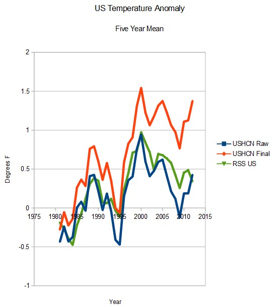
RSS US temperatures match USHCN measured temperatures quite closely. Unlike USHCN adjusted temperatures, which are a complete joke.

There’s the proof, as plain as can be. The real travesty is that someone who claims to be a scientists is making these adjustments.
Have you noticed recent RSS North Pole temps??? They have been tracking down since February and now near ‘average’… Something to watch for October and November ice refreeze and NH snow coverage.
DMI has shown the arctic summer temps to be below normal for the last two summers.
SWAG is the summer temps have little variation because they reflect the SST while the Arctic ocean is partially thawed. The Winter temperatures have a lot more variation.
AP science writer Seth Borenstein shows me this graph as “evidence” that global temperatures have not remained level for the past 18 years. What is the deal with this graph? https://pbs.twimg.com/media/B0FaTtoCcAAhbIH.png:large
Crap data from the usual bunch of fraudsters.
I don’t disagree with you. It seems as though Borenstein does though. I have had a few “debates” with him on Twitter about things he has written. I don’t have the credentials to make overpowering arguments, however.
People who accept government propaganda at face value, are a threat to everyone.
Interesting that NOAA doesn’t even bother to cite a source for their graph. I guess we’ve reached the point now where it’s supposed to be acceptable if they just make it all up.
Reblogged this on Climatism.