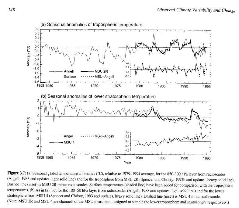
As of 1995, neither NOAA radiosonde nor NASA satellites showed any post 1958 warming. Graph below is from the 1995 IPCC report.
 Since 1996, there has also been no global warming.
Apparently all global warming occurred during 1995.
As of 1995, neither NOAA radiosonde nor NASA satellites showed any post 1958 warming. Graph below is from the 1995 IPCC report.
 Since 1996, there has also been no global warming.
Apparently all global warming occurred during 1995.
AMO 1995 – 2005 http://www.woodfortrees.org/plot/esrl-amo/from:1995/to:2005/plot/esrl-amo/from:1995/to:2005/trend
2005-2015 http://www.woodfortrees.org/plot/esrl-amo/from:2005/to:2015/plot/esrl-amo/from:2005/to:2015/trend
No trend up or down in the AMO since data started around 1856
http://www.woodfortrees.org/plot/esrl-amo/from:1850/to:2015/plot/esrl-amo/from:1850/to:2015/trend
1995 AMO went + 2005 peak and in 2015 it looks to be the point it will go back into a negative phase again.
+1
Don’t think so. The AMO usually spends about a decade at its peak. In this case that is 2005-2015. It then will slowly decline and go negative around 2025. Of course, there are ups and downs even in the positive phase.
You’re not considering solar radiations, which have strong effect on oceanic (multi-)decadal oscillations, including ENSO (which is not decadal).
My point is, the usual estimate of 30 years for the AMO could be shortened by many years– possibly even 10 years– due to the present low solar cycle.
In my opinion, we’ll only know it for sure in a couple of years, but the indication of a possible shortening is already very strong.
There is nearly a 100% chance we are entering a cold phase.
I love your subtle humor Tony. Keep up the great work exposing the frauds.
BTW, I often send some of your posts to the Canadian Government’s Prime Minister, as well as the Minister of Energy and the Minister of Environment, to show them that they cannot continue to support the false claims of the UN IPCC.
Thanks
You’ve cherrypicked the year in which warming occurred! You might as well arbitrarily measure your age from the day of your birth!
1995 is when the AMO went into a positive phase..
few charts for you and look at ones I posted above.
http://www.woodfortrees.org/plot/esrl-amo/from:1850/to:2015/plot/esrl-amo/from:1850/to:2015/trend
http://www.woodfortrees.org/plot/esrl-amo/from:1850/plot/rss/from:1979/plot/esrl-amo/from:1850/trend/plot/rss/from:1979/trend/plot/esrl-amo/from:1979/trend
I thought the RSS guys found problems in Spencer and Christy’s data that required adjusting the data upward creating a little warming trend prior to 1995. This would have occurred after the 1995 IPCC report making that chart obsolete.
Radiosonde data didn’t show it.
In the Dutch MSM there is a huge news item that this year was the warmest year since 1500, not only in the Netherlands, but also in the whole of Europe.
http://www.telegraaf.nl/binnenland/23462495/__Ook_warmste_jaar_voor_Europa__.html
Can anybody explain this? I remember much hotter years in the 20th century. I think this story about the hottest year since 1500 is just propaganda and lies. But a lie, repeated often enough, will eventually be believed.
Summer wasn’t hot in Europe. It was due to mild temperatures in other seasons.
Probably looking at the Central England Temperature record (CET) the longest running record.
http://wattsupwiththat.files.wordpress.com/2013/05/clip_image002_thumb8.jpg?w=921&h=560
However the temperature is falling from the peak . (from the MET office)
http://www.metoffice.gov.uk/hadobs/hadcet/graphs/HadCET_graph_ylybars_uptodate.gif
Steve noted the summer was not hot. Vukcevic has plotted summer vs winter from the CET records. (Perhaps a signature of Urban Heat Island effect?)
http://www.vukcevic.talktalk.net/CETsw.gif
Dang the first graph:
http://wattsupwiththat.files.wordpress.com/2013/05/clip_image002_thumb8.jpg
Any unadjusted records lay the CAGW lie bare.
i am cooling down earth
with your electric devices
You’re right, Tony – as usual.
http://i58.tinypic.com/vr3sbl.jpg
A better look:
http://i61.tinypic.com/jjlh7o.jpg
An obvious step change, and a totally different “picture” than the one usually presented in the climate debate.
If we extend the first period up to 1997 and jump the ENSO of 1998-2001, we get two periods of opposite linear trends
http://i1282.photobucket.com/albums/a532/dhm4444/wood4trees-Interactive-step-change-1979-1997-2001-2015-trend_zpse26f9b04.png
Your graph reminds me of the 2 step-changes that happened at the tropopause in the same period
http://data.remss.com/msu/graphics/TLS/plots/RSS_TS_channel_TLS_Global_Land_And_Sea_v03_3.png
(from http://images.remss.com/msu/msu_time_series.html)
Similar step-like decreases– in 1986 and 1998– also happened in atmospheric humidity at 9 km altitude (300 mb)
http://climate4you.com/images/NOAA%20ESRL%20AtmospericRelativeHumidity%20GlobalMonthlyTempSince1948%20With37monthRunningAverage.gif
(from http://climate4you.com/ClimateAndClouds.htm)
Reblogged this on Centinel2012 and commented:
Black energy is absorbing the global warming heat so the satellites can’t messages it.
Ahh yes Tony, close… that ode…
that ‘Echoing In My Dreams’… (or ‘Who Dun It’)
‘Twas a turbulent time, ending of ’97,
cold, the move from sixteen b you see.
What better time to quietly add within,
that critical … plus zero … point three.
http://www.woodfortrees.org/plot/rss/plot/rss/from:1998/offset:-0.3
Merry Christmas to all. 😆