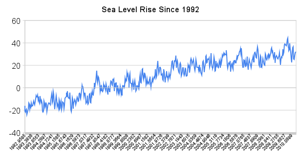
http://www.newciv.org/Synergetic_Geometry/current.htm
A standard high school science problem is to estimate the volume of an irregular solid. There are two ways of doing this.
One is very complicated and inaccurate. The other is very simple and precise. The complicated method is to make all kinds of measurements across the surface and try to come up with a geometric model for the shape. The simple method is to put the object in a beaker of water and see how much water is displaced.
Same story with the Greenland and Antarctic ice sheets. Some scientists have engaged in a complex and flawed approach of trying to interpret gravity data. The simple and accurate way is to look at sea level data.
Any water which melts from an ice sheet runs into the sea. Thus an increase in melt rate would necessarily have to be paired with an increase in the rate of sea level rise – of course assuming that ocean temperatures have not cooled.
This has not happened. In fact, the rate of sea level rise has actually slowed over the last five years.
http://sealevel.colorado.edu/current/sl_noib_ns_global.txt
http://sealevel.colorado.edu/current/sl_noib_global.txt
This simple fact is a show stopper for the theory that the rate of ice sheet melt has increased. You can’t get around it. Ocean temperatures have not cooled significantly, so the unavoidable conclusion is that ice sheet melt rates have not increased.


http://www.montrealgazette.com/travel/Arctic+continuing+down+death+spiral/3509174/story.html
Another death spiral. Don’t these fools ever get tired of this crap?
Nope. The acorn to the noggin knocked em loopy.
Steven, your graph is flawed. You used the data set “Inverted barometer applied, seasonal signal removed. You took every 15th data point starting with 1992.9595 (-24.642) and ending with 2010.0899 (26.635). There is no value on the Y-axis nor explanation for the 0-line reference. Your graph shows readings above 30 in 2006 and 2007, there were NONE. In 2008 there was only ONE above 30 (2008.3796 30.408) In 2009 you used 2009.2755 25.000 and 2009.6827 28.968. Yet in 2009 there were 9 above 30 and one above 40. For 2010 you used 2010.0899 26.635 but the highest for 2010 so far is 2010.1442 38.554. Your reference lines must be wrong because they show readings well above and just below 40 in the last 2 years, there are nu such readings in the data. You have no argument as to what the increased sea ice melt should have contributed to sea level rise. Without it your ‘unavoidable conclusion’ is an unsubstantiated conclusion. The graph http://sealevel.colorado.edu/current/sl_noib_global_sm.jpg speaks for itself, just look at the trend. It has fluctuated between 1992 and today, to pick the last 5 years is nonsense, particularly since 14 of the 15 30+ readings were in 2009 and 2010. Looks to me more like accellerating than slowing.
Pick any data set you want, you will get the same answer. I tried using the one you like:
http://sealevel.colorado.edu/current/sl_noib_global.txt
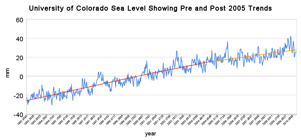
The trend from 1992-2004 was 3.46. From 2005-present it is 2.2. i.e. the slope is reduced.
Spreadsheet is here:
https://spreadsheets.google.com/pub?key=0AnKz9p_7fMvBdE4zb1F2YUVPcUw5dmY3OG51dEFGekE&output=html
The two graphs are not the same, the top one uses seasonal signal removed, the bottom graph seasonal signal included. The top graph shows no readings below 20 after 2008.2981, while the bottom graph shows about half the readings below20. Joining a trend line of 5 years to a trend line of 12 years is not convincing. Try 4 trend lines of 4.5 years and I am sure the line would not be straight. Also note that the data set used for the top graph, http://sealevel.colorado.edu/current/sl_noib_ns_global.txt has an extra entry at 2006.8593 (21.759) which shifts all entries after that out of step with http://sealevel.colorado.edu/current/sl_noib_global.txt bottom graph.
These details don’t affect the conclusions in any way.
The conclusions are simplistic and the graphs show values not representing the data.
In other words, you can’t find anything wrong with my explanation.
“In other words…”, I can, the graphs are wrong, they don’t reflect the data values on which they are supposedly based. You’re evading.
Simple question, are all values properly reflected in the graph. Both yes or no require an explanation.
I fitted a 3rd order polynomial to the Colorado data from 1993: it gave a current downturn in sea level represented by the x^3 term (-0.0086 x^3).
y = -0.0086x^3 + 51.322x^2 – 102655x + 7E+07
R² = 0.9305
But according to Bob Tisdale and other data sources e.g. Roger Pielke Sr – ocean temperatures and heat content are falling. So it may be hard to be precise how much SL rise rate decline is from ice melt deceleration.
Steve:
Your calculations here are making alot of simplifications (think the earlier ‘spherical cow in a vaccuum’ physics joke). The borders of the oceans aren’t all sheer cliffs, generally slope inward. So as sea level rises, the volume it must fill becomes ever greater. Hence, in the real world, assuming a constant melt rate, the sea level rise would eventually slow down. Given detailed topology information, you might be able to make some better assumptions about melt rate from sea level rise. But considering there are many other factors going into the sea level (ocean temperature, magma displacement, etc) you’d have to have some very detailed information to draw any substantive conclusions.
The percentage change in ocean surface area due to a 20 millimetre rise in sea level is incredibly small. It has no meaningful impact on the calculation.