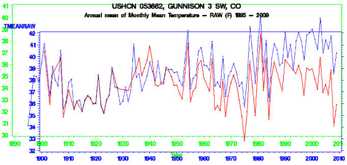
USHCN has turned a non- trend into a large warming trend, by cooling the past in Gunnison, Colorado. They accomplished this by subtracting 3.5 degrees from older temperatures and warming the present
Raw data is the red line and blue axis. Adjusted data is the blue line and green axis. The Y-axis is normalised to 1910.
h/t to Michael D Smith


The principal difference seems to be post 1980.
This is sufficiently recent that it should be possible to smoke out the (very large) adjustments made and verify whether they are indeed valid.
Incidentally, the link provided only yields an entry point to the onrl climate site, more input is needed to get any useful data out.
The link is good.
I stand corrected.
It is just that one must select the data to be displayed from a very long set of options, which appears daunting to the novice user.
I’m sure an explanation will be forthcoming very soon from one of our resident alarmists.
They haven’t been around much since December started.
We see what is being said about it on blogs like this one, ClimateAudit, WUWT, etc.
attached to wrong comment, doh
For what reason has the old data been made cooler? What does the peer review process have to say about that?
We see what is being said about it on blogs like RealScience, ClimateAudit, WUWT, etc.
A shame there are no real journalists around today. Maybe bloggers would not have to do their job.