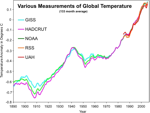
Romm is featuring this graph from “Evangelical Christian” John Cook.
Note that temperatures rose as fast from 1910 to 1940 as they did from 1970 to 2000.
This is solid evidence that the warming is not due to CO2, which only rose 10 ppm from 1910 to 1940. If you use the latest climate science 30 year lag rule, their problem gets even worse – because the 1910-1940 rise was due to the tiny rise in CO2 from before the automobile was invented.
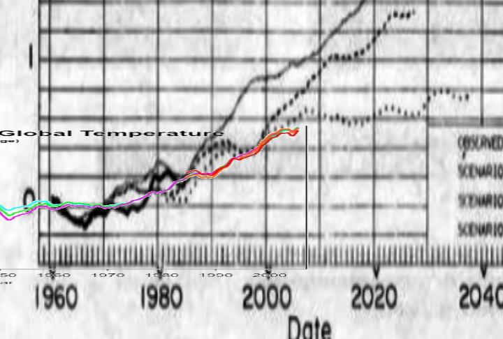
Now, let’s put the graph at the same scale as Hansen’s predictions.
Temperatures have fallen below Hansen’s Scenario C (bottom dotted line)
“scenario C assumes a rapid curtailment of trace gas emissions such that the net climate forcing ceases to increase after the year 2000.”
Cook’s graph obliterates their case, yet they introduce it as evidence.
Global Warmers vs Humanity dismissed.


Warmologists love spaghetti graphs and scaling for effect.
Steve,
“This is solid evidence that the warming is not due to CO2”. It is data only, evidence requires some theory of attribution.
I have not read anyone say that the temp rise until 1940 was do primarily to CO2, just that it was a likely factor.
Hansen’s model was based on 4+C/doubling of CO2, a number most climate scientists consider too high.
If you don’t know what caused the 1910 warming, then you can’t say it didn’t also cause the 1970 warming.
That is a reasonable position to take.
Or how about this one.
There is a lag or ‘warming in the pipeline that will comeback to haunt us’. Therefore……..
Whatever caused the warming from 1910, it’s ‘warming in the pipeline’ has caused the warming from 1975.
So where does CO2 fit in all this?
Any hypothesis is as good as any other in the absence of empirical evidence.
Or, how about this one: Easterling mapped the ocean oscillations onto a nominal, linear temp rise since exiting the Little Ice Age. No great surprise that the temp increases and decreases correlate very well to the positive and negative oscillations of the oceans. No CO2 needed. The real question is, what is driving the nominal, linear temp rise?
I assume you mean Don,
that is a reasonable hypothesis.
was due primarily
The ‘real’ measurements prior to 1985 don’t remotely resemble to current values.
Now where’s the fun in that!
You can’t prove global warming using real numbers, you know that…………
What stands out the most to me is how closely it actually tracks Hansens C.
C takes a steep curve after 2000, based on no increase in forcing.
Cook’s graph follows that same curve……
The way climate science works “if this trend continues”, we can now say that forcing has stopped…………………
TonyD:
The historical data speaks for itself. Just like the historical biological activity, plants grew in locations where they do not grow today.
Excellent. Cue the Perry Mason piano.
Don’t you just love the scale on these global warming graphs? The lines in the top graph cover approx. 0.7 degrees over 120 years but they make it look like polar bear will spontaneously combust at any moment.
scale of the graphs, a closer look
http://www.youtube.com/watch?v=ZsMV5-NRp2Y
Brilliant. Lindzen’s sardonic presentations are always a joy to watch.
Late breaking report –
“This ±0.46 C reveals that the global surface air temperature anomaly trend from 1880 through 2000 is statistically indistinguishable from 0 C… ” Patrick Frank
wahahahhahahaha
This has been known for decades, and is why the Callender, Plass, etc nonsense was repeatedly rejected in the 1950’s and 1960’s.
By force of personality alone is this “science” of “man-made climate” re-introduced to a gullible and vulnerable public; of all the times this bunk has been foisted on the public, only the association of this junk science with “liberal politics” has made it persist in public policy for as long as it has.
(Prior to that it was just bunk, independent of anybody’s political tastes)
Steve, the temperature curve above suggests any number of hypotheses, but, on its own, seems to me, as a layman, to be “solid evidence” of nothing but the fact that it’s getting hotter. And, frankly, hyperbole like that makes it harder for me to find you credible.
It sure is getting hot out there.
Steve, can you please update the comparison chart with observations to 2010 please?