[Update : Actually, I just forgot to use my brain. This post is completely bogus – as explained here]
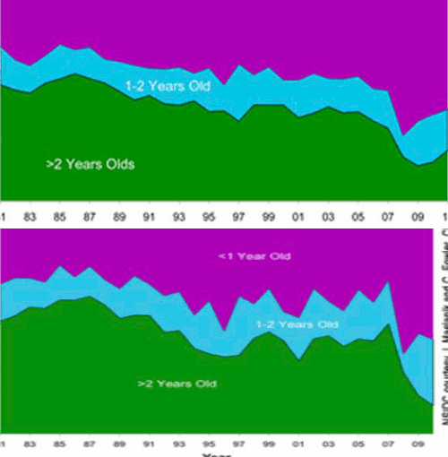
The blink comparator above flashes between normalized NSIDC end of September 2010 ice age percentages and April, 2011 ice age percentages. I see a problem.
All of the turquoise on the right edge of the September graph should have changed to green over the winter (minus any 1-2 ice which was disproportionately transported out of the Arctic.) NSIDC changed their percentage scheme from 30% concentration to 15% concentration over the winter, but that won’t account for this.
Polar drift doesn’t selectively target 1-2 year old ice, so I think something is wrong. The amount on the right edge which changed from turquoise to green looks too small to me.


You need to email Walt or Mark to explain it to you.
Andy
Don’t you hate that “thinking for yourself thing?”
Well, I’m hesitant to state this, but better from me than some infantile troll.
30% of 4 million = 10% of 12 million.
I think you might have a point.
Polar drift doesn’t selectively target 1-2 year old ice
Yes it does.
Most of the advection is via Fram strait. The 3+year old ice (what little is left) is plastered across the north of Greenland and the Canadian Archipelago, and there’s essentially no flow through that during the winter. The first-year ice in the graph is newly-formed ice and thus by definition hasn’t been advected out of the Arctic. The remaining ice – the stuff that actually exits the Arctic during the winter – is the ice that started in the central basin in September (i.e. it’s >1 year old) and doesn’t end up stuck in the “old ice” stronghold around the Lincoln / Beaufort seas.
Ice becomes 3-year-old ice (or older) by ending up in low-advection regions rather than being carried out with the transpolar drift.
Not gonna fly. Look at the location of the 1-2 ice last September. Most was located further away from the Fram Strait than the 2+ ice. Older ice should have been selectively transported. http://nsidc.org/images/arcticseaicenews/20101004_Figure6.jpg
You great berk, that picture (as you pointed out at the time) dates from before the ice “birthday”. Every magenta pixel on that map became “year 1-2” ice. Ice that is now counted as “<1 year" ice formed in areas that were open water in September.
If you want to discuss ice dynamics properly, why don’t you look at an animation, such as the one you discussed at length last summer?
http://stevengoddard.wordpress.com/2010/10/22/a-closer-look-at-the-nsidc-ice-age-animation/
Observe the ice flowing out through Fram, note the proportion of cyan pixels to green/red/blue pixels.
That was last year. The ice location was different at the end of September.
Edit to add: the cyan pixels in that September picture are the ice that is now more than 2 years old. As you pointed out at length at the time. Most of it is, as you point out, located further away from Fram, hence the reason for the uptick in >2year ice this year.