A few weeks ago, I caught NSIDC pulling some mathematical nonsense in their sea ice graphs. A few hours before the Arctic extent line was about to cross the mean line, they changed their plotting scheme to use a five day trailing average for the current ice and a nine day trailing average for the climatology. I pointed out to them that they can’t do that because it puts a two day relative shift in the data – and they fixed it the next day.
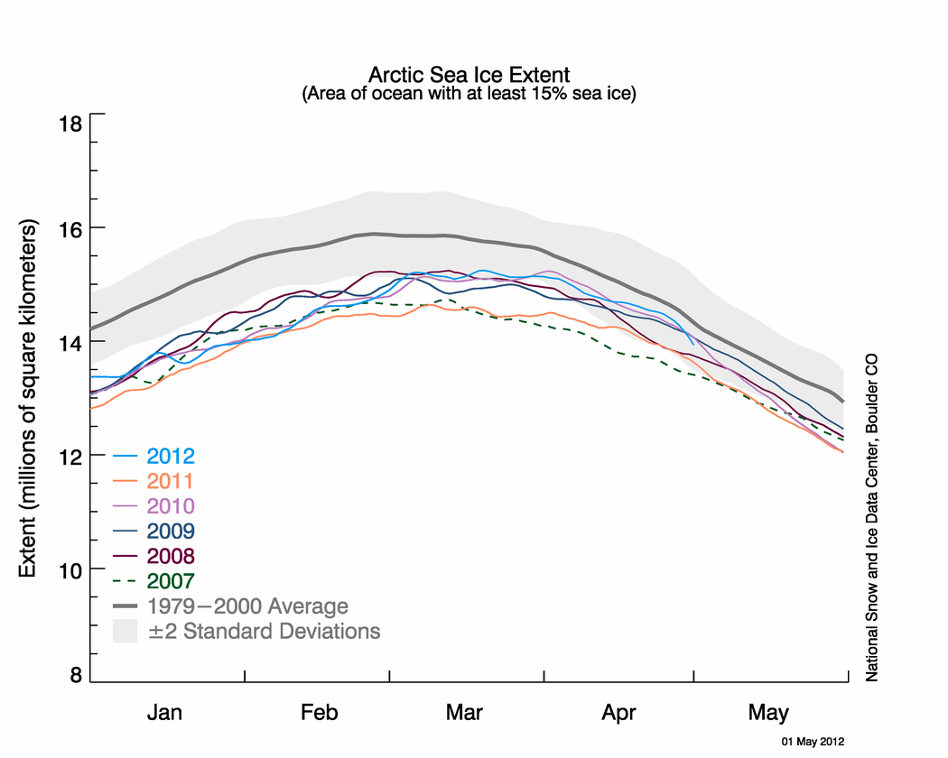
Amazingly, they have made a new mistake in their latest Sea Ice News. The graph below shows all recent years far below climatology.
Arctic sea ice reaches near-average extent in April « Arctic Sea Ice News and Analysis
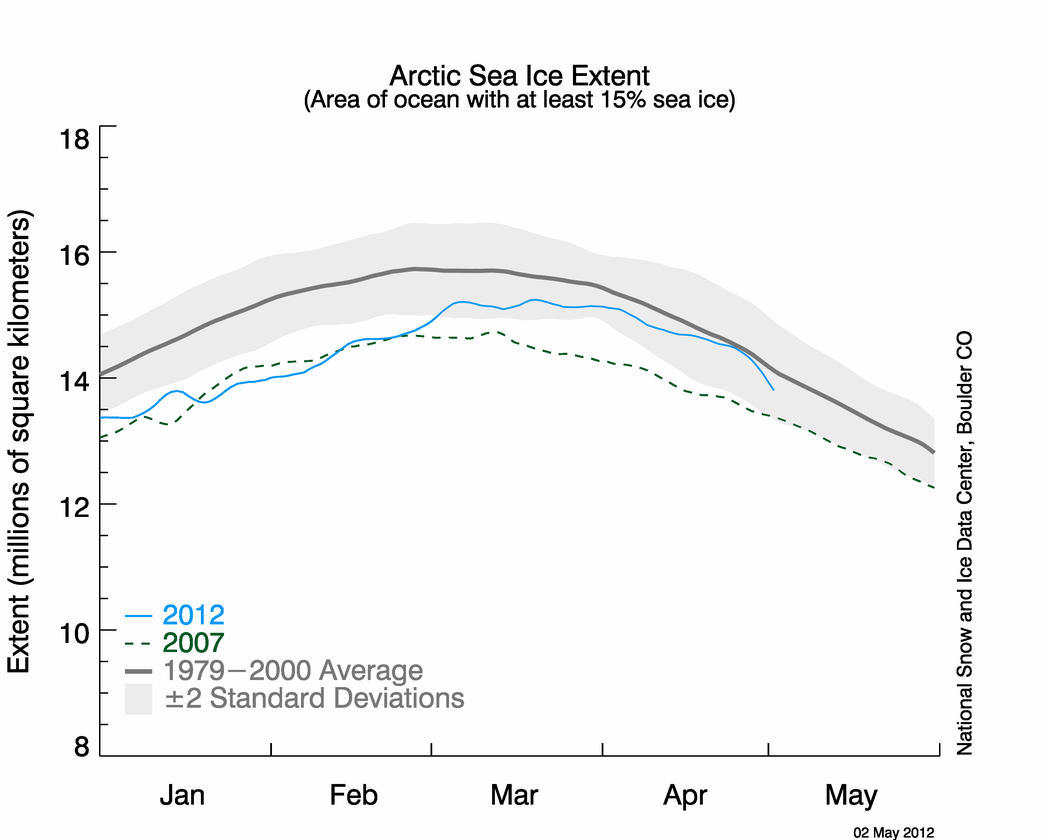
Compare vs. their current extent graph, which shows the blue line brushing up against the gray line last week.
N_stddev_timeseries.png (1050×840)
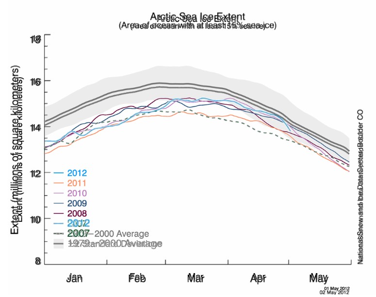
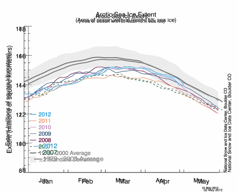
I overlaid the current graph on the Sea Ice News graph, and you can see the error in their climatology (thick grey line.)
I don’t think this is the same error as they made two weeks ago, because the climatology line doesn’t line up using a horizontal shift.
h/t to Rogelio


The meaningless mean. (yawn)
It is apparent that there is no QA in climate science. If it wan’t intentional then it is confirmation that they are incompetent and deserve to be scrutinized.
Like I said before, I don’t trust one thing these people say or do.
But if it showed too much ice and not less, they would have reviewed the whole process before publishing it. Confirmation bias, it’s a marvellous thing.
So why does the calculation for average ice stop at 2000? There is no valid statistical reason to only use 1979-2000 for the calculation, because this will under represent the natural variability.
The less data you look at, the less natural variability you will expect to see. If we for example had 500 years of sea ice data going back to 1500, then we would expect to see a much larger range to the data and greater variability.
This would increase the standard deviation of the data, increasing our estimate of natural variability. By limiting the calculation of average and standard deviation to only 1979-2000, the data is manipulated to give the idea that there is limited natural variability in the Arctic.
This is why I call it the ‘meaningless mean’.
Yoo cannot win against bos
2 million shill truthteam army.
http://www.iraqwar.mirror-world.ru/article/270639
http://www.iraqwar.mirror-world.ru/article/270646
http://www.iraqwar.mirror-world.ru/article/270643
+
How to skin an extinct nanook–
http://sermitsiaq.ag/node/125372
The underlying assumption in almost all climate science is that climate data is normally distributed. ie, that it has a constant mean and constant deviation.
However, if we look at the paleo records of the earth we find this is a wrong assumption. Climate does not have a constant mean and it does not have a constant deviation. They appear to be fractal distributions.
However, the formulas used to calculate of that mean and standard deviation used in almost all of climate science are based on the assumption that the mean and deviation are constant – that climate is a normal distribution.
Thus, the statistical basis for climate science diagrams such as the one above are inherently incorrect. They are assuming the distribution of the data is “normal” without having proved it is “normal”.
An entire field of science based on a faulty statistical assumption.
That’s because (with rare exception) you became a ‘climate scientist’ because you weren’t smart enough to compete in the published literature with the hard sciences, i.e, astronomy, astrophysics, atomic physics, etc. Then the green groups gained political power, and these third raters got elevated to the ‘world’s greatest scientists’ or some such. If it wasn’t for green politics, these guys would be ignored by everyone, which was the way it used to be in the good old days.
You are being insensitive to the feelings of Polar Bears and Penguins.
Economics is another field that used a wrong assumption about the data. How far ahead can economists predict the future? This should tell us something about climate science. Time series data is rarely normally distributed, thus standard statistical techniques are unreliable.
http://www.amazon.com/Maynards-Revenge-Collapse-Market-Macroeconomics/dp/0674050460
Benoit Mandelbrot has demonstated since 1958 that the time series data in financial markets can’t be normally or log normally distributed.During this same period of time ,Milton Friedman was building his theory of monetarism on the claim that the time series data was normally distributed.Mandelbrot discovered that it is the Cauchy distribution,with infinite mean and variance, as opposed to the usual case where the probability disribution has a finite mean and variance, that fits the time series data the best.
Pretty far… Adam Smith for the win…
http://www.questia.com/PM.qst?a=o&d=13886935
“The progress of the enormous debts which at present oppress, and will in the
long-run probably ruin, all the great nations of Europe, has been pretty uniform.
Nations, like private men, have generally begun to borrow upon what
may be called personal credit, without assigning or mortgaging any
particular fund for the payment of the debt.”
An Inquiry into the Nature and Causes of the Wealth of Nations, pg.579,
Adam Smith,
Published 1776.
Economics is a pseudo-science that is charged withthe awesome tax of accurately predicting past economic behavior with little if any predictive value. As such, it is much like Climate Science except for the continual readjustment of data to fit the models.
Recent actions of NSIDC hint at desperation. Arctic ice just isn’t death-spiralling as predicted. Now it’s back to data fiddling, graphology, and press releases about “thin ice” that will melt “quickly” that sound to me like wishful thinking. What ever happened to objective, judgment-free observation?
There must be some deeply hidden vested intersts at work corrupting the entire agency. Ugly. And scary.
Where can one get at the raw data for 1979 to now?
Where can one get the raw data from 1979 to now?
So here at the NSIDC when we say the data is X for a certain date it might be X for 2 days later, or Y when our crack team puts our buggy test system into production. Or when we say climatology for January 1st is 14 it might be 14.25.
Actually we’ll just check in with Steven Goddard and get back to you.
That line is several manhattans above the previous line, in the January area.
Moving the goalposts, fudging the data and adjusting the past, all in one graph.
Truly a scientific achievement of obfuscation.
Admitting that ice at the pole is “Normal” would be politically incorrect.
And now even showing the line “close” to the normal line seems to be politically incorrect…
If I had even a flicker of trust left for them, that stunt just blew out the flame.
To quote Butch Cassidy, “Who are those guys ?”.
Steven, they are unbelievable and I do not accept their data because they can not be trusted. We also have that pathetic Sec. of Defense Panneta who states that climate change is a threat to the security of the US. The idiocy of these people, the incompetence is beyond belief.
If I was you I would SAVE all these modifications. They are De Facto evidence that could be used in a court of law
ferd berple,
Whatever do you mean? 🙂
http://i783.photobucket.com/albums/yy119/jwslimething/image004.jpg
looks like they fixed it…
http://nsidc.org/arcticseaicenews/files/2012/05/Figure2.png
nope….not at all
NOAA almost hires magician, presumably to make data disappear or help hide the decline.
http://www.washingtonpost.com/politics/noaa-pulls-ad-for-magician-to-motivate-employees-at-leadership-event/2012/05/03/gIQAytcE0T_story.html
It’s time for a series of ads showing kayakers running up against pack ice on their insurance company funded quest to see the Arctic death spiral.
And I’m pretty sure the NSIDC brand needs to be mentioned. Like a thought balloon floating over the kayaker’s head, “Funny, the NSIDC claims this is open water.”.