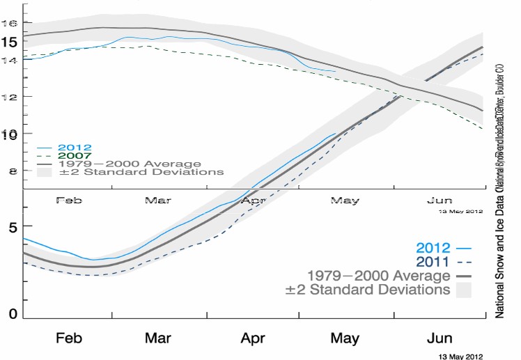
NSIDC normally stretches the Y-scale of their Arctic plots relative to their Antarctic plots, which makes it look like the negative anomaly is very large. Below I put both together at the same scale.
It turns out that the polar ice caps are doing just fine, and the Arctic Penguins and Wildebeest are in no immediate danger of drowning.


I like the new graph.
How about taking it one step further, and place the global ice average, two SD, and current area on the same scale?
Yes those critters are doing just fine.
One small correction: There aren’t any penguins in the arctic. They live almost exclusively in the southern hemisphere, with a few colonies as far north as the Galapagos Islands, near the equator.
No penguins, but lots of wildebeest in the arctic