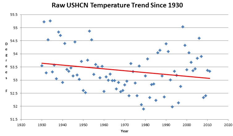
Since 1930, the average of all valid USHCN thermometer data shows a half degree decline in temperatures across the US.
But we keep hearing about the high ratio of record maximums to record minimums in the US. Below I will show you what they are doing.
I changed the counting algorithm to be completely unbiased. If ten different years tie for the all-time record high at a specific location on a specific date, they all get counted as the record. This increases the total number of records.
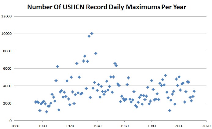
All-time high temperature records in the 1930s were far more common than they have been in recent years.
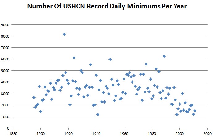
All-time low temperature records peaked in the 1920s and 1970s.
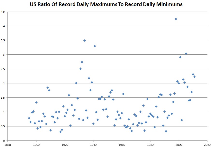
But here is the statistic trick. The ratio of highs to lows has been increasing lately. This is very misleading because the ratio of two small numbers is meaningless. Record highs and record lows have both been on the decline.
The far more important statistic is that the number of record highs has been declining.
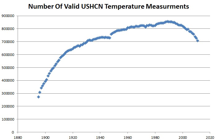
But this is worse than it seems. Note that there was a large spike in the ratio after 1990. Something else happened around that time – the number of stations dropped off dramatically. If NOAA was purging rural stations, that would cause the spike, because the record would be affected more heavily by UHI effects.


Reblogged this on Climate Ponderings.
Maybe this will be clear for them. Steve how many total sites?
USHCN has 1218 sites
Thanks.
What can one say from these graphs?
1. The U.S. is clearly warming as there are significantly more positive temperature records than the negative ones beginning in 80-ies. The number of negative records drops, while that of the positive is steady.
2. The temperature record history is a way too short to make any reliable conclusion. The records are still within 1-2 sigma statistics: the drop in the number of records is too smooth yet.
You display the mendacity and dissonance of true religious fanatic.
Did not expect that from a “skeptic”.
I am certainly neither an AGW-proponent, nor a “fanatic” in any way.
I simply digest what the data in YOUR graphs say.
I do not know (and am not interested to know) whether the data you show are skewed or not – in any direction!
Concerning fanatism – I am afraid you will see a fanatic in a mirror.
Sigh…
The 80 year trend in the temperature is clearly downwards, and I explained why the recent ratio is meaningless. Your conclusions are completely unjustifiable.
Steven,
Why do you call the ratio meaningless? The numbers are not small, they are in the thousands. And if you find it is statistically significant that the number of maximum records has been declining, shouldn’t you also find it statistically significant that the number of minimum records has been declining, by an even larger amount?
The total number of maximum temperature records is declining. As rural stations drop out, we lose record minimums. The ratio is meaningless.
I seem to recall a recent study by a meteorologist and a computer programmer that the drop in number of stations was anything but random – the higher elevation (and therefore cooler) stations were being systematically purged. That would explain the decrease in record lows starting in the ’90s.
UF, I can’t remember where the study can be found.
It also seems from your graphs that extremes in both direction have been declining in magnitude. If the world had warmed by about .75C over the that last hundred years as claimed by so many scientists, that would suggest that a modest warming produces more stable and less extreme weather, the opposite of that claimed by the warmists.
This might help. It demonstrates that station drop outs, infilling algorithms do significantly affect the trend.
http://boballab.wordpress.com/2010/02/26/interesting-gistemp-trend-maps/
And here is a second one showing that TOBS bias is itself biased with respect to latitude and elevation. TOBS bias should be independent of location, but its not, so something is wrong with the TOBS adjustments.
http://bittooth.blogspot.com/2010/12/connecticut-combined-temperature-review.html
“All-time high temperature records in the 1930s were far more common than they have been in recent years.”
Perhaps they were, but this says nothing about temperature trends. This is simply a statisitical inevitability. If you use extreme temperature records, you are always going to have a bias towards the beginning of the record aren’t you? For example: If you start in 1900, and your baseline is 1890, there is statistically a much greater chance of breaking a temperature record in 1901 than than there is in subsequent years – records will always be clustered near the beginning. In fact, all things being equal, the ‘opportunity’ to break a temperature record should decrease steadily over time
Ironically, your piece is entitled ‘another abuse of statistics by the team’.
Indeed… it would be hard to find a more blatant abuse of statistics than yours!
Explain this
http://stevengoddard.wordpress.com/2012/07/11/smoking-gun-that-giss-temperatures-are-garbage/
I rather think you first need to explain your quite blatant abuse of statistics as per my original point (or withdraw your meaningless statement above the graph “All-time high temperature records in the 1930s were far more common than they have been in recent years.”)
Perhaps then I can go digging around in Hansen’s data from 1999.
I can’t help it if you aren’t very bright.
Gavin,
Steven performed it both ways, the second time demolishing the strawman the critics set up, by doing it their way.
Same conclusion, even a caveman can see it…
Indeed, it would difficult to find a post dumber than yours.
http://stevengoddard.wordpress.com/2012/07/10/dumberer-and-dumbererer/
“I changed the counting algorithm to be completely unbiased. If ten different years tie for the all-time record high at a specific location on a specific date, they all get counted as the record. This increases the total number of records.”
What part of this isn’t clear? There is no time bias in the counting of the records.
He has done nothing of the sort Ben. By starting at 1930 in the other graph he has also blatantly abused statistics by choosing a start point which spins his story. By not acknowledging the fundamental bias in the ‘extreme temperature records’ method he appears to be deliberately attempting to deceive those who actually ‘are not so bright’. Finally, by resorting to abuse so readily he is indicating he has been cornered, but is unwilling to acknowledge this.
However – it is his blog, and I suppose he is free to post what he wants. But please don’t call it good science.
Gavin,
Get a clue
http://stevengoddard.wordpress.com/2012/07/10/dumberer-and-dumbererer/
Steven,
I’m going to have to go with Gavin on this one. Since Gavin is obviously right, I think you need to explain how you slid all the 1930 data over to 1900… 😉
You are too patient sir…
Gavin, what is it that’s so hard for you to understand? As you look back through time, there is no increased odds of the records which still stand today would be from the 1930’s as opposed to 2000-2010. None. If you believe otherwise, show the math.
But, more to the point Gavin, while it is true that this graph doesn’t specifically speak to whether or not our temps are generally warmer than back in the 30s, it does specifically speak towards the alarmists “extreme temperature records” meme. In fact, it destroys it. The temps and the weather is not becoming more extreme, it is become less extreme.
Reality is such a hard thing for an alarmist to deal with.