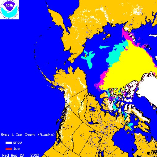
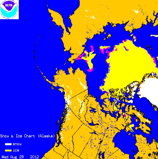
Turquoise represents ice present in 2012 which wasn’t present at the 2007 minimum. Red shows the opposite. There is 12% more ice than there was at the 2007 minimum.
http://www.natice.noaa.gov/pub/ims/ims_gif/DATA/cursnow_alaska.gif
ims2007262_alaska.gif (512×512)
The next map shows the changes since Monday.


The quick freeze looks to me like the straits between Alaska and Siberia will close early. I’m guessing here but the next disaster news story will be thousands of whales becoming trapped in the Arctic Ocean unable to escape the winter ice. Fleets of Greenpeace Chinook helicopters will be needed to fly them out to the Bering Sea. The horror! The horror!
Give up Steve. Ten years from now you’ll be forgetting all this ju ju magic that you used to whip up daily. Your rationalizations will be different then. Your arguments shift like a kaleidescope – changing, shifting yet always coming out the same.
Already its the “1938 had an open Arctic” absurdity but when the weather starts slamming us in earnest and the supermarkets start showing the effects of a truly open Arctic then you’ll simply exchange this current nonsense for some future confabulation.
What is wrong with buying wine from Greenland?
What is wrong with buying wine from Greenland?
Growing cactus in Kansas.
Some of those are good to eat too.
http://www.cgfi.org/2011/11/ice-free-arctic-6000-years-ago-by-dennis-t-avery/
Paraphrasing another poster:
“I’m delighted that we are being graced with visitors like Terra Incognita.
Sometimes the general tone of intelligent, co-operative people trying to assess and
understand a fluid and complex situation can get a little … well dull.
Terra Incognita’s ranting evangelical tone, and doggedly catastrophic outlook is a timely reminder of just how loopy the ‘other side’ is!”
By the way there is zero scientific evidence that man-caused CO2 emissions (roughly 4 percent of 0.38 percent of atmosphere) are warming the planet. As Australian scientist Ian Plimer observes:
“If one imagines a length of the Earth’s atmosphere one kilometre long, 780 metres of this are made up of nitrogen, 210 are oxygen and 10 metres are water vapour (the largest greenhouse gas). Just 0.38 of a metre is carbon dioxide, to which human emissions contribute one millimetre.”
And we’re supposed to believe that one millimeter atmospheric equivalent will lead to runaway global warming. What absolute nonsense.
By the way, the polar ice caps have been growing and melting for millions of years without any help from CO2. In fact, during the late Ordovician Period, earth was in the midst of an ice age while at the same time CO2 concentrations were nearly 12 times higher than today– at 4,400 ppm. According to greenhouse theory, Earth should have been exceedingly hot.
The AGW hypothesis has been falsified seven ways from Sunday, but the true believers cling to their fantasy like a small child hugging his favorite Teddy Bear.
Plimer’s argument about the human emissions is the wrong way of analyzing the issue. Excluding human emissions of greenhouse gases, emissions did not exceed absorption. Human emissions created an imbalance where annual greenhouse gas emissions exceed annual greenhouse gas absorption. The result is a rising atmospheric concentration of greenhouse gases and rising forcing attributable to greenhouse gases. It’s the marginal contribution that matters and the human contribution created the imbalance (emissions > absorption).
Also, FYI, the Australian government put out the following publication in response to Plimer’s book: http://www.climatechange.gov.au/en/climate-change/understanding-climate-change/~/media/climate-change/prof-plimer-101-questions-response-pdf.pdf
Don Sutherland , that is absolute tripe . You are speculateing about an unproven assertion . You have no basis for the idea you are presenting as kirk myers has correctly pointed out that the green house hypothesis has been shown to be incorrect many times , by nature and by intelligent people yet you keep dragging it back into the house because you can’t get the facts straight in your head .
Johnmcguire,
The greenhouse effect has not been disproved. Although there are uncertainties related to the climate sensitivity to growing anthropogenic forcing, that is quite different from assuming that such forcing has no impact. In fact, climate models can only reasonably represent recent observed climate change by incorporating anthropogenic forcing into the mix. Reliance on natural forcings alone no longer reasonably represents the climate trend. Moreover, no natural mechanism that can serve as a viable substitute for anthropogenic forcing in explaining the recent climate trend has been identified.
What ever Don!
http://iceagenow.info/2012/08/earth-cooling-%E2%80%93-co2-warming-tenth-models-show/
http://hockeyschtick.blogspot.com.au/2012/08/new-evidence-that-water-vapor-is.html
http://principia-scientific.org/publications/History-of-Radiation.pdf
http://principia-scientific.org/publications/History-of-Radiation.pdf
http://principia-scientific.org/
What happens in a bottle in a lab can not be extrapolated to the open atmosphere, simple as that!
So MASIE and NIC are catching up with the other sites as predicted. Thanks for posting these Steve, is interesting to see.
For the record, I’ve redone all your counts since you don’t seem capable of getting them right. What software are you using?
Aug 24th (day 237): 24,583 ice pixels
Aug 26th (day 239): 23,086 ice pixels
Aug 27th (day 240): 21,939 ice pixels
Aug 28th (day 241): 20,763 ice pixels
Aug 29th (day 242): 20,172 ice pixels
Sept 19th 2007 (day 262): 18,161 ice pixels
In percentage terms these are:
24th: 35.4% higher (you claimed 36%)
26th: 27.1% higher (you claimed 28%)
27th: 20.8% higher (you claimed 22%)
28th: 14.3% higher(you claimed 18%, then 15.8% with a copy/paste error, then finally 14%)
29th: 11.1% higher (you’re claiming 12% in this post)
Something is wrong either with your counting or your rounding. So far, every single number you’ve posted has been wrong, even according to your own claimed methodology – which as discussed previously is an inaccurate method applied to an inappropriate dataset.
You should go help Hansen with his numbers. He has a heck of a time getting them correct.
I’m using OpenGL bilinear interpolation to generate the final maps, which introduces some changes. The method you are using (counting the original maps) is more accurate.