New Met Office data shows the United Kingdom is warming in line with global trends
Readings show the UK’s annual mean temperature calculated over a thirty year time period has risen 0.52 degrees Celsius over the past two decades.
New Met Office data shows the United Kingdom is warming in line with global trends | Carbon Brief
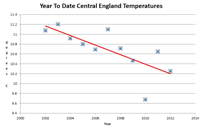
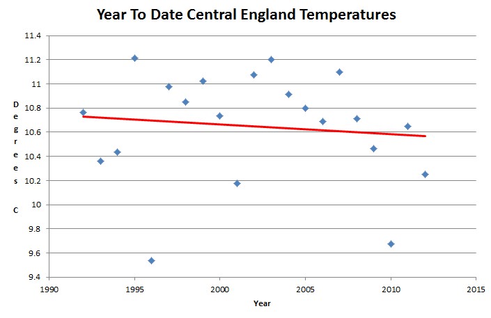
Here are the Central England Temperature year to date graphs for the last two decades.
Ten years – falling at 10C per century
Twenty years – falling at 2C per century
Monthly_HadCET_mean.txt (1659 on)
This has been the 90th warmest year in England so far, with all of the years listed below being warmer
1666 1676 1686 1706 1708 1727 1728 1732 1733 1734 1736 1737 1738 1750 1759 1761 1762 1775 1779 1781 1794 1798 1801 1819 1822 1826 1828 1831 1834 1835 1846 1859 1868 1869 1872 1874 1878 1884 1893 1896 1899 1911 1914 1921 1926 1933 1935 1937 1938 1943 1944 1945 1948 1949 1950 1952 1957 1959 1960 1961


Rejoice! Until a couple of years ago, the headline would have said “England warming faster than the rest of the planet”…
Your blog is literally of historic importance now.
You need to add 29 more years to that list, and bitch slap someone at Met.
Wikipedia’s page on this data set cuts off the data at its peak in 2008, prior to The Big Plunge:
http://en.wikipedia.org/wiki/Central_England_temperature
It also omits its recent extension back to the mid 1500s instead of mere 1600s.
And for central England, this summer was the 178th warmest in the 354 year-long series.
http://notalotofpeopleknowthat.wordpress.com/2012/09/05/uk-summers-back-to-normal/
The figures referred to in the Carbon Brief blog are based on the UKMO regional data series, which starts in 1910 and which covers all regions of the U.K., i.e. England, Scotland, Wales and N.Ireland, not C.E.T., which is based on only 3 individual locations in England.
So, Ray, it’s ok to cherry pick data? What’s the point? It is likely the warmest summer in the last 1 year in the UK, but if it’s the 178th warmest in the last 354 years, then it is nothing remarkable and even a two decade trend is nothing remarkable, even if it is accurate.
The headline is misleading. I think that’s the point.
If I bought a thermometer and stuck it in my backyard, I would record the highest and lowest temperature ever recorded in a single day at that location on that thermometer the day I buy the thermometer. It also has nothing to do with the climate where I am located. The next day I would set a trend and could stick a line through it to project out to infinity either warming or cooling. But if you have 400 or 500 years of data like England has, you should use that, not cherry pick 20 years to scare people into driving death traps like Chevy Volts.
The point is that the MO figures were not based on CET and I don’t think it is “cherry picking” to use the actual data on which the figures were based.
That said, I agree that the headline is misleading but I don’t think that the MO are to blame, (and I am no fan of the MO). What the MO says is that the average for 1981-2010 is 0.52c higher than that for 1961-90, not that the temperature has risen by 0.52c over the past two decades, as stated in the Carbon Brief blog, although the MO may have intended that confusion to arise.
Since the 30 year average for 1961-1990 is centered on 1975/76, and that for 1981-2010 is centered on 1995/96, it would be more correct to say that UK’s annual mean temperature has risen by 0.52c between 1975/76 and 1995/96, not over the past two decades.
don’t forget, lower levels of CO2 make thermometers give temperatures that are too high, and higher levels of CO2 make thermometers give temps that are too low, which is why the raw data needs to be adjusted to fit Hansen’s theories, which have proven to be striking accurate after the adjustments are made.
Wait……what??????!?!?
That’s not fair! That is raw, unadjusted data. That’s cheating!
It’s interesting that if you compare the trend of cycle C22 (between 1990 and 2000) with C23 (2000 to ~ 2008) and now, C24, you see a nearly stable average in C22, replaced by a lowering trend in C23 and an intensification of the lowering trend now… showing an obvious sensibility to solar radiation.
It’d be interesting to check how it evolved in previous cycles.
If you check the (now deleted-for political reasons) Met Office graph for the Arctic sea-ice extent,
http://iceagenow.info/2012/09/mystery-disappearing-graph/
you’ll see a very similar variation in correspondence with the solar radiation (since the 1970’s).
There you can even see the slight increase trend at the end of cycle C20 (prior to 1976), which was even lower than C23.
(ps.: in my previous comment the interval (1990-2000) corresponds to the period between the maxima of C22 and C23, not the total cycle. C23 started ~ 1997 and I supposed the trend between 1986-1990 was the same as between 1990-1996. If it was hotter the similarity with the Arctic sea-ice graph increases)
correction:
… if it was colder the similarity with the Arctic sea-ice graph increases …
sorry!:-)
more about the Met Office sea-ice graph,
http://notalotofpeopleknowthat.wordpress.com/2012/09/04/the-mystery-of-the-disappearing-graph/