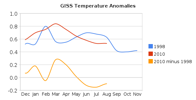
It appears almost certain that GISS will declare 2010 to be the hottest year ever.
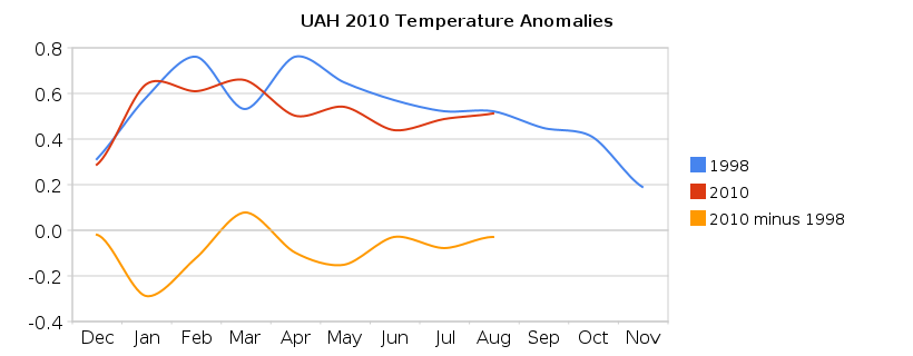
It is also almost certain that UAH, RSS and HadCrut will not agree with GISS. They will most likely place 2010 below 1998.
Dr Hansen has recognized the discrepancy, and explains it by his “better Arctic coverage”
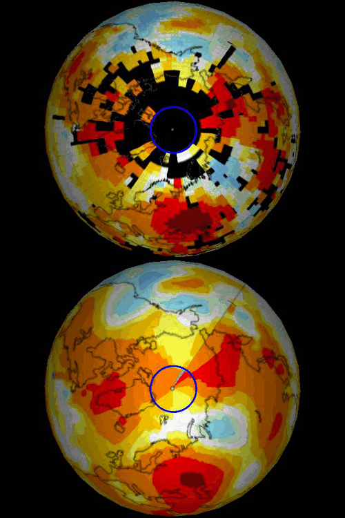
The blink comparator below shows GISS June-August (baseline 1958-2002) extrapolated (1200 km) vs June-August measured (250 km.) Note the large holes and the fact that there is little or no measured data north of 80N. Also note that GISS shows the region north of 80N as well above normal, despite the paucity of actual temperature data.
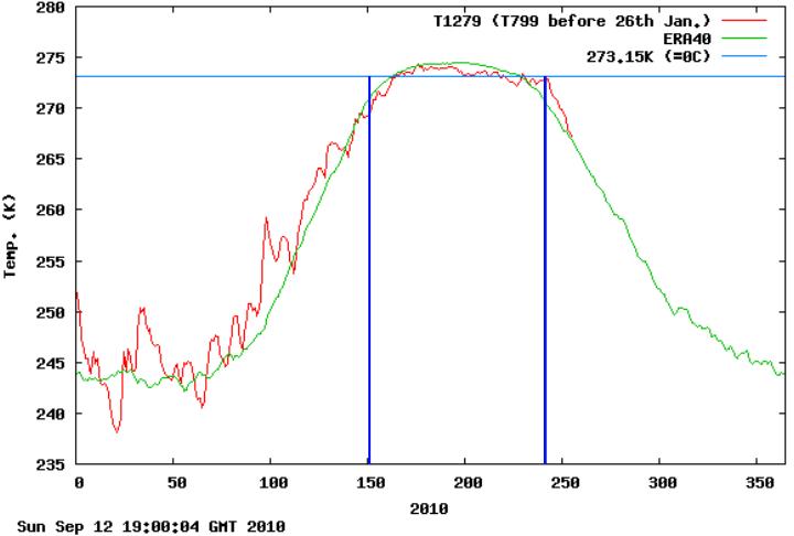
By contrast, DMI has a lot more actual temperature data, and shows June-August 2010 (north of 80N) well below the 1958-2002 mean.
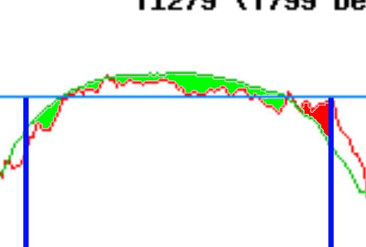
The DMI closeup below shows 5518 pixels below normal and 1471 pixels above normal from June through August.
So which temperature record do you trust? Is 2010 really the “hottest year ever?”


And after the glaciers cover all of Canada and a goodly chunk of the northern U.S. (including GISS in NYC), GISS, from its temporary offices in Atlanta, will declare the year as the hottest on record, through a careful extrapolation of what the temperature readings should be from the glaciated regions, if it weren’t for the fact that the ice was covering all their robust stations.
Do not worry, in 10 years, they will revise it downward by a few 100ths of a degree (even though their measurements are not that accurate).
I will bet by the end of the year GISS will be the too warm outlier.
The White Witch brewing in the Pacific will see to that….
Steven, 1998 still is not the warmest year on record in the GISS dataset. 2005 is. (and it is rather unclear, whether 2010 will be significantly warmer than 2005)
the DMI closeup is highly misleading, because you ignore the rest of the year.
Misleading? I am comparing GISS June-August vs DMI June-August. I also included a graph of the whole year. How is that misleading?
the title of this post says :”GISS On Track For Hottest Year Ever”.
the majority of readers will simply not notice your change of time frame.
i am a little curious, as it is very difficult to estimate from the two graphs. can you do a pixel count comparison between 1998 and 2010 up to now? (just if you find the time of course!)
sod says:
September 13, 2010 at 6:50 pm
the majority of readers will simply not notice your change of time frame.
You think people are that stupid?
It’s not misleading. He has everything labeled. Getting things mixed up was an idea introduced by you—and you alone.
Do you have anything real to contribute sod?
sod..cricket! cricket!
I cannot understand how Hansen thinks what he does is credible science.
He has a model which shows global warming still happening when the earth has not warmed since 1998. He uses this model to infill the Arctic temperatures, adds these temperatures to real values giving a result which agrees with his model.
Anybody else spot how incredible and non-science this is?
GISS 2005 was way hotter than 1998, 62 degrees versus 56. No way GISS sets record this year. If temps stay where they are for the final 4 months it is a tie. With La Nina ramping up, temps are almost certain to fall significantly.
Did you ever play baseball in Boston?
If so, I owe him a beer! I am a Mets fan. 😉
I may be wrong, but something isn’t quite right with the graph labeled “UAH 2010 Temperature Anomalies”.
Look at Jan for the series “2010 minus 1998” (yellow). Since the series “2010” is higher than “1998” in Jan, the yellow curve should rise above 0.0, but it currently displays a value below -0.20
Can you confirm the value is correct for “Jan” for the series “2010 minus 1998”?
Thanks