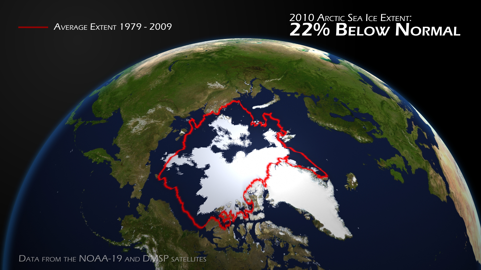
Anthony noted an error on the NOAA web site, where they claimed that Arctic ice extent was second lowest on record.
On further examination, I noticed another serious problem.
The text says “22% below normal,” but the map looks like almost 50% below the red normal line. So I did some pixel counting.
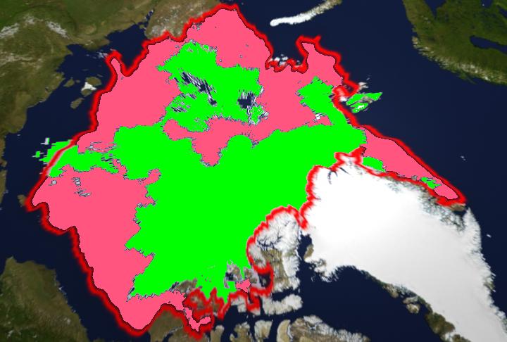
The map shows that the ice is 46% below normal, not 22%. The projection is not perfect, so the measurement is not precise – but the discrepancy between 22% and 46% is much too large to be accounted for by distortion.
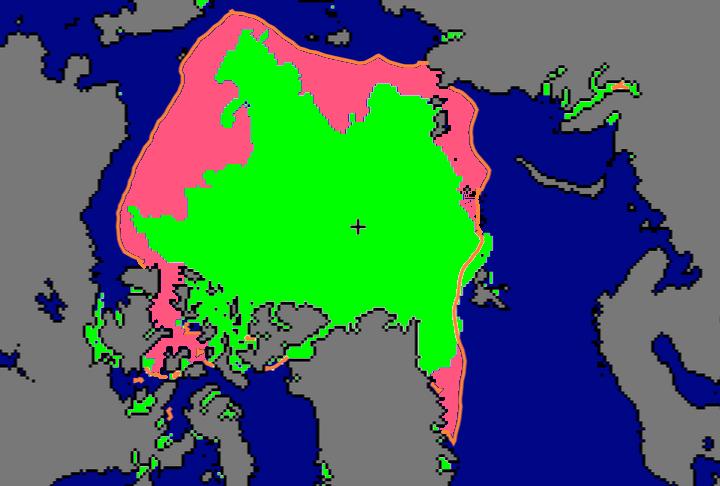
The NSIDC equivalent map below shows more reasonable numbers, at 29% below normal.
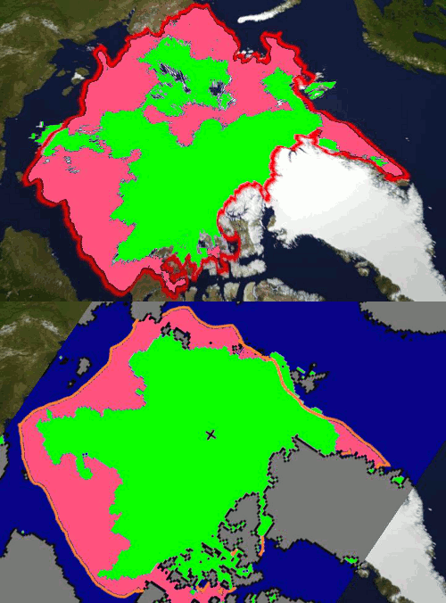
The blink comparator below shows the differences between the NSIDC map and the NOAA map.
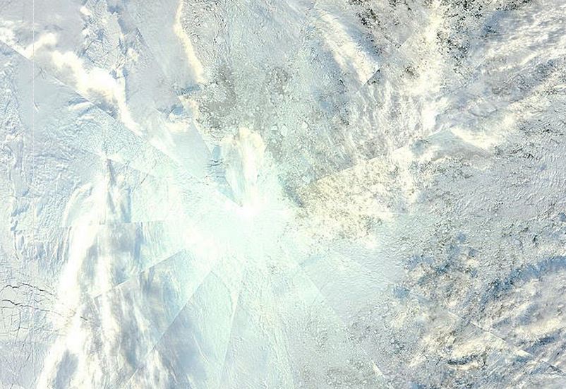
As you can see, the NOAA map makes the condition of the ice look worse than it is. They show large non-existent areas of missing ice near the pole. Below is a satellite image showing what the ice really looked like around the pole yesterday.
Looks to me like NOAA has some problems.


To think that as a pilot I trust NOAA with my life but at least the short term forecasts are reasonable. Hate to think what a flight would be like if thunderstorms and convective activity were political footballs. Yikes!
Cheers and 73,
Dan
LetsGoViking!
And maybe somebody forgot to program the computer to not count the ice of Greenland.
Wonder if any other other government agency makes such mistakes. Hmmm … nah, couldn’t possibly happen.
I find this article perplexing. If NOAA says that the representation shows a 22% loss and you do a pixel count and from that deduce that the loss is more in the region of 46% doesn’t that immediately suggest that pixel counting may not be the best way forward in this case. Pixels can represent data but then they can always just be pixels with no greater relevance than simple picture construction. Considering that you’ve been led to error in the past by this confusion I would hope that this time you have been more cautious in your assumptions.
Equally the difference in pictures used by NSIDC and other agencies is explained in the NSIDC faq:
http://nsidc.org/arcticseaicenews/faq.html
Regardless of pixels both NOAA and NSIDC are in agreement about this year’s minimum.
Given this, the claim that NOAA has manipulated the visual data to make the minimum seem worse strikes me as a little eccentric. Was the title on their picture ‘46% Loss’ ? Have you compared past NSIDC representations with past NOAA representations to see if there are consistent differences in sea ice representation?
I think you are in danger of jumping to (and inciting your readers to jump to) unreasonable conclusions.
Marco
It is quite clear that there are problems with the map. I didn’t “claim” anything other than a bad map.
stevengoddard says:
September 16, 2010 at 12:44 pm
It is quite clear that there are problems with the map. I didn’t “claim” anything other than a bad map.
Well I had the impression from reading your article that your pixel count led you to the conclusion:
Looks to me like NOAA has some problems.
Thus my post. It is far from clear that there are problems with the map.
You are of course under no obligation to answer the queries I made in my original post but as your article was titled ‘More NOAA problems’ and your blog is entitled Real Science I thought you might be more forthcoming in discussing what I suggested may be problems with your method.
Has anybody ever said that you have a striking resemblance to Judy Garland? Or is that you on the left?
Pingback: NOAA Fixes Their Broken Ice Map | Real Science
Pingback: Record Fast Arctic Freeze? | Real Science