Mann claims that the tree rings quit working 50 years ago. The trees work fine, it appears to be some climate scientists who are the problem.
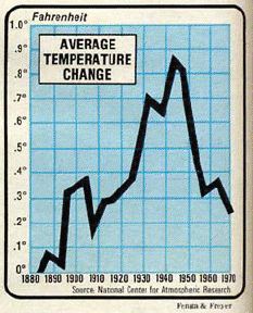
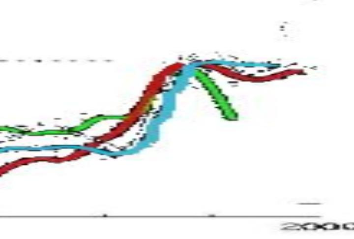
The green line is Briffa’s decline, which Mann hid. NCAR showed the same decline in the 1970s

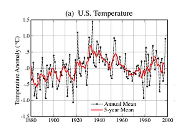
GISS used to show the same decline for the US, before they “corrected” it away in 2000.
Looks like the hide and seek game extends beyond PSU.


Just yesterday there was a post that says how sanctified the GISS data is. This just proves that most published climate science data has to be taken with a grain of salt until one can determine how much it has been massaged before the findings are released to an unsuspecting public. There is no shame in ClimateVille.
Data is data, the problem is what some people decide to do with the data. Even then I can live with people playing with the data AS LONG AS I KNOW WHAT THE GAME IS. If you want to adjust data to try out a theory feel free to bend spindle and mutilate, just tell me how and why. You never know I might just agree with you provided I know what you did.
Maybe tree rings quit working 1000 years ago, maybe they never worked as there are no instrumental records to compare them with prior to the invention of the thermometer.
But there are other proxies.
ChrisD:
Yes there are other proxies. It depends on how you select your proxies what results you will get. If you have a program that has a desired result you will only get proxies that fit that result. The statistically method needed to be selected before rather than looking for the best statistical method to achieve the desired result.
To quote P.G. Wodehouse, what frightful horse-radish.
1900 peer reviewed works show the Hockey Stick is wrong
http://www.youtube.com/watch?v=ZBQeqKQHlZc&NR=1
now everymonth when UHCN/GISS or whoever owns the supercomputer runs their algorithm to incorporate the latest data it rewrites old temperatures down and new ones up….
walla! warmest whatever ever!
It’s always worth looking at some of the review comments for AR4 re: the divergence problem…
“Show the Briffa et al reconstruction through to its end; don’t stop in 1960. Then comment and deal with the “divergence problem” if you need to. Don’t cover up the divergence by truncating this graphic. This was done in IPCC TAR; this was misleading. ” (Reviewer’s comment 309-18)
“If you do show Rutherford et al, you must show their values after 1960, as with Briffa et al 1960. Not to do so gives a very misleading impression.” (Reviewer’s comment 309-20)
…and the response…
“Rejected – though note ‘divergence” issue will be discussed, still considered inappropriate to show recent section of Briffa et al. series”
I suppose that’s your prerogative if you’re a lead author.
I suppose that’s your prerogative if you’re a lead author.
Yes, it is, otherwise all comments would have to be accepted, wouldn’t they?
Yes, and it’s also worth saying that anyone (within reason) can be a reviewer. These comments, inevitably, came from Steve McIntyre which probably explains the somewhat peremptory response.
He has a point though. If these particular tree rings can’t tell you what happened in the last 50 years when we know (more or less) exactly what the temperature was, how on earth can we have any confidence in them before that?
We’ve been through this, I think. Tree rings match instrument temps well through about 1960. Post-1960, tree rings still match instrument temps with the exception of some (not all) high latitude NH trees. For the pre-instrument period, tree rings play nice with other proxies.
There’s good reason to have confidence in the overall reliability of tree rings as temp proxies.
What you are saying is that integrity in climate science has hit rock bottom, and that true believers will believe any crap they are fed.
The close agreement with other proxies explains why the IPCC tossed their 1991 proxies which showed the MWP. Makes sense if you have an IQ of about 10.
No wonder you don’t moderate ad homs like real blogs do. Then you wouldn’t be able to post your own.
Anyone dense enough to say that they don’t trust tree rings now but they did trust them 700 years ago, deserves far more abuse than I am dishing out.
“some (not all) high latitude NH trees”
In which case those trees should not be used, or at least if they are used, the full record should be shown and not removed because it’s “obviously wrong”.
Paleoclimatology is a young discipline and I don’t dismiss it as phrenology like some do, but its practioners need to be absolutely above board. Otherwise they just leave themselves open to unnecessary suspicion. The suspicion is then dismissed as the wild ramblings of the denialosphere or whatever instead of legitamite criticism and the whole silly circus continues ad nauseam.
*practitioners*
Uh, stunned by Millwall’s last minute offside equaliser.
*legitimate*
Time for bed.
The NCAR graph is global and the GISS graph is US. And the scales are different.
Apples, oranges.
Furthermore, if you look at the GISS chart, there actually is a pretty significant decline from the 1940s through about 1970. So I’m not sure what exactly was hidden.
What a stupid comment
Yes, as we can all tell from your detailed rebuttal.
NCAR is smoothed. GISS is both annual mean and 5 year smoothed mean.. Depending on the smoothing Al-Gore-Rhythm used by NCAR and the tree rings in the graph representing Briffa’s work, which is regional, We are talking about “Fruit Salad”. Especially when referring to the Spaghetti graph from the IPCC report. If you were to look at Mann’s work compared to this, you would probably see different results because we all know that Mann only used the best methods and proxies because they were picked because they provided the desired results.
I think Steven was showing all the graphs are meaningless, especially the one fromIPCC AR4.
I think Steven was showing all the graphs are meaningless
He’s used that NCAR graph repeatedly, and not in an “it’s meaningless” sort of way.
You don’t trust those guys at the National Center For Atmospheric research?
If I may quote, “What a stupid comment.”
Mike said “I think Steven was showing all the graphs are meaningless…” I pointed out that this is not my impression, since you’ve used the NCAR graph a lot. How hard is that to understand?