h/t to Joe Romm
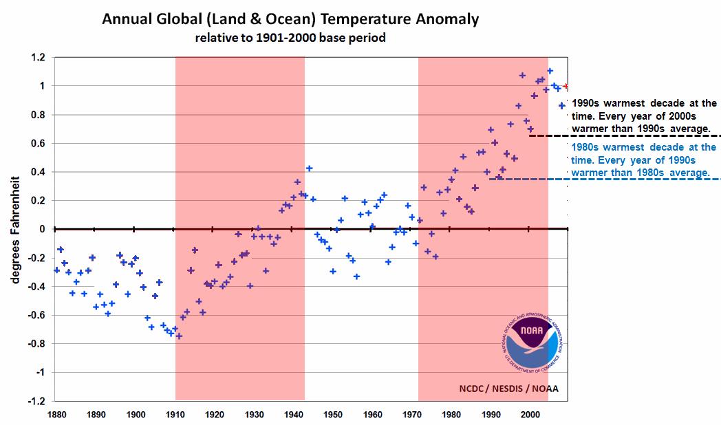
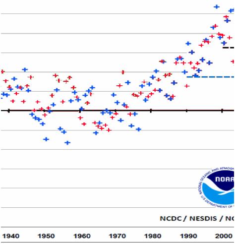
NCDC shows that recent warming is identical to an earlier warming, when CO2 was much lower (310 ppm) and increasing slowly (3 ppm / decade.)
The graph below overlays the earlier warming (red) on the recent warming (blue.)
Blaming this on CO2 seems pretty clueless.


I think what you are seeing and has been shown before is a result of a proper Al-Gore-Rhythm being used to massage / torture the data. People cry foul when Waterboarding is used to extract needed information from terrorists but nothing is said when it is used on innocent climate data to force a confession.
I am against torture and terrorism of any type and do not feel they are justified for any purpose. I also think the CLB (Chicken Little Brigade) should be held accountable for their terrorist activities. Claiming that Civil Disobedience and disruption of commerce is preforming religious rituals. Is like saying people that blow them selves up in crowed locations are preforming normal religious rituals. The court in UK has labeled belief in AGW as equal to a religious belief.
Here is a graph showing the same (i.e. showing that the two cycles are virtually identical) using HadCRU data: http://www.appinsys.com/GlobalWarming/SixtyYearCycle.htm
“1975-2005 Warming Identical To 1910-1940 Warming”
Steve I’m not sure what point you are making/insinuating. And shouldn’t you have perhaps mentioned that the 1975-2005 warming was on top of the 1910-1940?
I think that you might learn a lot more by plotting out the data yourself like I have.
http://clearscience.wordpress.com/
It seems your previous warming rate is less as well as the previous warming period length. I would very much counter your claim that they are “comparable”.
Once again, it pays to be able to plot out the data yourself rather than conduct biased graphical analysis.