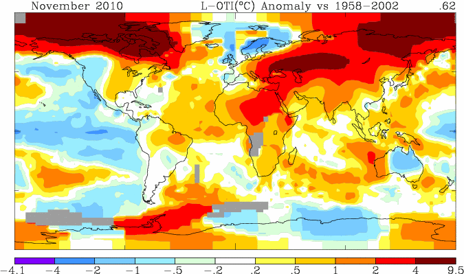
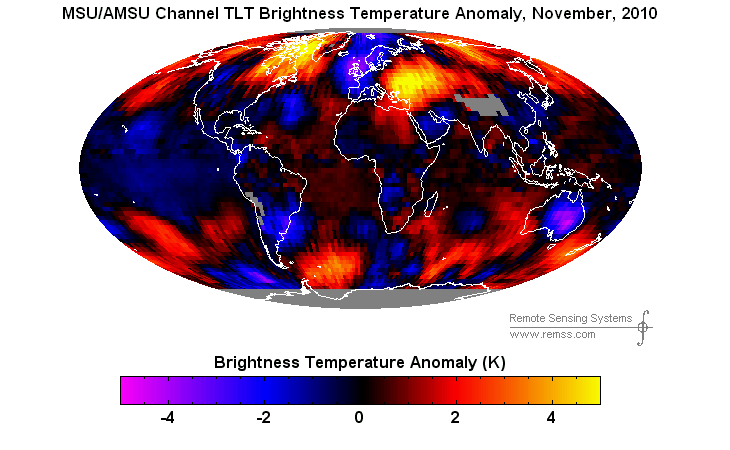
GISS shows Africa hot. RSS shows Africa generally cool. GISS shows the Beaufort Sea more than 4C above normal. RSS shows the Beaufort Sea about 2C above normal. GISS has very few thermometers in either of those places.
GISS shows all of Russia very hot. RSS shows large parts of Russia normal.
Hansen has made it clear for months that he wants 2010 to be the hottest year ever.


James Hansen has fervent views on global warming. He is one of the most radical global warming believers in the world. He makes it clear he thinks people will die from global warming. He wants industry leaders tried as criminals. He is called the grandfather of global warming. There are some that will say his personal opinion doesn’t effect his work. But should people be so naive to believe that? What a herculean accomplishment it would be for him to leave is exceptionally radical views at the door when he walks in to work and be unbiased. Has anyone considered that he has his job at NASA precisely because of his extreme views?
I’ve always wondered why they let that pinhead stay around. He fudges numbers, gets arrested and cries about people trying to keep him quiet. Its like NASA doesn’t want GISS to be credible. IDK.
GISS was set up to study the atmosphere conditions on neighboring planets with the goal of possible space flights and colonies on said planets. When NASA’s mission changed GISS was going to be reduced. James Hansen saved GISS from the chopping block with his claims about catastrophic global warming. His testimony before congress was a plea for continued funding of GISS.
Hansen’s model was used to provide evidence that an Ice Age was coming also in the mid 70s.
Check out this
http://www.ncbi.nlm.nih.gov/pmc/articles/PMC129389/?tool=pmcentrez
Lets explain very very slowly, first the t e m p e r a t u r e dropped, then CO2 d r o p p e d
Why is it so hard for those guys to understand, my cat could understand this concept
CO2 is a marker of life, it goes up and down according to activity. Earth’s life is CARBON BASED, it has no relevance to the greenhouse effect
The GISTEMP anomaly is 1958-2002. The RSS one is something like 1979-2000. So the colors are not comparable.
The baseline doesn’t matter, it is the polarity.
And satellite temperatures are normally higher than land temperatures during El Nino events.
Go to the GISS site and generate a map with the RSS baseline (1979-1998, I think) and you’ll see it’s not much different:
http://data.giss.nasa.gov/work/gistemp/NMAPS/tmp_GHCN_GISS_HR2SST_1200km_Anom11_2010_2010_1979_1998/GHCN_GISS_HR2SST_1200km_Anom11_2010_2010_1979_1998.gif
How convenient for GISS that they have no measure points in the cooler parts of Africa:
http://data.giss.nasa.gov/cgi-bin/gistemp/do_nmap.py?year_last=2010&month_last=11&sat=4&sst=1&type=anoms&mean_gen=11&year1=2010&year2=2010&base1=1979&base2=1998&radius=250&pol=reg
Actually Steve, are you just incompetent or are you actually a liar?
Just need to check because I cannot believe you don’t realize the GISTEMP and RSS anomalies are calculated on different baselines. Hence your
“GISS shows the Beaufort Sea more than 4C above normal. RSS shows the Beaufort Sea about 2C above normal.”
is utter toss. Either you don’t have a single clue about this issue or you are lying through your teeth.
Do you really believe that the baseline affects the polarity of the slope?
Why don’t you slow down. You are making a fool out of yourself.
“Do you really believe that the baseline affects the polarity of the slope?”
You really are a complete dick. The “polarity” of the slope? Presumably you mean the “sign”.
But yeah that’s irrelevant too.
“GISS shows the Beaufort Sea more than 4C above normal. RSS shows the Beaufort Sea about 2C above normal”
Normal in both cases is different.
So fuck you.
Polarity is the sign, dumbass.
We have all these people that want to defend GISS when GISS does not even defend itself and its product.
From this site:
http://data.giss.nasa.gov/gistemp/abs_temp.html
A Q and A regarding temperature records.
Quote:
Q. What SAT do the local media report ?
A. The media report the reading of 1 particular thermometer of a nearby weather station. This temperature may be very different from the true SAT even at that location and has certainly nothing to do with the true regional SAT. To measure the true regional SAT, we would have to use many 50 ft stacks of thermometers distributed evenly over the whole region, an obvious practical impossibility.
Q. If the reported SATs are not the true SATs, why are they still useful ?
A. The reported temperature is truly meaningful only to a person who happens to visit the weather station at the precise moment when the reported temperature is measured, in other words, to nobody. However, in addition to the SAT the reports usually also mention whether the current temperature is unusually high or unusually low, how much it differs from the normal temperature, and that information (the anomaly) is meaningful for the whole region. Also, if we hear a temperature (say 70°F), we instinctively translate it into hot or cold, but our translation key depends on the season and region, the same temperature may be ‘hot’ in winter and ‘cold’ in July, since by ‘hot’ we always mean ‘hotter than normal’, i.e. we all translate absolute temperatures automatically into anomalies whether we are aware of it or not.
Q. If SATs cannot be measured, how are SAT maps created ?
A. This can only be done with the help of computer models, the same models that are used to create the daily weather forecasts. We may start out the model with the few observed data that are available and fill in the rest with guesses (also called extrapolations) and then let the model run long enough so that the initial guesses no longer matter, but not too long in order to avoid that the inaccuracies of the model become relevant. This may be done starting from conditions from many years, so that the average (called a ‘climatology’) hopefully represents a typical map for the particular month or day of the year.
We now know that weather is variable and that makes climate variable. In that case a range of expected temperatures should be provided as a normal rather than a single number. Of course that would not work for those that are promoting alarm positions as weather normally stays within a certain range in each region but it would allow people to expect a warming trend or a cooling trend.
GISS is part of the Climatologist Chicken Little Brigade which makes their historical records worthless due to built in biases.
NCDC went up to +0,694 for november, so GISS and NCDC are almost similar in 2010:
http://img24.imageshack.us/img24/5937/gissncdc2010.jpg
And remember, GISS has a lower reference period. Hadcru is not in for november yet.
UAH and RSS: No reason to think the temperature thousands of meters above us should be the same as the surface temperature.