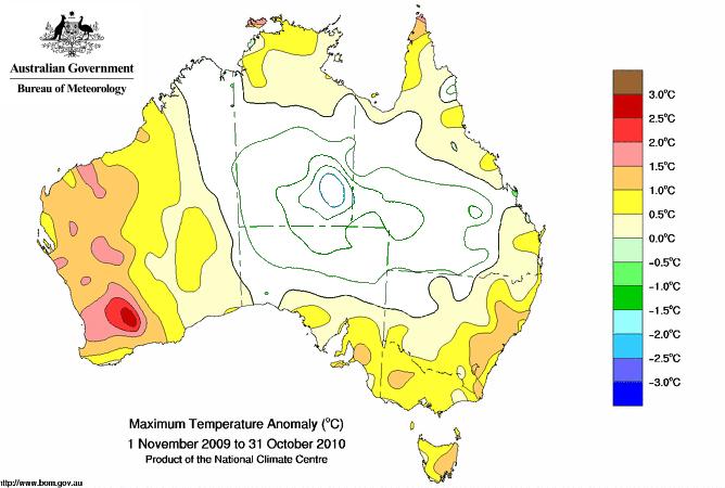
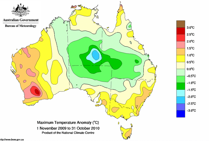
The image above shows Australian high temperature anomalies for the last 12 months. For demonstration purposes I removed the colouring from the interior, as if there were no thermometer readings available.
If GISS filled in the interior, their algorithm would make the whole country above normal.
Now, let’s look at the full map.
As you can see, the 1200 km extrapolation technique is useless. GISS would have made the interior hot, when in fact it was cold. This is the same trick which did in the Arctic, so that they could declare 2010 #1.


Yep, but now politicians refer to 2010 as the warmest year on record because NASA said so. Mission Completed.
Typical…
I can(cun) sort of understand extrapolation where there aren’t any thermometers but are you saying they extrapolate information even when there are thermometers and hence don’t need to?
No, I am pointing out their assumptions don’t work.
The arctic during 2010 was in fact very warm. This is what the vast majority of stations are reporting. Furthermore, this year is on pace to be the warmest on record for Arctic stations. It’s not exactly the “assumptions” you give them impression of.
DMI shows summer temps north of 80N as coldest on record.
Clear, when you say vast majority, do you mean both of them?
Clearscience:
“The arctic during 2010 was in fact very warm. This is what the vast majority of stations are reporting. Furthermore, this year is on pace to be the warmest on record for Arctic stations. It’s not exactly the “assumptions” you give them impression of.”
According to GISS?
DMI?
‘misleading’ is quite generous
i would call it fraudulent