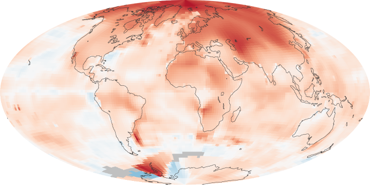
A new NASA report is out showing the extreme heat affecting the world. Particularly in Europe.
My comments are interspersed in red.
The world is getting warmer. Whether the cause is human activity or natural variability (or manipulation by GISS) thermometer readings all around the world have risen steadily since the beginning of the Industrial Revolution.
According to an ongoing temperature analysis conducted by scientists at NASA’s Goddard Institute for Space Studies (GISS), the average global temperature on Earth has increased by about 0.8°Celsius (1.4°Fahrenheit) since 1880. Two-thirds of the warming has occurred since 1975 (carefully cherry-picked start date), at a rate of roughly 0.15-0.20°C per decade.
The maps above show temperature anomalies, or changes, for 2000-2009 (top) and 1970-1979 (ice age scare.) The maps do not depict absolute temperature, but how much warmer or colder a region is compared to the norm for that same region from 1951-1980 (global cooling cherry-pick.) That period was chosen largely because the U.S. National Weather Service uses a three-decade period to define “normal” or average temperature (because it gave us a scary red map.) The GISS temperature analysis effort began around 1980, so the most recent 30 years were 1951-1980. It is also a period when many of today’s adults grew up, so it is a common reference that many people can remember. (We ignore the 1930s because we don’t want to confuse people with the truth.)
http://earthobservatory.nasa.gov/IOTD/view.php?id=47628
According to an ongoing temperature analysis conducted by scientists at NASA’s Goddard Institute for Space Studies (GISS), the average global temperature on Earth has increased by about 0.8°Celsius (1.4°Fahrenheit) since 1880. Two-thirds of the warming has occurred since 1975, at a rate of roughly 0.15-0.20°C per decade.
The maps above show temperature anomalies, or changes, for 2000-2009 (top) and 1970-1979. The maps do not depict absolute temperature, but how much warmer or colder a region is compared to the norm for that same region from 1951-1980. That period was chosen largely because the U.S. National Weather Service uses a three-decade period to define “normal” or average temperature. The GISS temperature analysis effort began around 1980, so the most recent 30 years were 1951-1980. It is also a period when many of today’s adults grew up, so it is a common reference that many people can remember.


Normal climate is a regional condition over a period of time determined by long term variable weather patterns and is a range of temperatures. Not an average of a mean on a global scale determined by picking the best period for the desired results. GISS really needs to be a little more honest and start by advising their results are little better than a Wild A@@ Guess!
Climate is cherry-picking data which supports Hansen’s 1988 predictions for as long as they think they can get away with it.
It makes it tough when we have Climatologists that do not understand climate and chose the definition that best fits the agenda rather than the definition that best fits the real world!
That abnormally cold period (1951-1980) provides a perfect springboard to “prove” global warming. In fact the “normal” high temperature in January for Washington, DC was 1.6 F colder during that period than the prior period.