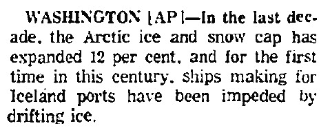
Chicago Tribune March 2, 1975
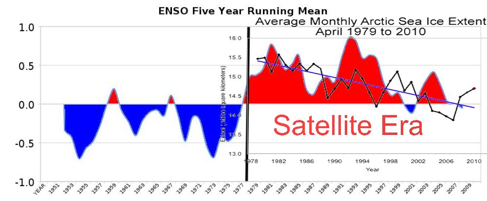
Satellite records started in 1978, when ice was at the highest level of the century. That was also when the PDO shift occurred. Of course Arctic ice has declined. Blaming the decline on CO2 is both clueless and intellectually lazy.


I’ve been making this point for some months now. Hope Julienne reads this post.
Going by that report and the April ice extent graph, ice hasn’t even declined to pre-1965 levels yet. I doubt it ever will.
Its a death spiral I tell ya, we’re doomed.
OT, heading out for a few days of hunting in -26C CAGW(Central Alberta). Will miss this site while i’m gone.
I think the Chicago tribune must have been wrong
http://arctic.atmos.uiuc.edu/cryosphere/IMAGES/seasonal.extent.1900-2007.jpg
Andy
Somebody is wrong.
How did they measure ice extent in 1900 without satellites?
Oh and Steve, it’s now November.
Stop picking April because you know it was a slow start to the season this year just so it makes your end point look good. 😉
Put this one on there instread.
http://nsidc.org/images/arcticseaicenews/20101206_Figure3.png
That buggers up your latest correlation somewhat though 🙂
Actually all the ice is gone.
that’s true, it is gone, don’t pay attention to graphs, you’ll be mislead by doing that
The ice is down 15% – who cares? And you KNOW it is caused by me toasting my bread?? Great job in exposing this fraud Steve. Too bad we can’t round all these liars and con men up and put them somewhere and let them live with the life as they want to impose on the rest of us.
Andy
The graph shows about 12% reduction, i.e. about the same as the increase in the decade upto 1975.
Andy:
Thanks for the graph that shows a 10% decline depending on the years used. If you compare low to low or high to high. Of course for promoting an alarmist point one would need to provide a partial cycle in ice extent that only shows max to min if that much. We would need another 60 years to observe the known variations that are evident in the historical record over short time periods of less than 100 years. I know that is ignoring the thousand year and longer cycles that are also evident in the records.
The Question for you: Was it a late start to winter or within the normal range. Are the Springs starting earlier or are they within a normal range. Average does not mean SHI@!
I just used the same graph Steve did but showed the proper end point rather than cherry picking April because it was high then. Your’s and Paul H’s extra comments are not relevant to the point I was making.
Andy
Where is Brendon + his cherry picking when you need him?
Pingback: Amarcord, quei favolosi anni '70 | Climate Monitor