Page 2
Disrupting the Borg is expensive and time consuming!
Google Search
-
Recent Posts
- The Real Hockey Stick Graph
- Analyzing The Western Water Crisis
- Gaslighting 1924
- “Why Do You Resist?”
- Climate Attribution Model
- Fact Checking NASA
- Fact Checking Grok
- Fact Checking The New York Times
- New Visitech Features
- Ice-Free Arctic By 2014
- Debt-Free US Treasury Forecast
- Analyzing Big City Crime (Part 2)
- Analyzing Big City Crime
- UK Migration Caused By Global Warming
- Climate Attribution In Greece
- “Brown: ’50 days to save world'”
- The Catastrophic Influence of Bovine Methane Emissions on Extraterrestrial Climate Patterns
- Posting On X
- Seventeen Years Of Fun
- The Importance Of Good Tools
- Temperature Shifts At Blue Hill, MA
- CO2²
- Time Of Observation Bias
- Climate Scamming For Profit
- Climate Scamming For Profit
Recent Comments
- Bob G on The Real Hockey Stick Graph
- arn on The Real Hockey Stick Graph
- Bob G on The Real Hockey Stick Graph
- arn on The Real Hockey Stick Graph
- Bob G on The Real Hockey Stick Graph
- Bob G on The Real Hockey Stick Graph
- Gordon Vigurs on The Real Hockey Stick Graph
- arn on The Real Hockey Stick Graph
- arn on The Real Hockey Stick Graph
- Gordon Vigurs on The Real Hockey Stick Graph


OT, but your iPad platform does not work. I sent Anthony my evaluation of his switch (he has since pulled it down) but at the time I didn’t know it was a WordPress template.
Graphics/images are obscured by the heads and initial copy. It looks busy or that the page didn’t load properly. Lose either the intro copy or the images. I’d prefer losing the copy since your headlines are always effective. Users can tell what the article just by viewing the head and your choice image.
-I can understand why you wanted to have pages swiped rather than scroll down; the iPad only has a top of page function, not bottom of the page, which makes reading comments a pain—unless of course you decide to put the most recent at the top. That said currently the“swipe me” arrow directs action from left to right to reach the next page. Not the case. If you want to keep it on the right side, change the text to read “next” and make it a tap function (it can still have the page turn effect) or make the arrow point to the left to indicate direction of motion.
Anyway, it sucks, don’t use it until WP gets a half decent programmer and graphic designer to fix all the problems, which are many—I bailed on your site as soon as the home page loaded, so I didn’t bother to track them all down, but believe me there will be a lot.
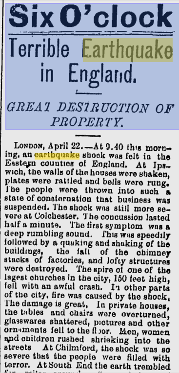
I owe you BIG TIME !!!!!!! I have a bound copy of the ‘London Illustrated News’ from Apr. 19 – Nov. 29 1884. It’s on pg 390… will try to forward if I can!
“Every now and then we hear of a slight earthquake tremor at some remote place such as Comrie, in Perthshire…” Aye, theivin’ buggers, yer a’ways blamin’ us!
In gratitude…. Jeff