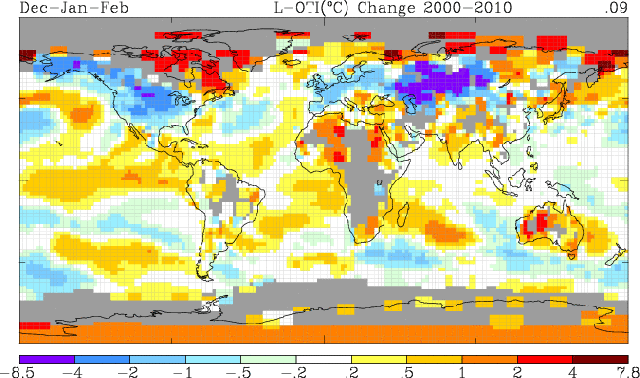
We have been subjected recently to massive doses of propaganda correlating record snow with alleged warming, but GISS shows winter temperatures plummeting in North America, Europe and Asia.
Are these climate experts ignorant about the climate, or are they dishonest? What do you think?


Steve, can you make a same plot for just 2009 and 2010? I’m curious how much these last two winters are biasing your plot above?
Julienne,
According to the GISS web page, it is supposed to be a trend from start date to end date. I’m not quite sure what you are asking.
Are you sure Affect isn’t a more applicable description? I don’t know that data included in a trend biases the trend, it is part of what makes up the trend.
The word Bias infers something that I do not think is appropriate.
Julienne, I’m not sure if this link will render the map you desire or if it will take you to the input screen, but you should be able to see what you are asking for by clicking on this link.
http://data.giss.nasa.gov/cgi-bin/gistemp/do_nmap.py?year_last=2011&month_last=01&sat=4&sst=1&type=anoms&mean_gen=1203&year1=2009&year2=2010&base1=1951&base2=1980&radius=250&pol=reg
As you can see, there isn’t much difference in the mapping. In fact, it shows a bit less cooling in the places Steve mentions, but cooling it does show.
It isn’t what I expected either. This seems counter intuitive.
Thanks James. So this is the anomaly for winter 2009/2010 in the DJF temperatures. It would make sense to have cooler surface temperatures in regions where there was anomalous snow cover. I think you see that in this plot. Rutgers northern hemisphere plot of anomalies in snow cover (time-series, not spatial) shown here: (http://climate.rutgers.edu/snowcover/chart_anom.php?ui_set=0&ui_region=nhland&ui_month=2) show a pretty consistent positive snow cover anomaly for winter this last decade. You can also look at the spatial patterns of the anomalous snow cover. So when I look at it visually (and this is not a quantitative analysis since that would require downloading and processing both data sets which I don’t have time to do at the moment), it does appear that the regions of the negative trends in DJF surface temperatures shown by GISS correlate with the regions of anomalous snow cover. Not surprising since the surface will be colder if covered by snow.
Julienne,
Thanks, yes, I agree with your comment, but I was expecting to see more cooling in the last 2 years than what was reflected on the map. But, that just may be attributable to what my personal experience has been in the last 2 winters. Rutgers does some great things with their snow lab. It is referenced here often.
Time, always and consistently increasing in quantity, always the rarest of resources.
This graph may be easier to read…
http://climate.rutgers.edu/snowcover/chart_seasonal.php?ui_set=nhland&ui_season=1
Hi Steve, Just that the last two winters of heavy snowfall and cold air spilling out of the Arctic could be biasing the trends. It’s one reason why we’ve started looking at pentads of anomalies, rather than trends in certain variables (such as temperatures) since trends can be very biased by a couple of years. I also don’t know if the GISS site only shows statistically significant trends (something that should be done in any trend map).
I have never used their site, so I’m not sure if they allow any interactive plotting capability to do further analysis.
It does, but it is difficult to navigate if you don’t frequent the site.
Julienne,
It hasn’t been just the last two winters.
http://stevengoddard.wordpress.com/2011/03/04/winter-2010-2011-was-the-third-snowiest-on-record-in-th-northern-hemisphere/
As I’m sure you remember, here in Colorado we started having really cold snowy winters five years ago.
Steve, while I can honestly say I don’t remember winter 2006 specifically (except freezing doing field work in Barrow, AK in Feb and Mar when air temperatures were -40), the anomalies in the Rutgers snow maps do indicate a decade of more winter NH snow cover from 2000 to 2011 (but a trend towards less spring snow). I would expect the plot of DJF surface temperatures such as you show from GISS to agree with the maps of more snow on the ground during those same months/time-period. Thus, nothing too surprising there. And I don’t see how it fits with your last sentence that Latitude has decided to answer….
Julienne,
Right before Christmas 2006, we had three feet of snow in Fort Collins, which hung around until the end of February. I got my SUV high centered in the snow and blew out the transmission. It was also a very cold winter.
http://www.hprcc.unl.edu/maps/current/index.php?action=update_region&state=CO®ion=HPRCC
stevengoddard says:
March 5, 2011 at 3:27 am
I got out of town RIGHT before that happened. Came back to find my wife’s car completely buried…hardly visible at all. Sold that car a few months later…we’re a one-car family.
-Scott
to answer the question
I think they are ignorant and dishonest….
So ignorant they think no one will catch their lies………………
All the imaginary warming seems to be over the oceans and places where no one lives, like Nunavet and northern Siberia.
So, “Sources and parameters: GHCN_GISS_HR2SST_250km_Anom1203_2009_2010_1951_1980”
Any chance of seeing the map with a different reference period? (Say….1981 to 2010)
Or would that be too “blue” to pass the censors? 😉
It is a trend map. It doesn’t have a reference period.
Steve, I think he’s talking about the base period used in the parameters.
PJB, I think this is what you’re asking for?
http://data.giss.nasa.gov/cgi-bin/gistemp/do_nmap.py?year_last=2011&month_last=01&sat=4&sst=1&type=anoms&mean_gen=1203&year1=2000&year2=2010&base1=1981&base2=2010&radius=250&pol=reg
Trends don’t have a base period.
any trend map must have a start and end date to compute the trends over. I think that is what PJB was asking…the map you show was trends for 2000-2010. It will look different over different time-periods used to compute that trend. James below posted a link to the actual anomaly relative to the 1981-2010 baseline (which mostly shows positive DJF temperature anomalies, except over Asia). A trend map for 1981-2010 will look different than the one you show in the posting.
PJB, here’s the map you want to see….
http://data.giss.nasa.gov/cgi-bin/gistemp/do_nmap.py?year_last=2011&month_last=01&sat=4&sst=1&type=anoms&mean_gen=1203&year1=2000&year2=2010&base1=1998&base2=2010&radius=250&pol=reg