
The map below shows the GISS February, 2011 extrapolation projected on to a sphere. The extrapolation patterns are bizarre, with negative anomalies abutting +5 anomalies. Their map represents impossible physical conditions.

Most of their Arctic data is fabricated, because they don’t actually have any coverage in most of the Arctic – as seen below in their 25o km map. Grey areas represent no data.

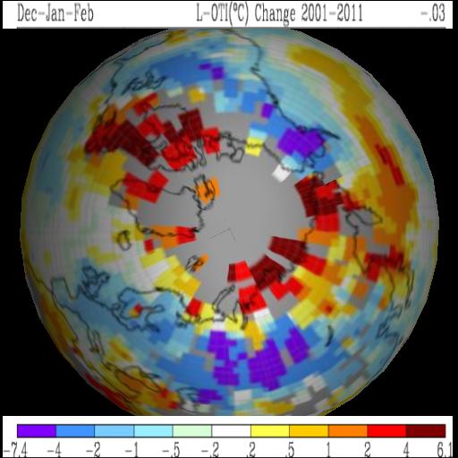
Original projections are shown below.


So what they are saying is cold air comes down from the Arctic…
…but it is replaced by hot air that just appears out of thin air
Amazing how accurate the extrapolation can be……. they must have some super smart scientists working at GISS.
Steve, would it be possible to somehow make the projection using single pixels for each recording station without any extrapolation? Just use one color for water, another for land, the remainders divided up for the temperature scale. It would be kind of a control map, yeah difficult to see of course, but more accurate (single pixels would probably represent city sized objects in reality). Folks would really have to look hard to find the data points (which is my point).
I think it would place the scale of our big blue planet versus our tiny little presence in perspective. I could also imagine an animated GIF that starts with their wide extrapolations, then changes to the narrower one with all the gray, then shows the reality with the single points.
Simple lesson would be: this is a brazen unscientific scam of massive proportions. No-one except the most jaded partisan should be able to ignore the scale of this deception. Maybe this could be the proverbial stake thru the heart. Or wishful thinking.
That is approximately what the 250 km map shows. It would be a lot of work to locate all the stations.
I seem to recall that the some group (the Danes perhaps) have actual temperature readings for the arctic. Would it be possible to use their real data in place of GISS’s fake data, to show the difference?
I have sent an email to a Dane who might know the facts, but he might answer me directly, so would it be possible for You stevengoddard to send me an email?
Hi Carl,
Let me know what you find out.
Nice statistical data fabrication aka fraudulent science from Nasa GISS.
Do they provide access to their statistical data fabrication source code or algorithm?
Isn’t the 250km scale ALSO a statistical data fabrication at a smaller scale?
Just how far from a temperature station is the measured temperature valid?
From my experience the micro climates that would be in a 250km radius zone would have different temperatures, heck even if it’s all arctic in that radius zone wouldn’t the temperature vary naturally with the implication that it would be impossible to know the “true” average temperature?
So any temperature reading extrapolated over an area would need to have some probability or confidence or error range associated with it?
How is that measured or indicated?
Wouldn’t they also have to show an error graph or map to go along with their GISS Data Fabrication in order for it not to be fraud?
It sure would be nice to see their data fabrication algorithm so it can be splayed open for the world to see that it is NOT observational data.
Which brings to mind that there must be a way on a map or graph to distinguish data fabrication from real unmodified observational data in some way? Hmm…
I understand that there are other thermometers up north that are not used by GISS Data Fabricators Extraordinaire, how would these alter the GISS Global Data Fabrication of Earth Temperature?
PWL:
Temperatures are accurate within a few meters if the wind is not blowing or maybe if it is. The measured temperature is also valid vertically in a range of about .5 meter. I read that to et a fairly accurate surface temperature you would need a stack 50 meters tall with a recording device every 2 meters. But that would only be good for that small area. Most sites are corrupted so the entire record is worthless for more than aircraft needs at the time the take off!
WTF!!?? It’s always hot as blazes in the south Pacific and places in the Arctic where no one lives. What is this heatwave in Antarctica? Haven’t they been very cold?
What would the anomaly be based on 1981 – 2010? Why does GISS use 1951 – 1980? The obvious answer is that it shows a greater positive anomaly.
Hansen started his Crusade in the 80s so he uses 1951-1980. CRU uses their own Cherry picked period and UAH now uses 1981 – 2010!
One comment on there not being that many thermometers in the Arctic. I think the UAH satellite data shows warming in the Arctic.
http://nsstc.uah.edu/climate/
Or I’m reading it wrong.
Quoting robhoneycutt from skepticalscience.com:
“The map GISS uses is a Mercator projection which distorts the area of the poles. They obviously do not have complete coverage in the Arctic but go through great pains to accurately present it. We do have coverage of the poles through satellite data which encompasses 98% of the globe and that data is in full agreement with GISS.
So, what Goddard is trying to do is pull a fast one on you to generate doubt. The data is NOT? as sparse as the 250km map looks. If you wrapped that exact same data onto a sphere you’d get a different sense of the data. But there is nothing wrong with looking at the 1200km data. It’s fully representative of what is going on.
Look, they even allow you to create polar maps. tiny. cc/mzbs4”
Satellite data has a hole at both poles. Nice try though. RSS has a hole of 7.5 degrees at both poles.
If Hansen doesn’t think he has data at 90 degrees, he shouldn’t put it on the map.
541iceman (35 minutes ago)
“Pink, can you tell us what fraction of the Earth’s surface is poleward of 82.5 degrees (north and south?), i.e., the part not covered by the MSU satellites?
Let’s look at a smoothed gistemp trend plot on a 250 km grid: tinyurl com/4fp32j8. This is the anomaly between the 2000-2010 average and a baseline of 1951-1980. ? gistemp is honest in showing where there aren’t any data.
Do you really think it matters to global T, whether the pole data hole is interpolated based on the surrounding records, or excluded from the averaging?”
You are kidding. Try averaging 10% very large numbers (+5.0) with 90% very small ones (+0.1) , and see what happens.
gistemp is honest in showing where there aren’t any data.
Do you really think it matters to global T, whether the pole data hole is interpolated based on the surrounding records, or excluded from the averaging?”
Uhmm…. Pink, you’re confused. The map isn’t global temps, its a map that supposedly represents global temps. Looking at the larger interpolated map, do you believe this to be an honest representation of GISS’ coverage?
Does it matter to global temps when excluded? Hmm, now where can we find a similar data base that doesn’t include the polar interpolated data?……… thinking…..thinking…… oh! I know!!!! HadCrut! They used almost exactly the same data!
http://www.woodfortrees.org/plot/hadcrut3vgl/from:2001/trend/plot/gistemp/from:2001/trend
Mind you, they use different “homogenization” techniques and I’m under the understanding that HadCrut is “adjusting” theirs soon, but naahh. Wouldn’t make a difference, would it?
Hansen whole global average temperature is a model output based loosely on surface temperatures extrapolated with best guess estimates!
It is not actual measured data. The closest thing we have to measured data is the satellite records that are to short to be of value and thy do not measure surface temperature but Lower Troposphere temperatures so due to lag between surface and lower troposphere there should be no correlation between the two. If there is it is someone attempting to give credibility to the surface temperature data that it does not deserve.
Pinkman3610 are you pwered by Duracell so you can keep going and going and going!
If you want to enter a discussion you need to find a reliable source for your position because regurgitating what garbage that is located at the site you quoted makes you look ignorant!
Well, don’t be too hard on him, he gets his info from nonskepticalscience. They’re a funny lot.
lol, full agreement with satellites that don’t measure the poles either! Beautiful.
Pink, forget the poles just for a second. Do you even believe a thermometer is an accurate representation for even 250km radius? Really? Don’t you have a weather channel at home where you can see the divergent temps within a 250km(155 mi) radius? pphhhhttt. The map is a video game and nothing more.
Of course, I should mention the well documented siting difficulties recorded at surfacestations.org. And before anyone blathers about the study that showed it didn’t matter, note that against Anthony’s advice and permission, the study only used 40% of the data set. Given the collection method, the study is as of less value as the roll of Charmin one might go out and purchase.