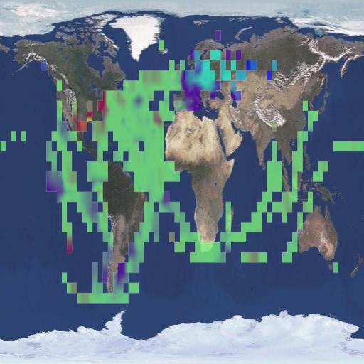
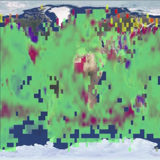
The image on the left shows HadCRUT coverage in 1850. The image on the right shows HadCRUT coverage in March, 2011. In 1850, they covered less than 1/3 of the planet – yet report temperatures within 0.01 degrees.
Also interesting to note is that HadCRUT missed all the cold in Canada and Greenland last month, which explains their nonsensical uptick. At least they are honest enough not to make up data like GISS does.
The surface record is of very limited value, as the coverage is limited and erratic. Why did Dr. Muller not point any of these things out in his Congressional testimony?


BEST is all about promoting drastic measures to combat a fantasy!
Climatologist and their Lemming friends have the Don Quixote Syndrome!
Also interesting to note is that HadCRUT missed all the cold in Canada and Greenland last month…..
Ummm, huh? Ya, interesting is a word for that.
Hansen just painted Greenland red. HadCRUT had the decency to leave it blank.
Yeah, and those thermometers, in 1850, were all precisely calibrated and without systematic errors (every factory produced perfect products.)
Yeah, right.
Thanks
JK
I’ve tried to point that out to folks a lot. And that the older the records go, the more concentrated the data is in America and northern Europe (1880’s and on). So, when they say it’s the warmest year, decade, whatever on record, I like to compare that to the US record for context–it’s still the 1930’s I believe–almost like a control group. Seems a valid argument to me, but it’s just dismissed as elaborate attempts to be a ‘denier’.