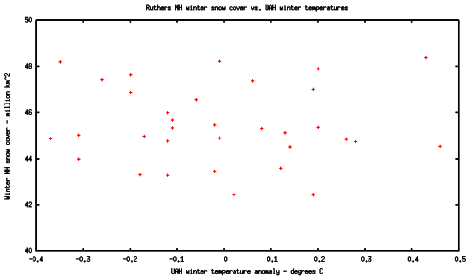
Latitude suggested that I try this. The plot below shows Rutgers winter (Dec-Feb) snow cover vs. UAH global Dec-Feb temperatures.
As you can see, there is no correlation. Snowy winters are just as likely during global warm winters and cold winters. Winter 2009-2010 was El Nino and was very snowy. Winter 2010-2011 was La Nina and was very snowy.
However, there is a very strong correlation between mid-latitude NH cold and snow. Unfortunately RSS has not updated their data, and I can’t plot this out yet.


Come on! No linear interpolation? Shame on you!!
You just need the right code. Hey I know. Let’s ask Mikey. Yea, he can write the code that will give the desired shape. See, cause and effect proven by modeling. That was easy.
Wrong.
MM only knows how to write code that generates hockey sticks, and that’s not the desired shape here.
-Scott
but but butbutubut….
They said that global warming was making it warmer and warmer made more snow….
lol great job guys! That’s some good butt hurt dealt to the blathering heads that call themselves scientists.
Any chance you could make those points bigger/bolder? They’re pretty hard to see.
-Scott
Is that better?
Much!
yep…..
What’s funny is that the three extremes are evenly spaced…
..one cold, one zero, and one hot
Like Goldilocks
I borrowed this………………..;-)
I just noticed that it does not snow at all at a+0.35C….. 😀
you guys are blind, i see a hockey stick in there….just image…
Steve – plot looks better, thanks.
Here’s a funny thought…what if we fit the data to a 2nd order polynomial? It almost looks like it would have a bottom out near 0 to +0.1 C anomaly…going up at the extremes.
Isn’t that proof that the average climate is “perfect” and either colder or warmer is more snow? (yes, sarcasm)
-Scott