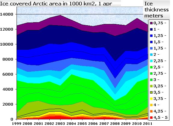
Frank Lansner sent this graph of PIPS Arctic ice thickness over. It shows fairly good correlation since 1999 with the NSIDC ice age graph at bottom. 2007-2008 was an anomaly, and the ice volume is clearly growing over the last three years.
Disrupting the Borg is expensive and time consuming!
Google Search
-
Recent Posts
- The Real Hockey Stick Graph
- Analyzing The Western Water Crisis
- Gaslighting 1924
- “Why Do You Resist?”
- Climate Attribution Model
- Fact Checking NASA
- Fact Checking Grok
- Fact Checking The New York Times
- New Visitech Features
- Ice-Free Arctic By 2014
- Debt-Free US Treasury Forecast
- Analyzing Big City Crime (Part 2)
- Analyzing Big City Crime
- UK Migration Caused By Global Warming
- Climate Attribution In Greece
- “Brown: ’50 days to save world'”
- The Catastrophic Influence of Bovine Methane Emissions on Extraterrestrial Climate Patterns
- Posting On X
- Seventeen Years Of Fun
- The Importance Of Good Tools
- Temperature Shifts At Blue Hill, MA
- CO2²
- Time Of Observation Bias
- Climate Scamming For Profit
- Climate Scamming For Profit
Recent Comments
- Francis Barnett on The Real Hockey Stick Graph
- Bob G on The Real Hockey Stick Graph
- Bob G on The Real Hockey Stick Graph
- arn on The Real Hockey Stick Graph
- Bob G on The Real Hockey Stick Graph
- arn on The Real Hockey Stick Graph
- Bob G on The Real Hockey Stick Graph
- Bob G on The Real Hockey Stick Graph
- Gordon Vigurs on The Real Hockey Stick Graph
- arn on The Real Hockey Stick Graph


Whats the graph at Sept 1st?
Andy
Doh. Do you think that some winters the ice gain 3 meters?
I am with bastardi….we are going to see considerable recovery this September over last year