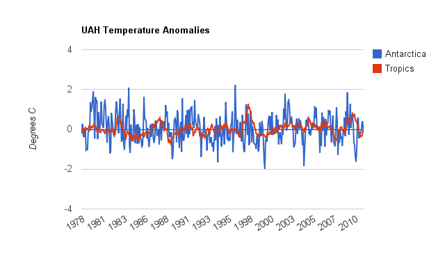
http://vortex.nsstc.uah.edu/data/msu/t2lt/uahncdc.lt
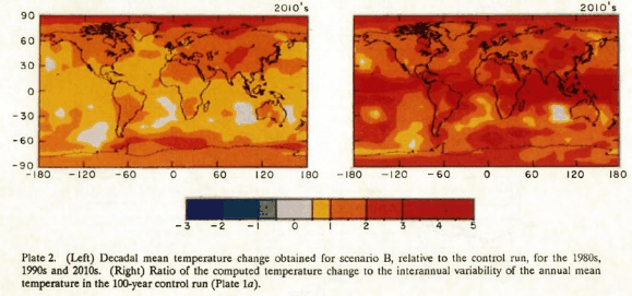
In 1988, Hansen generated the forecast maps below for scenario B, which assume “a reduced linear growth of trace gases”
http://pubs.giss.nasa.gov/docs/1988/1988_Hansen_etal.pdf
CO2 has actually increased exponentially, so it becomes clear that Hansen has essentially no skill in forecasting temperatures.


I want to see two maps – one of Antarctica and one of Greenland showing the averave temperature distribution on the normally warmest day of the year. I then want to add the Warmist Warning Value to the maps. Temperatures to rise by 4 C? Then add 4 C to the maps.
I want to see how much of Greenland and Antarctica remain perpetually below freezing even if the Warmist Fantasy comes to pass.
I want to see how they decided what was “normal”………….
Do you go back to last week? decade? century? million years?
Sorry, by “Normally” I meant day-of-the-year, not which year was warmest.
For Greenland, is August 21 normally the warmest day of the year? Perhaps a monthly average would be better?
The point is, if the center of Greenland is forty degrees below freezing during the warm summer months, then it will remain frozen even if global warming raises the temperature another five degrees. Now extend out from the center. How much stays in perpetual ice even after a theoretical AGW?
Anyone having trouble discerning the difference in colour between 3, 4 and 5 degrees above “normal”?
I thought anything above three was infinity.
Oh now, let’s not confuse “infinity” with the real, empirical numbers, like 1, 2, 3, & “a very large number”.
I want to tell you, science does not get any better than this……….
First, YOU decide what’s normal.
Then, You declare it’s abby-normal.
Then, you declare it’s “unprecedented”
…and the money just rolls in
maybe I am paranoid, but I have a feeling that the 2010s diagram is just the 2000s with more red all over
Global warming seems to be missing an awful lot of places, including the US, Australia and Europe. That is why red and pink crayons come in to play, for places where there allegedly is no data or where data needs “adjustment”.