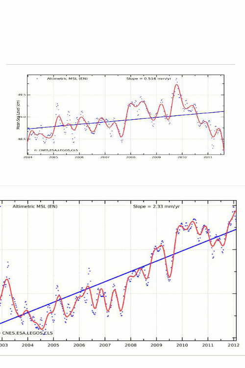
During Envisat’s last days, it was tortured by scientists seeking to make it look like sea level was actually rising. The blink comparator below shows the spectacular changes which scientists made during Envisat’s final days. Both images are to the same scale.
The before and after data bear no resemblance to each other. Kudos for spectacular junk science which makes James Hansen look legitimate by comparison.


Good to see that you’re alive and kicking, Steven.
Could you expand on your above charts? And what current sea level data show?
Thanks much.
Now with Envisat down, how are we going to know that sea levels are rising to unsustainable levels? How are we going to know if the sea is threatening to drown FL and Manhattan? We’ll be flying blind on sea level.
Oh yeah, a person said “go to the beach!”
No, that won’t work. Don’t believe your own eyes. “You’ve got lying eyes” when it comes to sea level. We need enhanced satellite imaging and fourth generation data processing, and perhaps also if we can finally get a moon base we should observe sea levels from there also.
200% of actual.
That’s what killed it.
Nothing wants to be run at 200%
I agree with you Steve. These sea level data were definitely waterboarded.
Vi agra overdose.
Could you please just post 2 separate images on the same page. That blinking makes it impossible to compare and makes my head hurt
Wow. I think you’ve found the new front-runner in the Climate Data Dancing Competition. That is spectacular (-ly appalling).
And yes, it is good to see you’re still with us.
I keep going down to the 1821-dated sea level marker on the harbour to see if the water has risen yet and am continually disappointed. No wonder they tortured the Satellite to death getting the graph that they wanted.
Here’s the graphed ENVISAT data as downloaded from Aviso on February 9, 2012:
http://www.burtonsys.com/climate/MSL_Serie_EN_Global_IB_RWT_NoGIA_Adjust.png
It’s very nearly the final version before their massive revision of the ENVISAT record, and newer than the “before” version in your blink graph.
And here’s the associated data file, downloaded on the same date:
http://www.burtonsys.com/climate/MSL_Serie_EN_Global_IB_RWT_NoGIA_Adjust.txt