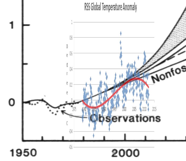
The latest scam from the team is to ignore Hansen’s failed 1988 forecasts, and go back to a 1981 forecast. It turns out that forecast has already failed as well. The graph below overlays RSS satellite data on top of his forecast.
Temperatures dipped during the 1980s and early 1990s due to two large volcanic eruptions. Then they rose until 2006, and have been falling ever since. Hansen’s feedback theories require an exponential increase in temperature, but the curvature of the actual data has been the opposite for the last 20 years – curving downwards.
Wouldn’t it be nice if the team stopped lying – about everything.


Temperatures dipped during the 1980s and early 1990s due to two large volcanic eruptions.
And guess when satellites started monitoring sea levels?
1993, when sea levels were at a low after Pinatubo and a decade of falling or flat lining.
If you take the last 30 yrs average, sea levels are rising at 1.93mm/yr, similar to many other periods in the 20thC
Just like satellites monitoring Arctic ice from 1979 when it was at a peak.
http://notalotofpeopleknowthat.wordpress.com/2012/05/18/sea-level-risea-look-at-church-white-2009/
So when the next volcanic eruption happens all the excuses will be screams from the roof tops. Funny how the much valued computer models can not account for real world events.
That red line is not the linear trend though…
The behaviour is clearly not linear
But they think it is. I think we’ll need a bit more time to debunk this one, though.