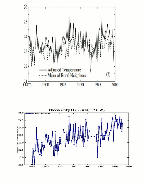
The black and white image in the animation below is what Hansen said Phoenix should like after UHI adjustments – almost no trend.
The blue line is how Hansen currently shows Phoenix – a sharp warming trend. Apparently the UHI effect in Phoenix has disappeared since he wrote his 1999 paper. He cooled the past by about a degree and warmed the present by almost that much.
pubs.giss.nasa.gov/docs/1999/1999_Hansen_etal.pdf
Data.GISS: GISS Surface Temperature Analysis
No doubt this is all first rate science, and has nothing to do with politics or funding.


Climatology’s Dark Age, ushered in by Hansen et al…
The mutter from the holy halls of GISS –
“… and look! See the data DOES fit the model..”
The high priest at the keyboard, glanced up for a moment, and just smirked from under the floppy hat.