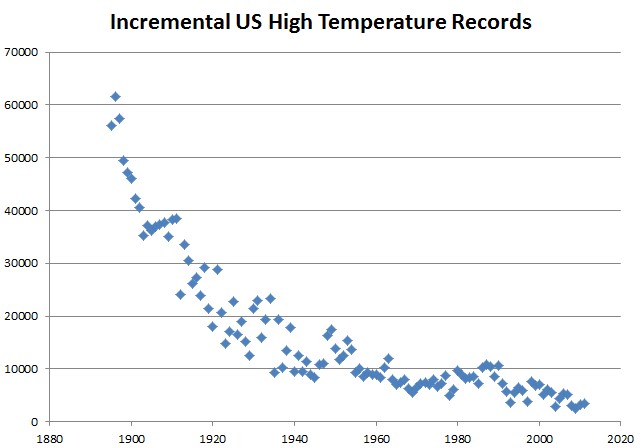
Yesterday, after I posted the US temperature record graphs, a number of geniuses started accusing me of calculating incremental records – i.e. during year one, every station sets a record on every day, etc.
Just for fun, I did that calculation and plotted it out below. It is completely meaningless and obviously not what I presented.
The graph below is the unbiased version, where all years which share an daily all-time record get counted.


Reblogged this on Climate Ponderings.
Dumberererer still: they could have plotted their own graphs and seen how dumb they are
You give them entirely too much credit.
See my comment here.
http://notrickszone.com/2012/07/10/esper-et-al-2000-year-reconstruction-distinctly-depicts-powerful-natural-factors-shatters-absurd-notion-co2-drives-climate/#comment-122570
Worse, it looks like they used a spline filter for each individual tree, at least in one of the graphs of the addenda. Now, that may be SOP in dendro, but it’s smoothing upon smoothing with a filter that is not a favorite of mine. Maybe they run their algorithms on unsmoothed data though, I haven’t read enough to be able to tell ya.
BUT, it has to be said, it’s a leviathan of a paper together with its technical addenda. They seem to be showing what they’re doing. Hope Steve McIntyre analyses it.
Sorry wrong thread, wrong blog. Should have gone to
http://suyts.wordpress.com/2012/07/10/a-note-to-skeptics-do-not-step-in-the-traps/#comment-14990