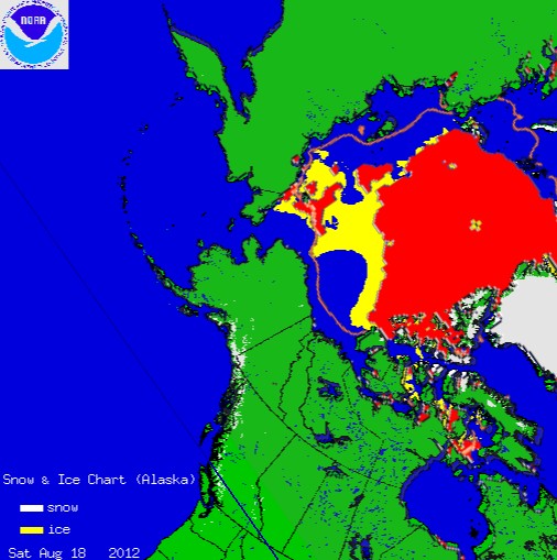
The map below shows the difference between National Ice Center ice (yellow) and NSIDC ice (red.)
NSIDC uses microwave emissions to spot ice, and they are missing lots of ice which is seen in visible light.
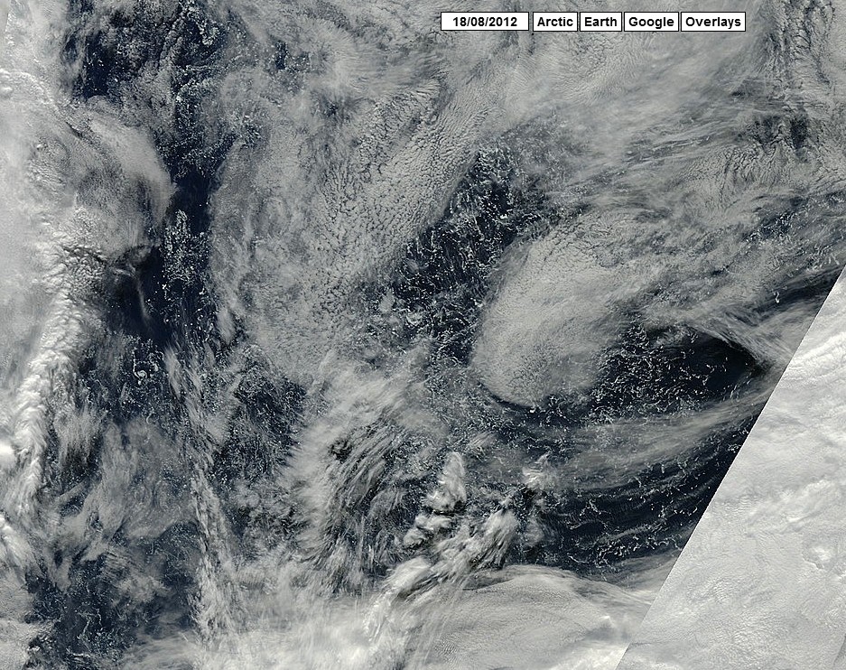
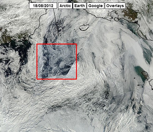
//ARCTIC.IO/OBSERVATIONS/8/2012-08-18/8-N76.083133-W160.925244
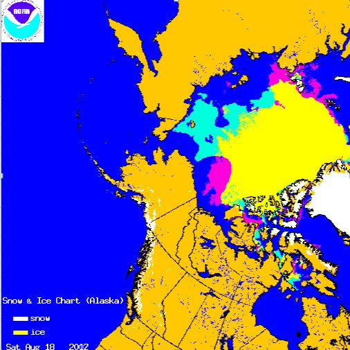
National Ice Center August 18 2012 vs August 18 2007.


It seems that measuring ice extent is highly subjective, thus prone to deliberate misrepresentation on the part of alarmist propagandists. According to them, if ice is broken up by a storm (or icebreakers for that matter), it no longer exists.
Almost right – NSIDC use microwave emissions, not reflections. There are satellites that use microwave reflection (or rather, scattering), e.g. QuickScat, but that’s not the ones used by NSIDC/IJIS/Bremen.
Tell me, that ice you zoom in on in the top picture: does it look like a large volume to you? Concentration is certainly very low – near the borderline to count in extent, or perhaps even below. Healy’s webcam shows it to be very thin and sparse.
http://icefloe.net/Aloftcon_Photos/index.php?album=2012
The fact remains that when you compare like-for-like (i.e. compare NSIDC to NSIDC, Bremen to Bremen, IJIS to IJIS, National Ice Center to National Ice Center), this year is either a little below or a little above the corresponding date in August 2007.
The presence of ice indicates that the water is cold and will refreeze quickly – unlike 2007.
Here’s the image for Aug 18th 2007:
http://www.natice.noaa.gov/pub/ims/ims_gif/ARCHIVE/AK/2007/ims2007231_alaska.gif
Why don’t you overlay that with the 2012 figure and do a proper like-for-like comparison? Comparing Sept 19th 2007 to Aug 18th 2012 is not appropriate.
NATICE shows that 2012 has 7.5% more ice than the same date in 2007. The areas which melted after this date in 2007 have already melted this year, and I am guessing that they won’t melt again ;^)
Here is a map for everybody to study this cold water:
http://ocean.dmi.dk/arctic/satellite/index.uk.php
Just set the box in the left sidebar to “Sea Surface Temp. (anomalies)”
In 2007, the Chukchi Sea was 5C above normal, as opposed to close to normal today.
“The areas which melted after this date in 2007 have already melted this year, and I am guessing that they won’t melt again”
Yes, but 2012 (according to IMS) has a lot of ice remaining at low latitudes in the East Siberian and Chukchi seas, which is at risk of melting out. In fact, it’s thin and sparse enough that according to the microwave imagery, it already has melted out. The chances of this surviving through to mid-September are negligible.
Are you suggesting that NATICE will be lower in 2012 than 2007? That seems like a pretty large stretch
IMS/NATICE lost 300k between the 17th and 18th, so it’s not remotely unlikely.
ftp://sidads.colorado.edu/DATASETS/NOAA/G02186/masie_extent_sqkm.csv
There are large areas of MYI which would have to disappear for that to happen.
(note, MASIE uses IMS as its main data source, as you can clearly see if you look at their images.)
You could also try making a blinky gif of the data from the 17th and 18th. You already have the 18th, so here’s the 17th.
http://www.natice.noaa.gov/pub/ims/ims_gif/ARCHIVE/AK/2012/ims2012230_alaska.gif
That whole area is disappearing fast, because it’s so thin and low concentration, and it’s sitting in salt water a couple of degrees above freezing.
Steve, THIS is what you’re talking about. You’ve posted the overhead MODIS visual photos yourself, and here’s a close-up from a ship that’s sailing among them.
http://icefloe.net/Aloftcon_Photos/index.php?album=2012&image=20120819-1001.jpeg
The massive amount of multi-year ice you’re talking about? It. Is. Not. There. There are a few heavily-decayed floes left drifting in open water.
nonsense
http://www.arctic.io/observations/8/2012-08-18/7-N81.836515-E177.84591
Okay Steve,
That’s a picture centred on 81N, 177E. It’s well within the area that everybody agrees has some remaining ice in it.
There no ice there in September 2007
No, oddly enough. lots of ice melted in this area in 2007 in between August and September.
http://igloo.atmos.uiuc.edu/cgi-bin/test/print.sh?fm=08&fd=17&fy=2007&sm=09&sd=17&sy=2007
And it isn`t going to this year
We’ll have to see…
According to the figures given by Cryosphere Today here…
http://arctic.atmos.uiuc.edu/cryosphere/timeseries.anom.1979-2008
The total ice area for the lastest date is 2.9199M km squared.
On the same date in 2007, it was 3.2991M km squared – but it fell a lot more, to a shockingly low level of 2.9194, about one month later.
jak hits the reset button and ignores the article he is responding to.
NIC includes ice of all concentrations (including 0-15%) in their ice edge calculations. NSIDC follows a more common convention of using only 15% concentration ice and higher in their calculations, which is why NIC’s numbers are so much higher than other groups’ analyses. Most organizations use >15% because including ice of less than 15% concentration tends to end up including a fair amount of random “noise” where there clearly isn’t ice. That is why NIC uses a 3-day average in their analysis rather than doing a daily ice plot like most other organizations. DMI uses 30% as their minimum, which is why they show ice extent at a record minimum already with a few weeks to go yet in the traditional melt season.
NIC shows a lot more ice than they did in 2007.
In 2007, the ice was much more compacted due to the “unusual” wind patterns. Those winds were non-existent this year, resulting in an ice pack that is much more spread out. Despite that, NIC shows ice extent running only slightly higher than it was in 2007.
http://www.natice.noaa.gov/ims/images/sea_ice_only.jpg
Really?
There was a massive winter storm which broke up the ice two weeks ago. You are going to have to do better than that.
Steven,
By all accounts, those winds from the recent storm served to spread out the ice pack rather than condense it. You know better than that. Think about it from your own words: if it the storm “broke up the ice” as you say, is the ice getting more condensed or more spread out? That’s a no-brainer.
I’m really tired of stupid straw man arguments.
Then stop making them.
you http://stevengoddard.wordpress.com/2012/08/19/julienne-stroeve-explains-the-effects-of-the-winter-storm-which-hit-the-arctic-two-weeks-ago/
Last point from Julienne Stroeve’s analysis that you so kindly linked to:
“Storm rotation (counterclockwise) spread out ice over larger area”
Thank you for providing even more evidence for my assertion.
Where it melts
If it had all melted, we wouldn’t be having this lovely conversation. It was multi-year ice that the storm separated from the main ice pack, and as you have pointed out, it takes a while for multi-year ice to melt. As a result, we have large swaths of ocean that have very low concentrations of sea ice in them (less than 15%) that are slowly melting but are still significant enough to show up on visible-wavelength satellite images.
As I pointed out, that was not the effect of the winds in 2007; the 2007 winds served to compact the ice pack, which meant there were few areas of low concentration sea ice (unlike the rather large area this year). That is why organizations that track sea ice area (rather than extent) like Cryosphere Today and DMI show the current sea ice area for 2012 to be very close to the minimum area for 2007, whereas most organizations that show only ice extent indicate there’s still a ways to go until we hit the 2007 minimum for extent.
Given the situation, any organization (like NIC or the Canadians) that include ice of less than 15% concentration are going to show a much higher extent than those that don’t. I don’t see why this is so difficult for you to understand. I suspect it actually isn’t. Like your profile on this site says: you’re “Just having fun.”
I suspect that you are here to waste my time. The NIC graph shows a lot of ice covered water which the NSIDC map doesn’t.
“The NIC graph shows a lot of ice covered water which the NSIDC map doesn’t.”
Yes. Yes, it does. Apparently you don’t care why. And now we’ve come full circle. Good evening to you, Mr. Goddard.
From the look of those ice extent maps, someone is lying to us. Could it possibly be NSIDC
Maybe they are also “Just having fun”
Yeah Whatever…….
Ya got what ya wanted here didn’t ya! 😉 Ya FOS piece of excrement and Yeah Whatever….