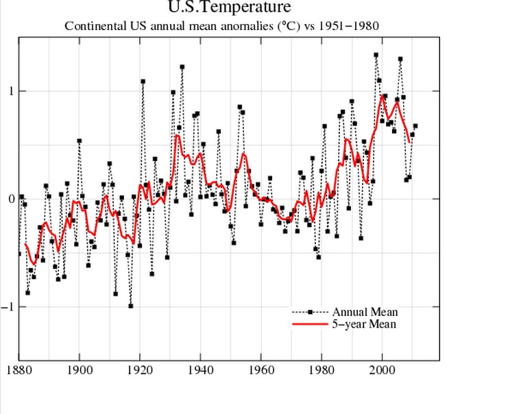
A month ago, GISS showed this incredibly stupid plot of US temperatures. Besides the fact that the data is massively tampered with to reverse the 80 year cooling trend, they showed 2012 US temperatures approaching infinity.
Now their graph looks slightly less insane.


I think you have well demonstrated in the last few months what I can only call the criminal incompetence of NOAA, NASA and GISS, in promulgating “runaway global warming” to the public (and to our government leaders, who are also incompetent in their field). The entire system is broken, so there are no “experts” to call, if we wanted to sue them; and indeed, the “experts” — academics — have all, apparently independently and instinctively, reverted to the most childish avoidance behavior, and pretend everything is just fine, that climate scientists are just not “communicating the truth” well enough, in a (pretended) “post-normal science” situation. I would prefer to see all the scientific “authorities” discomfited, and many at the top of every institution fired, now, rather than see World War III, which is coming as surely as … if the avoidance behavior goes on, as it is doing, at ever more hysterical levels.
Alarmists love to cite their own prefabricated charts as “proof” that catastrophic warming is taking place. Then if anyone questions the altered data, the alarmists want to exterminate them. The scientific method at its very best (sarc).
Harry and Andy have stated the facts so well I can only add that I agree .
I knew it as screwed, blewed, tattoed and barbecued.
Interestingly their graph shows 50 years of warming 1880-1930… And around 65 years of ‘flat’ temperatures, from 1930-1995.
It looks like they simply removed 2012 in its entirety in the second graph.