
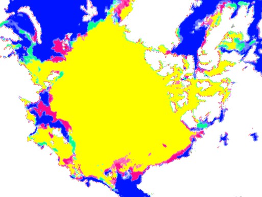
The map below shows ice present in 2013 but not present in 2006 as green, and red shows the opposite. The patterns are very similar.
Disrupting the Borg is expensive and time consuming!

Google Search
-
Recent Posts
- The Real Hockey Stick Graph
- Analyzing The Western Water Crisis
- Gaslighting 1924
- “Why Do You Resist?”
- Climate Attribution Model
- Fact Checking NASA
- Fact Checking Grok
- Fact Checking The New York Times
- New Visitech Features
- Ice-Free Arctic By 2014
- Debt-Free US Treasury Forecast
- Analyzing Big City Crime (Part 2)
- Analyzing Big City Crime
- UK Migration Caused By Global Warming
- Climate Attribution In Greece
- “Brown: ’50 days to save world'”
- The Catastrophic Influence of Bovine Methane Emissions on Extraterrestrial Climate Patterns
- Posting On X
- Seventeen Years Of Fun
- The Importance Of Good Tools
- Temperature Shifts At Blue Hill, MA
- CO2²
- Time Of Observation Bias
- Climate Scamming For Profit
- Climate Scamming For Profit
Recent Comments
- arn on The Real Hockey Stick Graph
- arn on The Real Hockey Stick Graph
- Gordon Vigurs on The Real Hockey Stick Graph
- Peter Carroll on The Real Hockey Stick Graph
- Robertvd on The Real Hockey Stick Graph
- Robertvd on The Real Hockey Stick Graph
- Gordon Vigurs on The Real Hockey Stick Graph
- Jack the Insider on The Real Hockey Stick Graph
- Bob G on The Real Hockey Stick Graph
- conrad ziefle on The Real Hockey Stick Graph
At the peak of the summer 2006 is the highest of the last 8 years.
If this continues it’ll be an spectacular recovery of the Arctic ice in comparison with 2012.
reference chart:
http://ocean.dmi.dk/arctic/plots/icecover/icecover_current.png
At the peak of the summer the Arctic ice of 2006 is the highest of the last 8 years.
If this continues it’ll be an spectacular recovery in comparison with 2012.