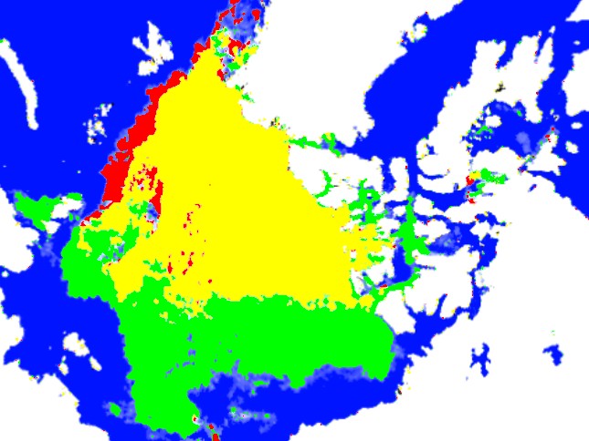
Green shows ice present in 2013 which was not present on this date in 2012. Red shows the opposite.
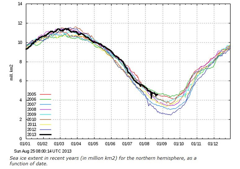
Arctic ice extent is the highest since 2006
COI | Centre for Ocean and Ice | Danmarks Meteorologiske Institut
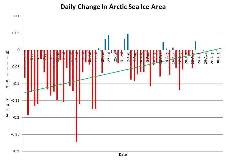
The Arctic melt season is effectively over.


If my coastline was ised down like that ill be pissed off…crap…ice is a bad thing.
That is a remarkable one year recovery. While all the alarmists were saying this was going to be another bad year for Arctic ice, you were saying there was going to be a big recovery. Congratulations!
Quick, somebody call Al Gore or David Suzuki!
Why? They don’t deal in facts anyway.
The green line is 2006 ?
Read again …. “Green shows ice present in 2013” …. the green is illustrating an area and isn’t a line. Red is the area where ice was present last year but absent in 2013 & yellow areas mark the presence of ice in both 2013 and 2012 or areas of no year over year change.
opps … I guess you were taking about the second graph … my bad & indeed green is 2006 😉
According to AMSR-E Sea Ice Extent, Japan, the greatest ice extent at the peak of the summer since 2002 is the extent of 2003, followed by 2006 and 2004 with nearly the same amount and, therefore, 2013 is approx. in 3rd place in the last 11 years,
http://s1282.photobucket.com/user/dhm4444/media/sealevel_zpsb78f34f1.jpg.html
sorry I posted the wrong link,
http://s1282.photobucket.com/user/dhm4444/media/AMSRE_Sea_Ice_Extent-japan-2009-05-24_zps4e46fdc1.png.html
I would assume that the green line in the second graph is the linear regression of the data presented in the graph.
Also, the X axis is mislabeled. It says “year”. It should say “date” (for this year – 2013)
Bad scenario for the Northern Hemisphere…..setting up for a cold winter.
Repeating the 1919-1948 era would seem to be quite normal…
How to get the number 66%?