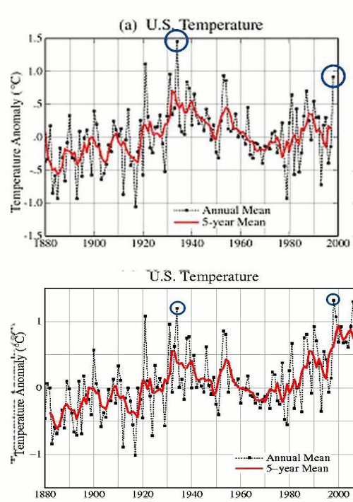
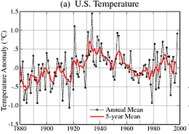
NASA used to correctly show that the 1930s and 1950s were the warmest decades in the US.
in the U.S. there has been little temperature change in the past 50 years, the time of rapidly increasing greenhouse gases — in fact, there was a slight cooling throughout much of the country (Figure 2).
But around the year 2000, they made the decision to alter the data, in order to create a non-existent warming trend.

In the private sector, this sort of behavior is normally prosecuted – but in government you get rewarded with funding and prestige for generating fake data which suits the political objectives of Washington DC.


But it is all justified! They just cannot tell you how or why.
The charts look the same. What should I be seeing different?
You should be using a browser which supports animation.
Try the direct URL of the image in an empty new tab in your browser …
http://stevengoddard.files.wordpress.com/2010/10/1998changesannotated.gif
Also check your browser preferences for “Display Animated Images …” or similar wording.
There are no modern browsers that do NOT understand GIF files, they are among the oldest surviving file formats.
The pause in global cooling is over.
Reblogged this on Health Science Watch.
The first plot is coherent with “Hot days in sharp decline in the US”,
http://stevengoddard.wordpress.com/2013/08/28/hot-days-in-sharp-decline-in-the-us/
the second is not. The *facts* always come to the rescue of *other facts*.
But Steven,
In the last century, our best climate scientists had but crude temperature records and the science and statistics of temperature measurement and data processing were too immature to properly produce a realistic global temperature record. Then the wise and venerable St. Hansen and his acolytes discovered the secret and arcane adjustments required to get the correct answers to the riddle of climate. Such is progress in man’s upward quest for knowledge. (/sarc)
Algore starting sitting on the left side of all graphs.
These data “adjustments” and “homogenizations” are so obvious and so obviously biased. I can not figure out why the scientific community and the media do not feel obliged to expose it. Without them, all the proclamations of this being in the top 10 warmest years, along with the alarmism, crumbles.
Does Andy Revkin really not care? Do fellow scientists actually believe the rationalizations and the slim little academic papers that are used to justify all the maneuvers?
Hey Gina. I suspect that the great majority of scientists do not know how the temperatures have been adjusted. Most scientists, just like most laymen, do not actually research a subject before forming an opinion about it. They look at the headlines of Nature or the abstract on some paper and just assume that the facts are as represented. Because they are honest scientists and engineers, their default view is that other scientists and engineers are honest also. Why even consider the possibility of fictitious temperature adjustments when the subject is not controversial? If you could gather the world’s scientists and make them sit at a table until they had seen the real data vs the adjusted data, then you would get converts. But in the real world, most people — scientists included — let “the experts” form their opinions for them.
Thank goodness for sites like this that show the actual numbers!