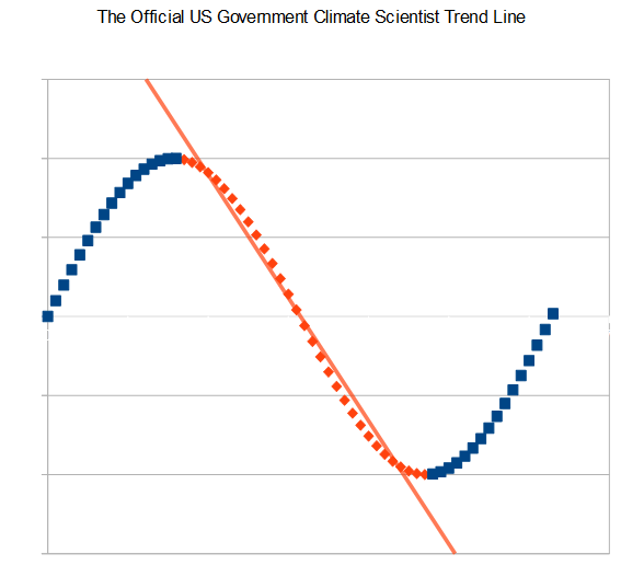
If you are a government or academic climate scientist, you can (and will) use a variant of this trend line for graphing any and all climate phenomena.
Disrupting the Borg is expensive and time consuming!
Google Search
-
Recent Posts
- Grok 3 Trusts The Government
- NPR Climate Experts
- Defending Democracy In Ukraine
- “Siberia might stay livable”
- Deep Thinking From The Atlantic
- Making Up Fake Numbers At CBS News
- Your Tax Dollars At Work
- “experts warn”
- End Of Snow Update
- CBS News Defines Free Speech
- “Experts Warn”
- Consensus Science With Remarkable Precision
- Is New York About To Drown?
- “Anti-science conservatives must be stopped”
- Disappearing New York
- New York To Drown Soon
- “halt steadily increasing climate extremism”
- “LARGE PART OF NORTHERN CALIF ABLAZE”
- Climate Trends In The Congo
- “100% noncarbon energy mix by 2030”
- Understanding The US Government
- Cooling Australia’s Past
- Saving The World From Fossil Fuels
- Propaganda Based Forecasting
- “He Who Must Not Be Named”
Recent Comments
- arn on Defending Democracy In Ukraine
- William on Defending Democracy In Ukraine
- gordon vigurs on “Siberia might stay livable”
- conrad ziefle on NPR Climate Experts
- conrad ziefle on Defending Democracy In Ukraine
- conrad ziefle on “Siberia might stay livable”
- Timo, not that one! on “Siberia might stay livable”
- arn on Defending Democracy In Ukraine
- arn on “Siberia might stay livable”
Looks like you cherry picked your end points – the actual trend over the last 1.5 cycles is up.
Or maybe 1.25 cycles.
Their trend lines have direct correlation to funding levels.
Surely, that’s the Arctic ice trend line; the grant income trend line and the temperature trend line go the other way.
They usually use the 270° to 90° (4π/3 to π/2) trend with sine functions but a good hockey stick really needs to curve fit the tangent function of 270° to 90°… kind of like NOAA’s “adjustment” trendline.