Climate Red Shift

“If the present refuses to get warmer, then the past must become cooler”

NOAA has just replaced their non-scary blue SST anomaly maps with a scarier yellow and red version.

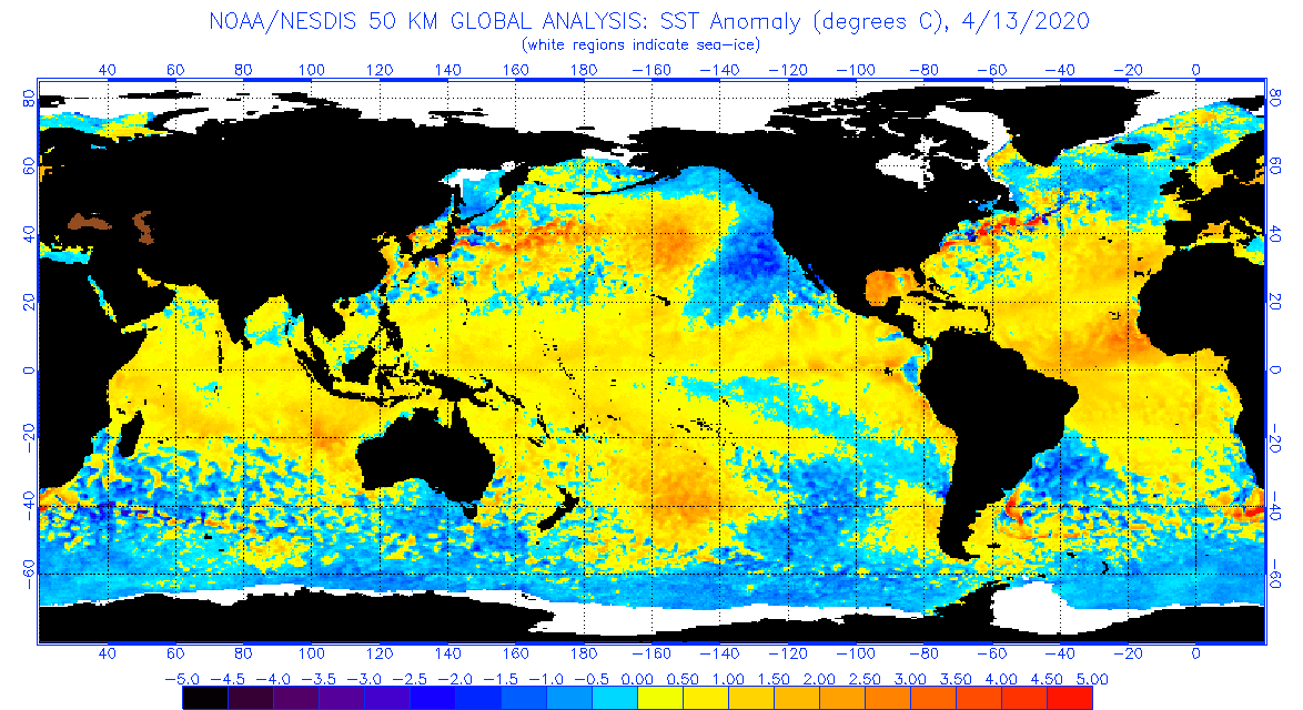
https://www.ospo.noaa.gov/data/sst/anomaly/2020/anomnight.4.13.2020.gif

The new version just heated the oceans way up, and they are now keeping an eye on the Greenland coral reefs. The water off Greenland was quite cold last week, but now it hot! Amazing how this happened after one of their coldest winters on record.

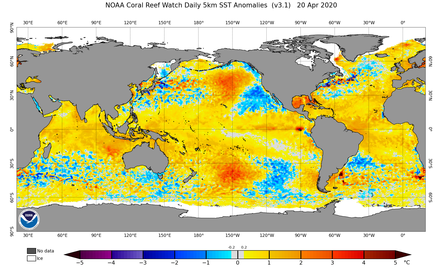
ssta.daily.current.png (1787×1085)

According to NOAA, a change in resolution made the oceans hot.

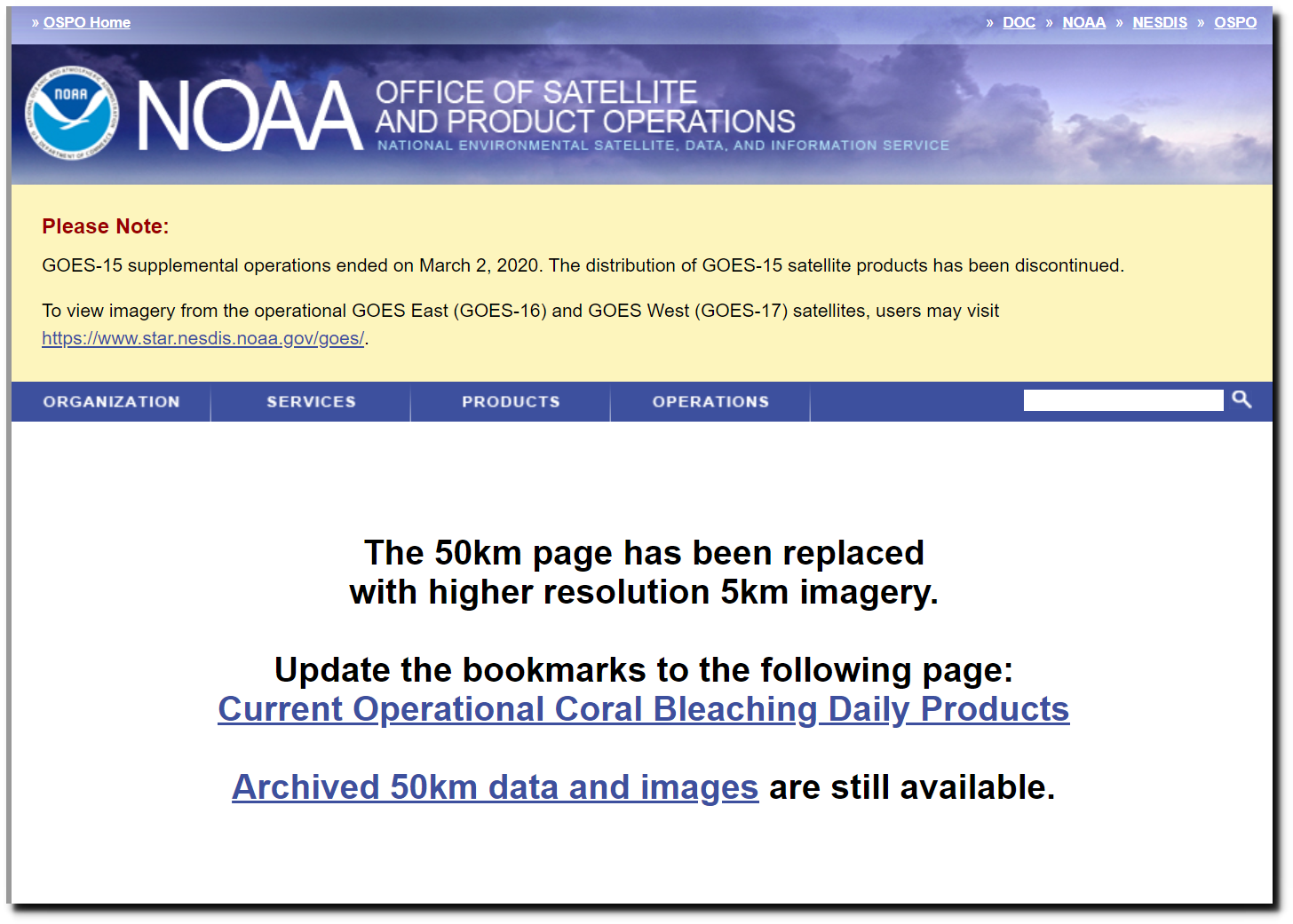
notice – Office of Satellite and Product Operations

New and creative ways to heat up the planet.

This entry was posted in Uncategorized. Bookmark the permalink.

11 Responses to Climate Red Shift

  1. Steve Case says:

    And NASA’s GISTEMP released its Land Ocean Temperature Index for March 2020 this past weekend. And they cooled the past and increased the present with over 300 changes to the monthly data all the way back to February 1880.

    Over the last ten years, here’s what that looks like:

    https://i.postimg.cc/Xv6f3DjS/image.png

  2. mddwave says:

    I remember a few years ago (5-10) that the sea temperature anomaly chart was more blue than yellow. The same thing happened then as now. The chart changed overnight to be back to yellow.

  3. kzvx says:

    The climate isn’t changing but the data is

  4. Brian D says:

    Has been a really cold mid-April. I’m sure they’ll find a way to make it a hot one.

  5. nfw says:

    Temperatures have nothing to do with honesty and facts, it’s all about how they feel (sic) about it.

  6. Mohatdebos says:

    Snow flakes in the Detroit area all week.

    • Rah says:

      Snowing in Cleveland when I drove through there this afternoon. I’m tired of this crap. Bring on the Spring weather.

    • Gator says:

      Snowflakes cover the entire country, and are the bane of our society. Wouldn’t it be nice if children just didn’t know what a snowflake is, or how to become one?

  7. Steven Fraser says:

    There are two different resolution changes, and a masking of the -.2 to +.2 range, displayed as grey, which formarly would have been displayed as light blue (-.2 to 0.0) and light yellow (0.0 to +.2).

    The 2 resolution changes are: 1) the 5km x 5 km grid, formerly 50km x 50km, so each grid point is 1/100th the former size, and, 2) each anomaly degree above +.2 and below -.2 is now represented with 10 different shades per full degree… showing .1 degree gradations. Formerly, each .5 degree range got its own color, in other words, 2 colors per whole degree range has become 10 colors per degree.

    Next thing to check is the baseline…

  8. Steven Fraser says:

    Differences in climatology are discussed at https://coralreefwatch.noaa.gov/satellite/methodology/methodology.php#clim

    Biggest difference, at first glance… the 50km version used averaging out to (up go ) 150 km to determine the color of a pixel group, and the 5km version uses interpolation.
    In other words, a different algorythm used for determining the color of a pixel.
    2nd most obvious difference is that the climatology for a given day is now interpolated between the values for the 15th of each consecutive mongth, and prorated based on the current day’s distance fro the previous 15th. This has the effect of creating a daily climatology that is modeled to daily granularity, mathematically derived from the midmonth values.

Leave a Reply to Gator Cancel reply

Your email address will not be published. Required fields are marked *