Hi, everyone.
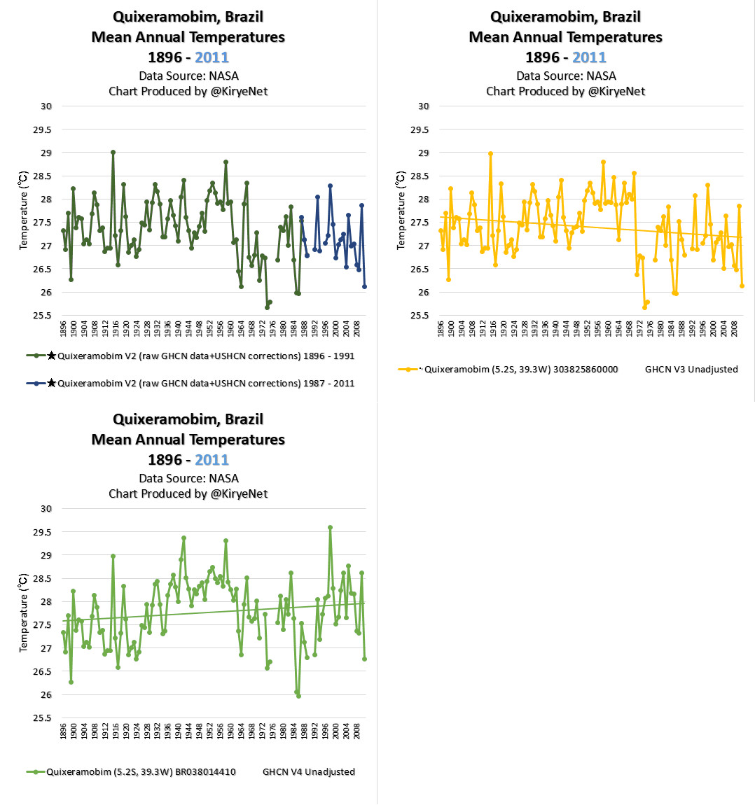
Here is an animation chart for mean annual temperatures in Quixeramobim, Brazil.
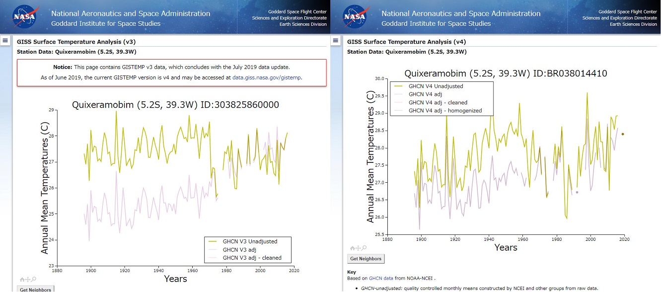
As you can see, GHCN V3 Unadjusted data show Quixeramobim had a cooling trend since 1896, while V4 Unadjusted data show a warming trend.
According to NASA, both are unadjusted data, but they aren’t in agreement.
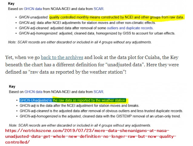
To make matters worse, as I tweeted July 21 2019, NASA used to claim that GHCN-Unadjusted is the raw data as reported by the weather station, but now they changed their explanatory text.
Once you see the post, you can easily see what I mean right away.
Then, let’s look at the GHCN V2 data set.

?Data Source: (1896 – 1991), (1987 – 2011)
As you know, NASA simply like changing their temperature data.


