
The EPA has brought back their website detailing “ongoing climate threats” which were being suppressed by the Trump Administration.
Heat waves across the country are more frequent, more intense, and last longer. Wildfires are burning more land. The East and Gulf Coasts are flooding more often, while ice sheets are disappearing and sea levels are rising.
U.S. brings back climate change website detailing ongoing threats | Reuters
The first graph on their website shows CO2 concentrations, in an attempt to link CO2 with climate.

Climate Change Indicators in the United States | US EPA
Then they have heatwave graphs going back to the 1960s, showing heatwaves increasing.
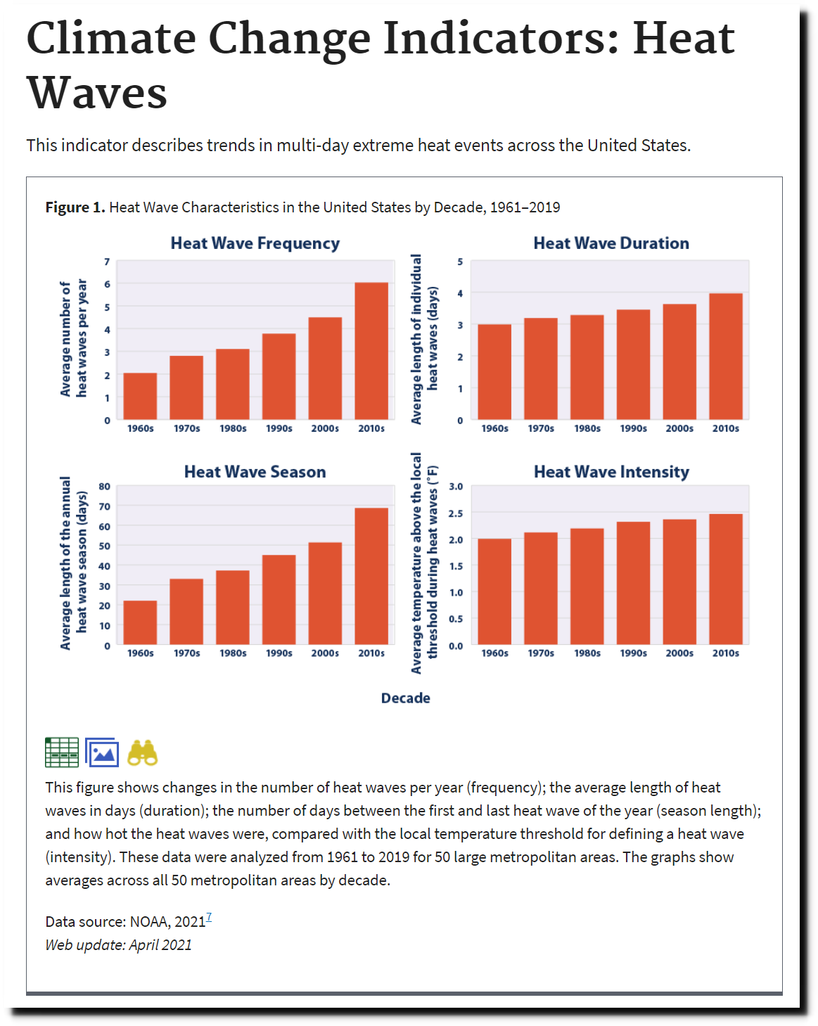
Climate Change Indicators: Heat Waves | Climate Change Indicators in the United States | US EPA
Their old heatwave graph shows that they cherry picked the lowest point in the dataset, and that heatwaves were much less severe in the second half of the 20th century than in the first half.
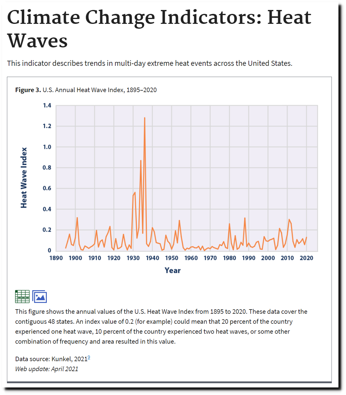
Climate Change Indicators: Heat Waves | Climate Change Indicators in the United States | US EPA
The National Climate Assessment showed the same thing.

Temperature Changes in the United States – Climate Science Special Report
Summers are also getting shorter, with May temperatures getting cooler


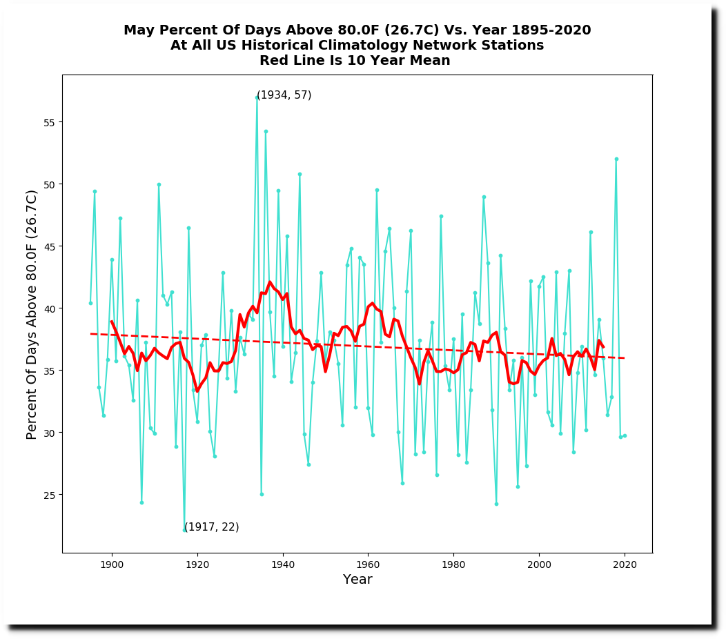
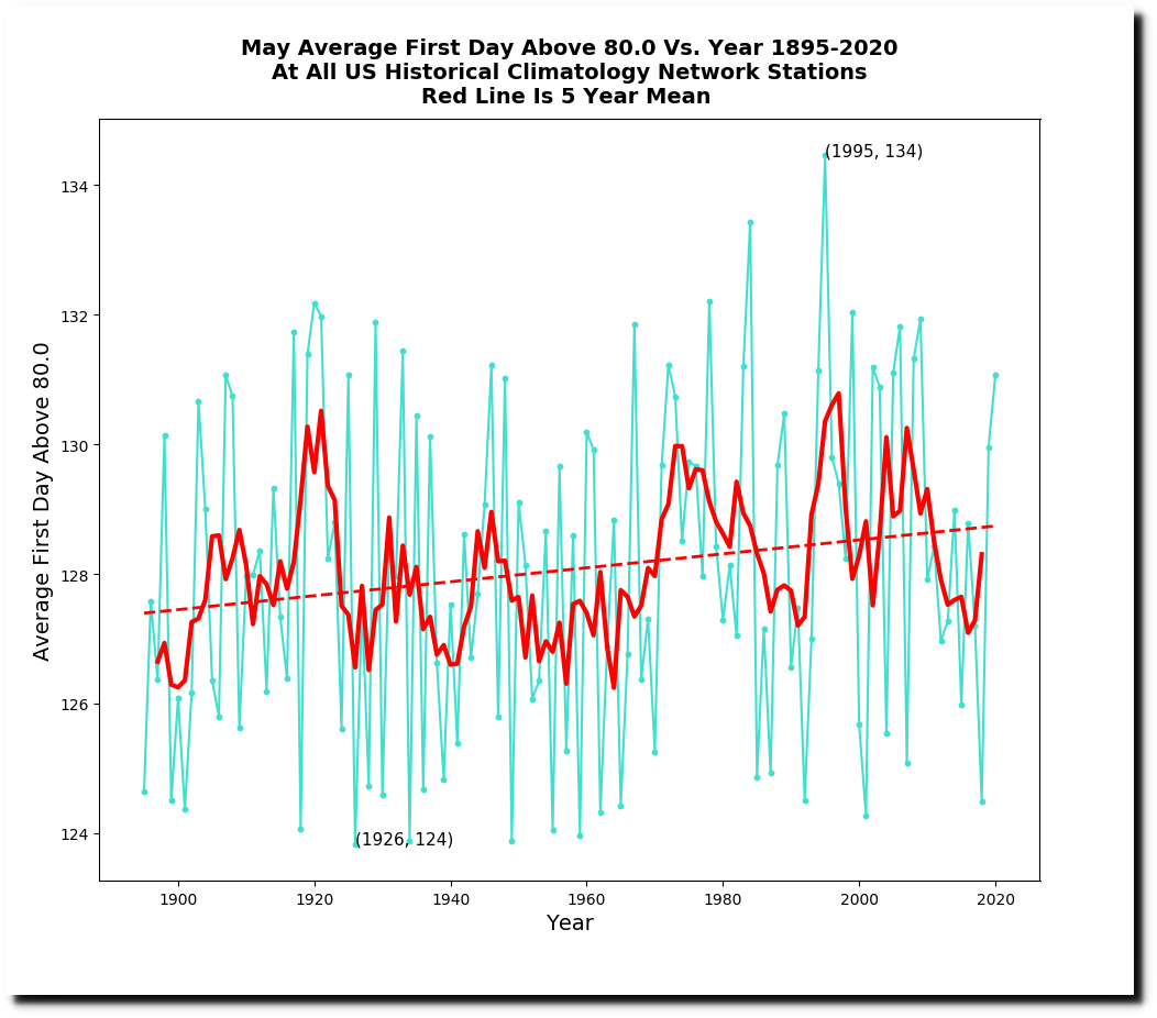
Summers have gotten much cooler in the US over the past century.
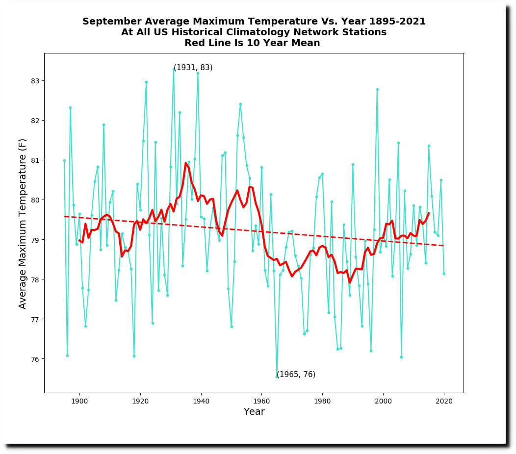
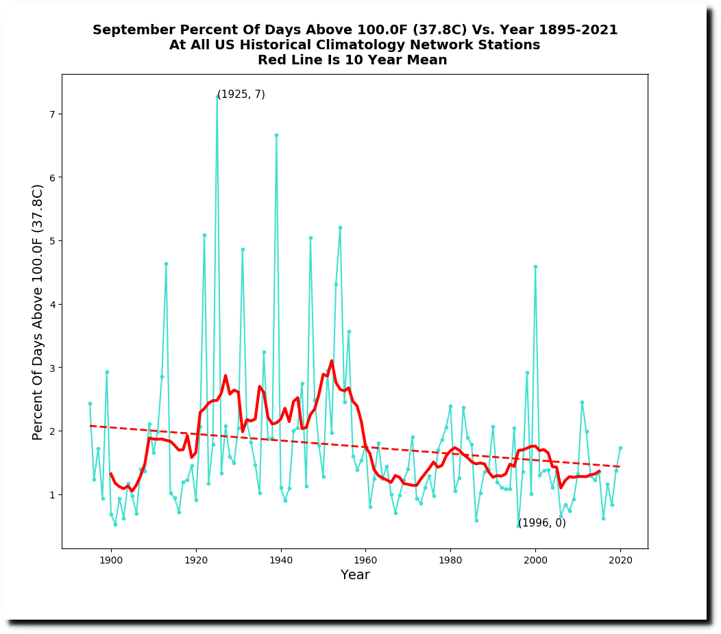
September temperatures are getting cooler as well.

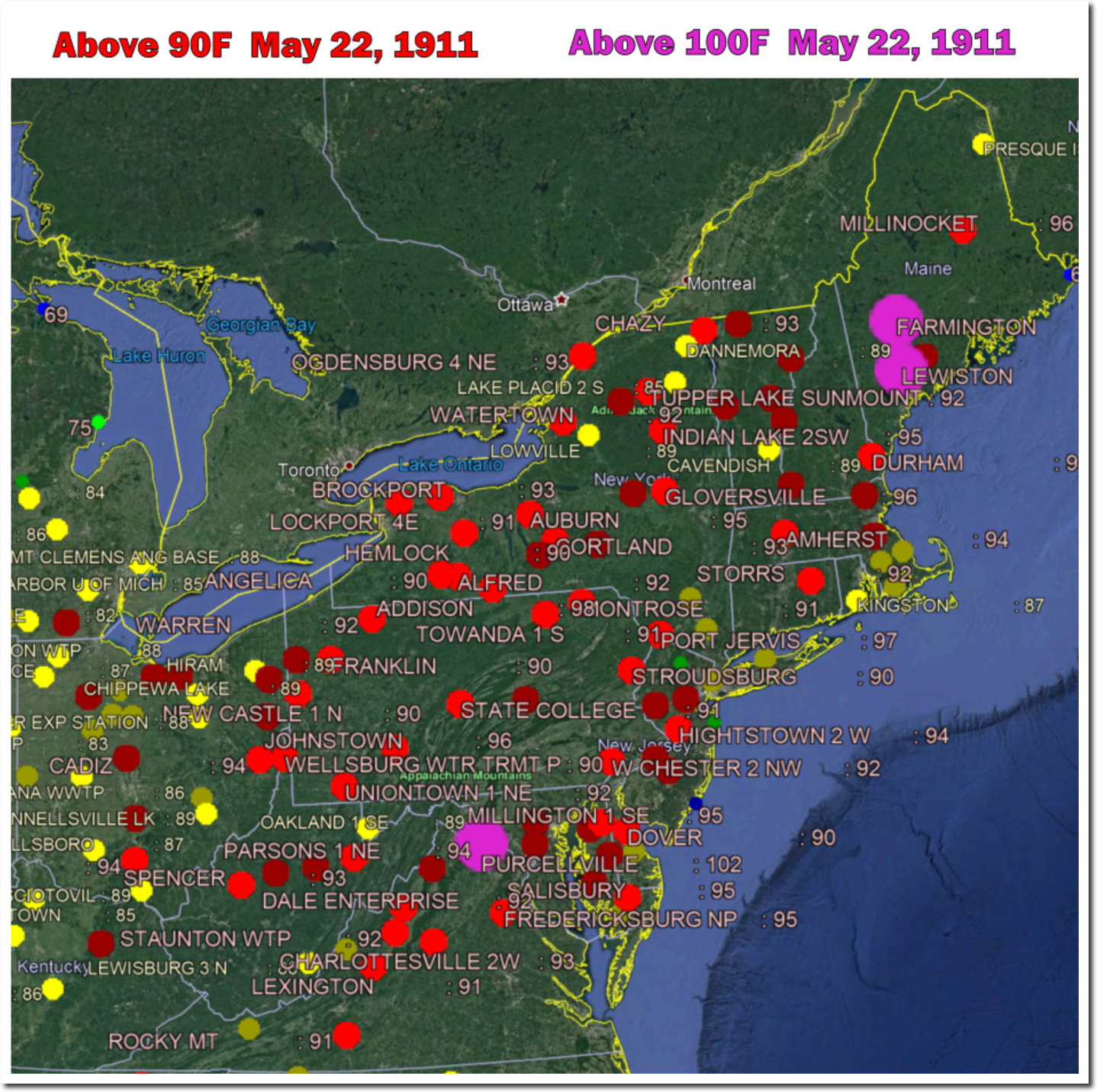
On May 22, 1911, almost the entire northeast US was over 90F (32C) and Maine was over 100F (38C.)
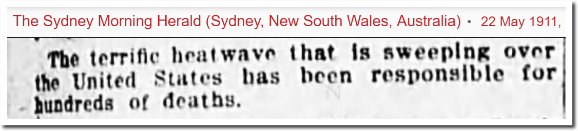
22 May 1911, Page 1 – The Sydney Morning Herald at Newspapers.com
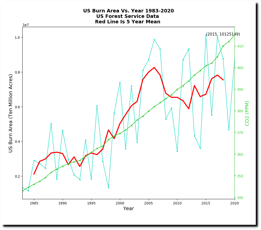
The EPA shows forest fires burn acreage has been increasing since 1983.

Climate Change Indicators: Wildfires | Climate Change Indicators in the United States | US EPA
The entire US Forest Service data set shows that burn acreage has plummeted as CO2 has increased.

National Report on Sustainable Forests — 2010
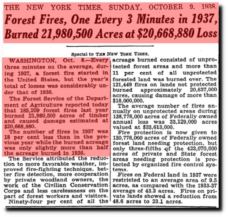
TimesMachine: October 9, 1938 – NYTimes.com
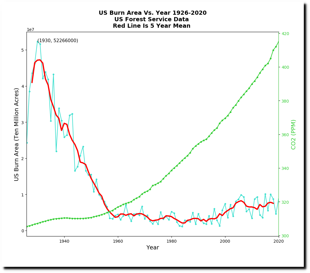
By cherry-picking a start date of 1983 and greatly exaggerating the Y-axis, they make it appear like CO2 and burn acreage correlate.
Their drought graph shows that the climate isn’t changing
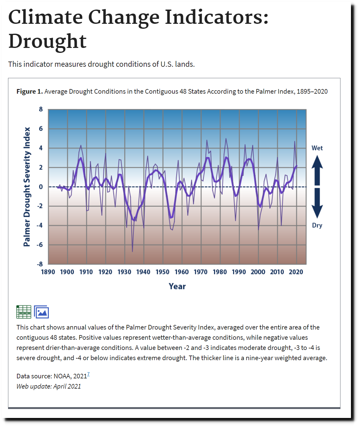
Climate Change Indicators: Drought | Climate Change Indicators in the United States | US EPA
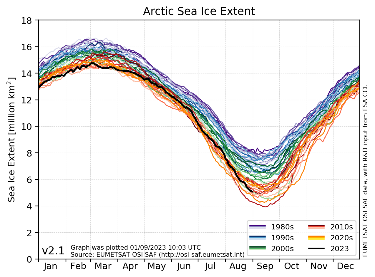
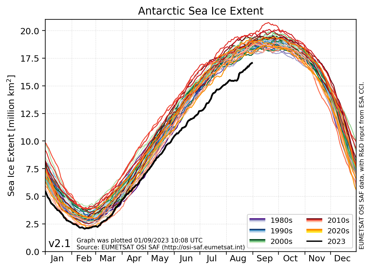
Sea ice extent at both poles is close to the 1981-2010 median.
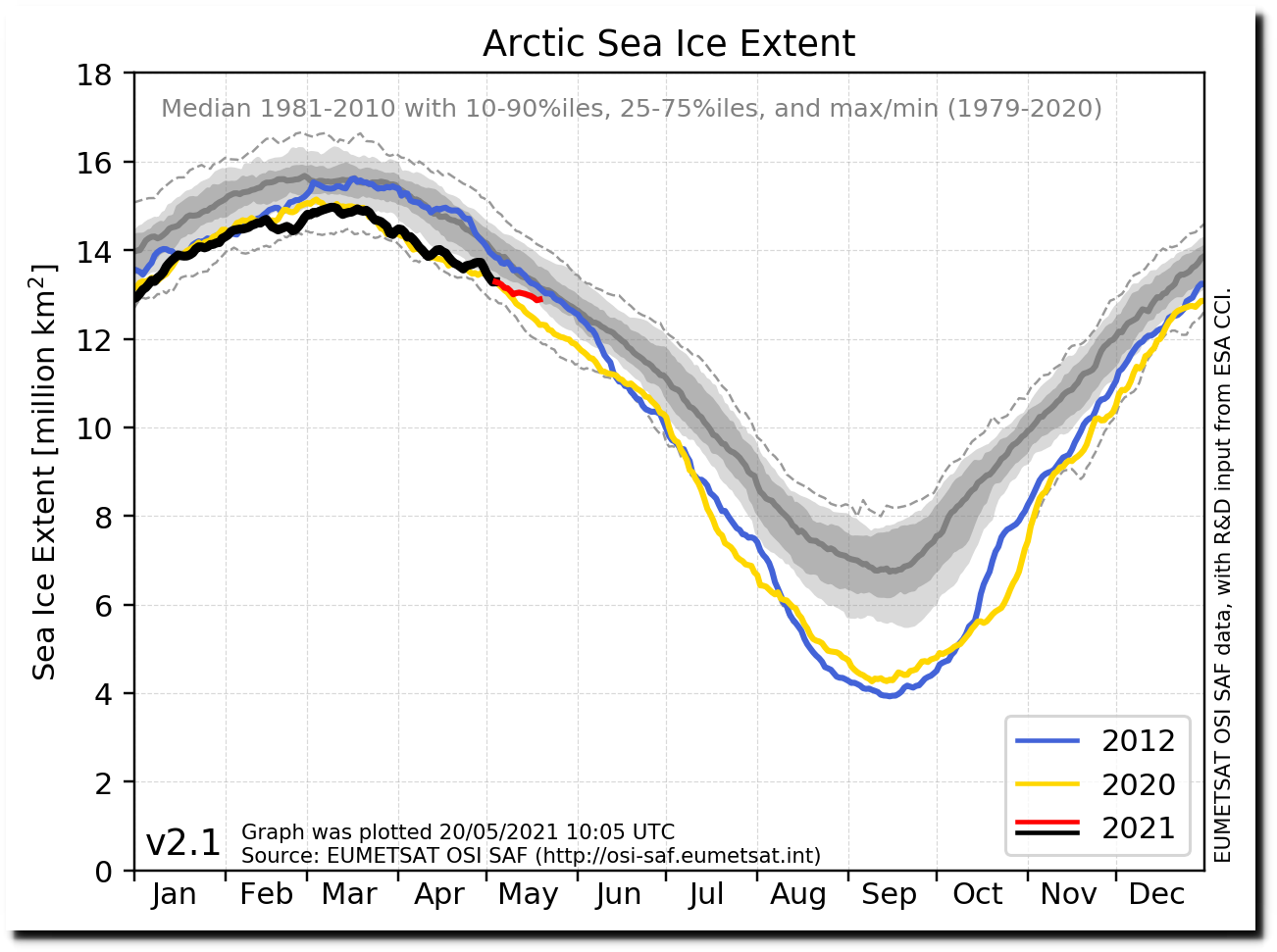
osisaf_nh_sie_daily-all.png (1274×943)
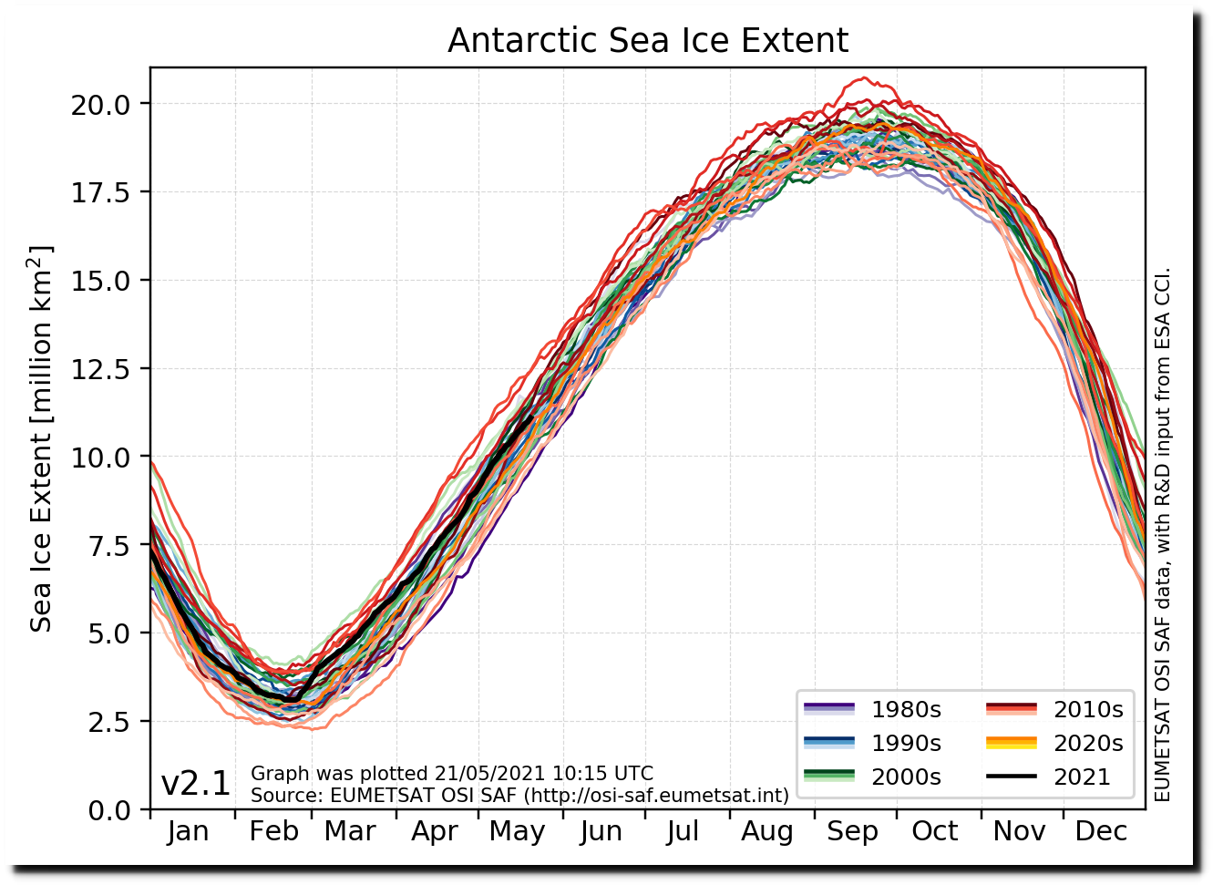
osisaf_sh_sie_daily-all.png (1303×943)
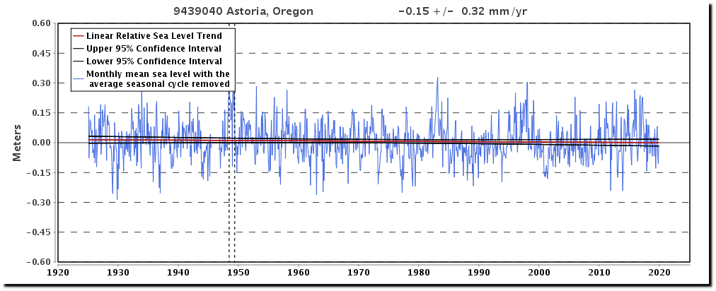
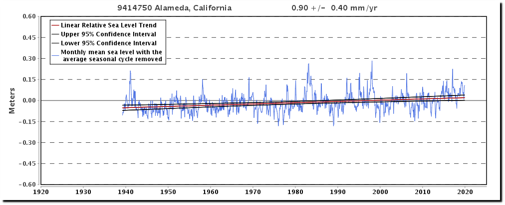
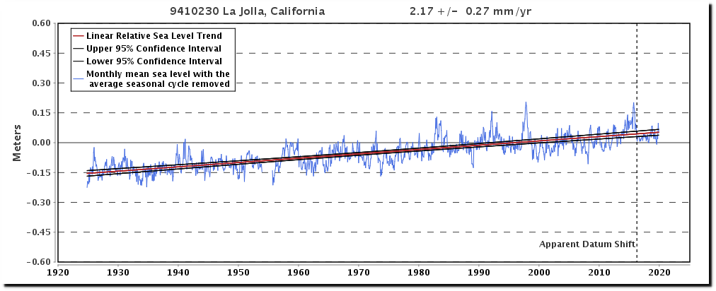
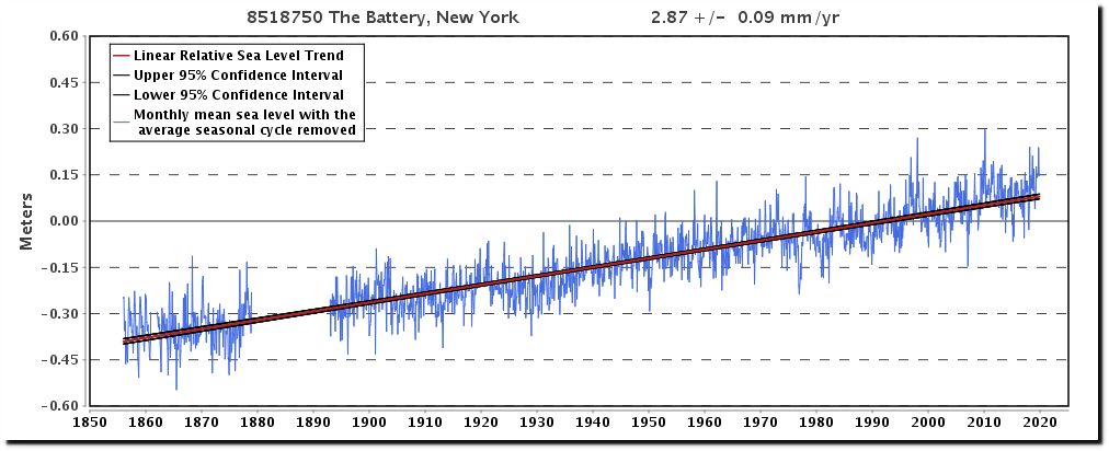
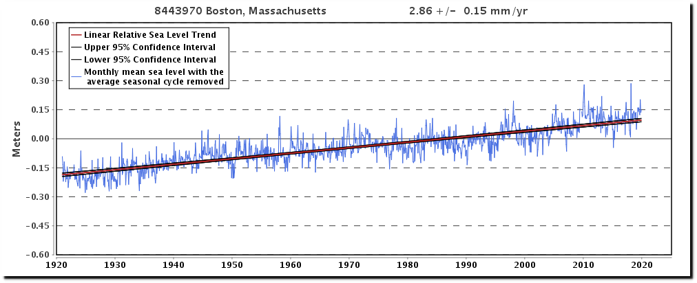
Se level has been rising for 20,000 years, and there is no indication it is accelerating
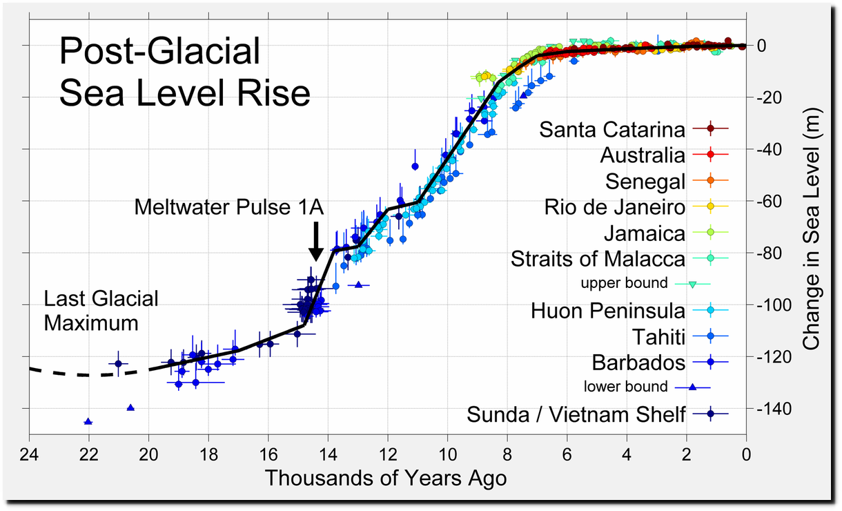
File:Post-Glacial Sea Level.png – Wikimedia Commons

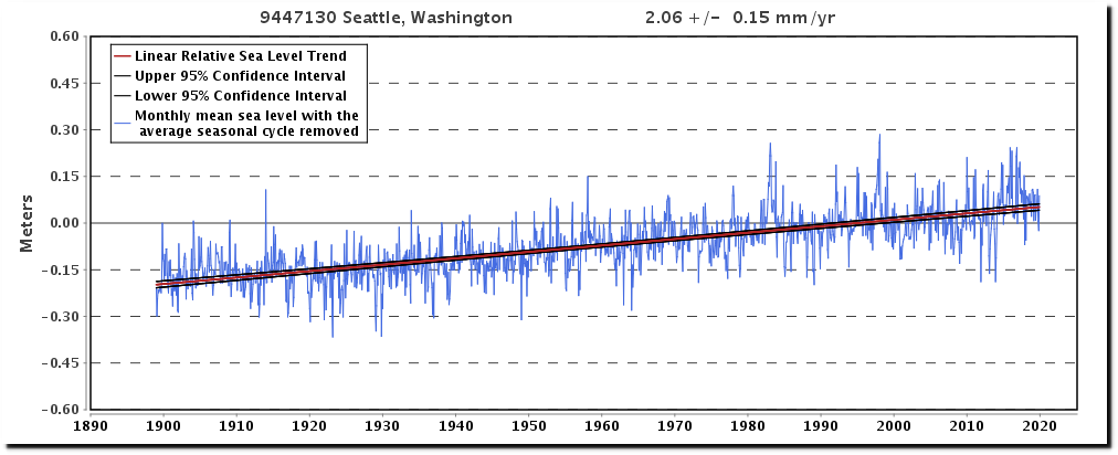
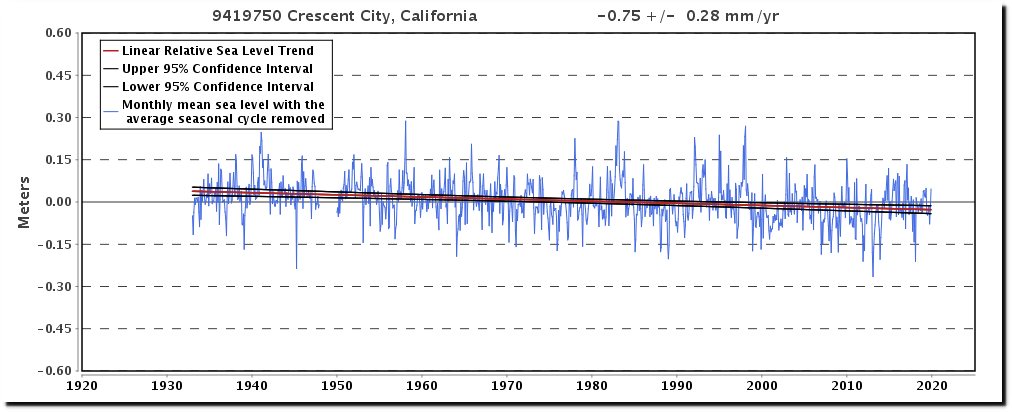
9419750 Crescent City, California
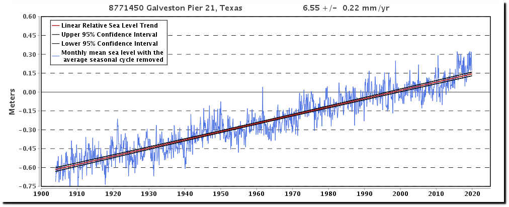
8771450 Galveston Pier 21, Texas
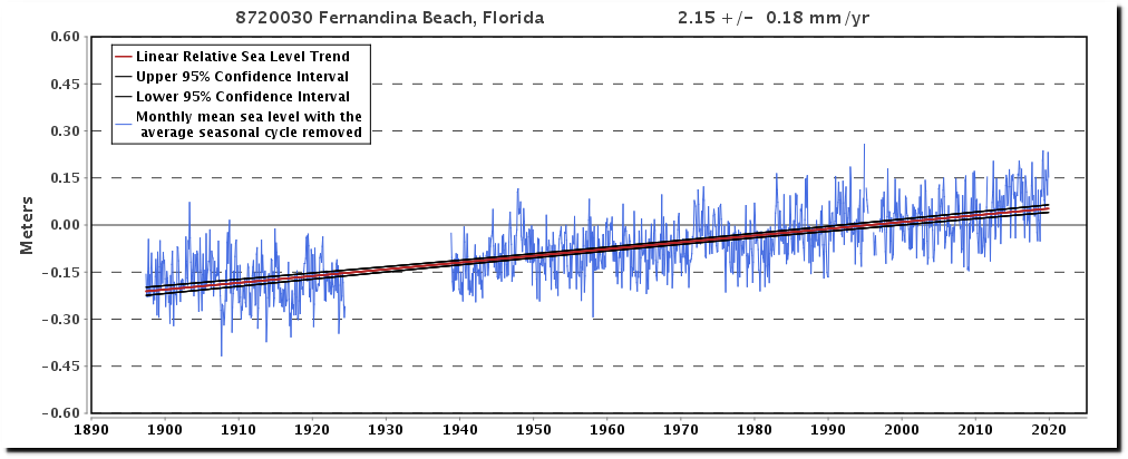
8720030 Fernandina Beach, Florida
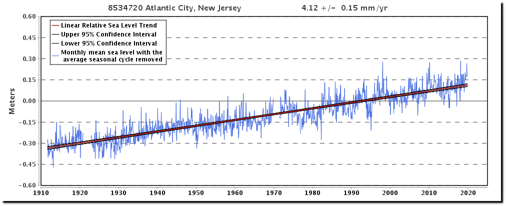
8534720 Atlantic City, New Jersey
The last time CO2 levels were this high, temperatures were 5F warmer – meaning that this time, they are 5F cooler. In other words, CO2 doesn’t control the temperature.
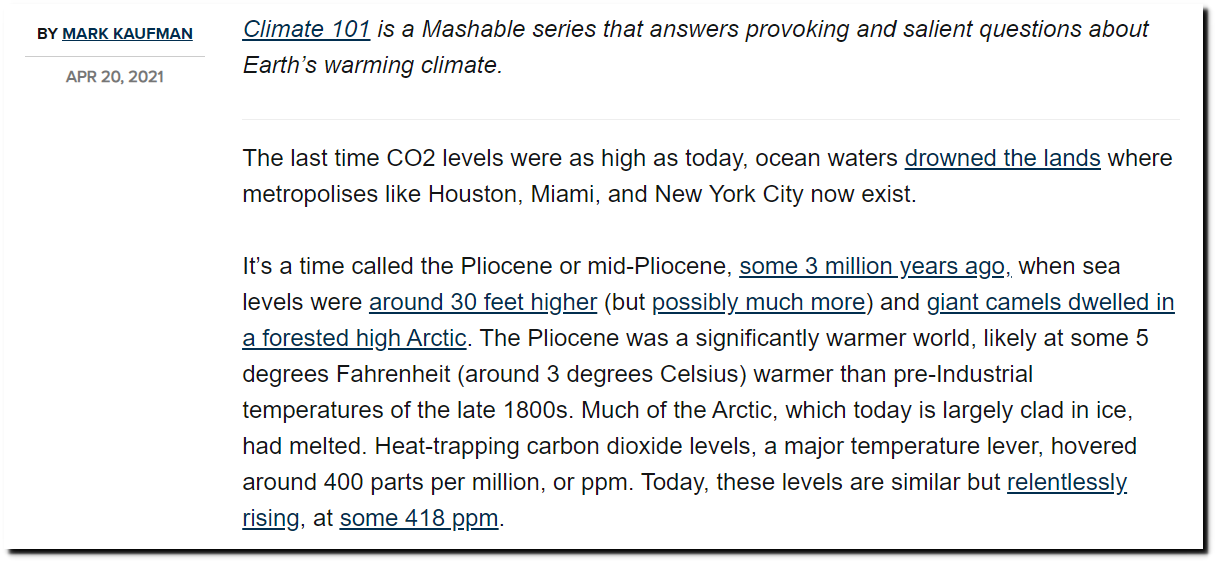
What Earth was like last time CO2 levels were as high as today
