DMI’s explanation for why the altered the data. They claim the new model doesn’t change the relative positioning between years and primarily affects melt season volume.
“We have improved the DMI operational ocean and sea-ice model HYCOM-CICE with higher horizontal resolution and updated HYCOM and CICE code. In particular, the sea ice code has been greatly improved with meltponds, sea-ice salinity, improved thermodynamics and much more.
The freshwater discharge from Greenland has also been greatly improved using freshwater product from GEUS, which especially improves the coastal ocean currents and thus the ice transport nearshore Greenland. The model has been running continuously since September 1990.
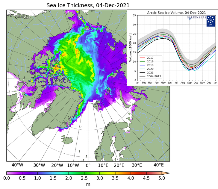
The model has been running continuously since September 1990. Therefore, we have by December 07, 2021 updated the graphics of sea-ice thickness and volume using the new and improved data on Polarportal and ocean.dmi.dk.
The improved model setup has led to higher variability as well as less adrupt melting during the melt season, which gives a shift of approximately half a month for the time of minimum ice volume. The trend between the years is almost unchanged. Thereby, a year with a large sea-ice volume in the old setup also has a large volume in the new setup, and similar for years with low sea-ice volume.”
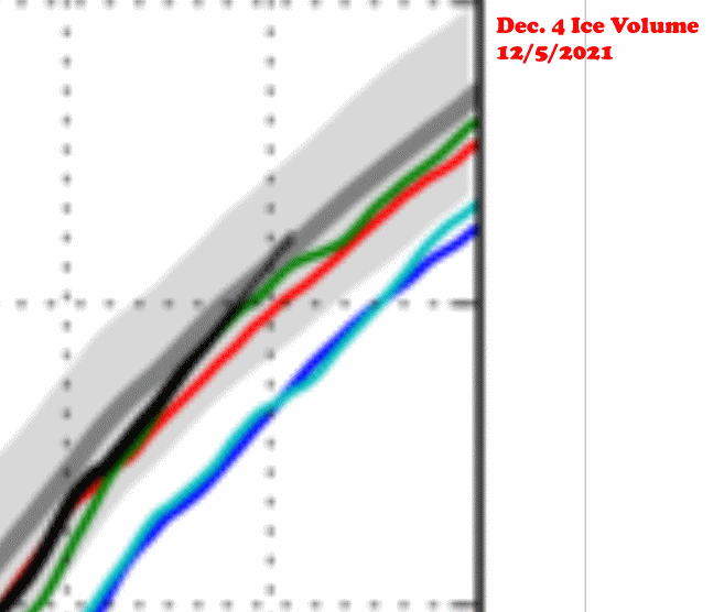
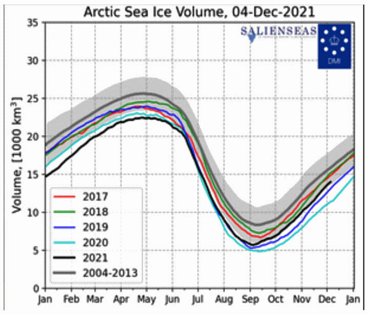
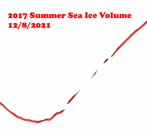
The “new and improved” version put 2021 below the 2004-2013 mean, below 2017 and below 2018. The two years which saw a large reduction in December volume were 2020 and 2021. There aren’t any melt ponds in December. The 2004-2013 mean, and 2017, 2018, 2019 didn’t change significantly – but 2020 and 2021 dropped sharply.
CICE_combine_thick_SM_EN_20211204.png (728×631)
FullSize_CICE_combine_thick_SM_EN_20211204.png
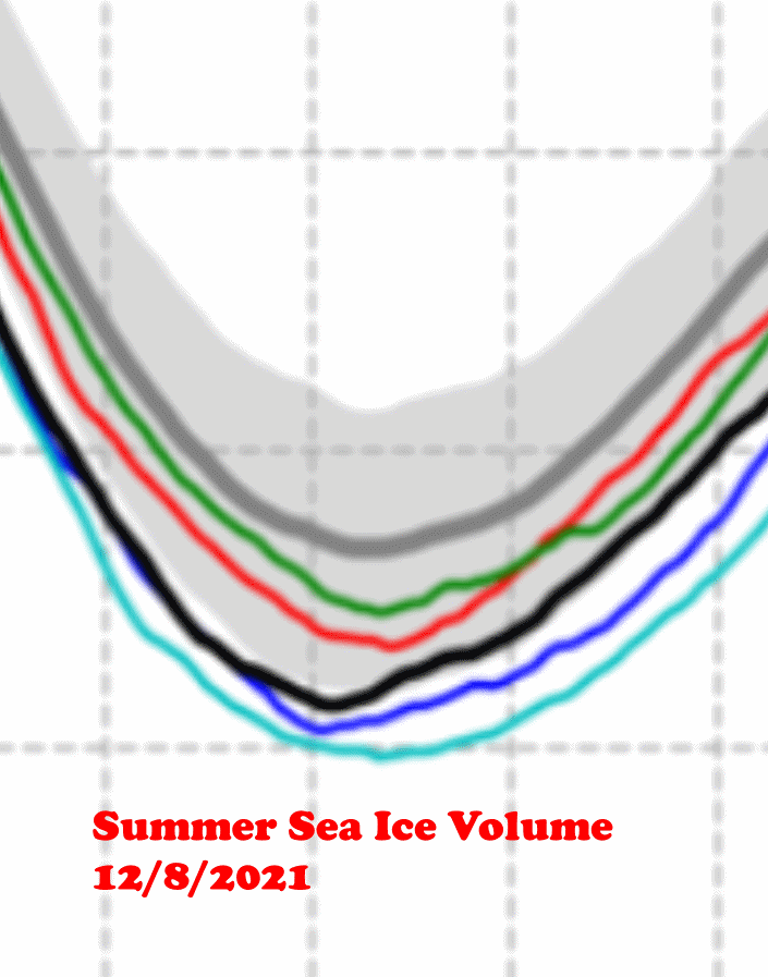
There was very little change to the 2021 summer volume, but lots of change to the winter volume. The is the opposite of other years and the opposite of their description of the changes.
The changes they made occurred during winter, not summer. It appears they rotated the 2021 data several degrees clockwise, which brought spring volume up and winter volume down.
The sailors are trapped in the ice because of an early freeze up, and DMI has altered the data to show the exact opposite.
The 2017 data is rotated counter-clockwise in the new version, but the 2021 data is rotated the other direction. Their changes aren’t credible and are a complete mess.
I was wondering what was going on the last few days after 2021 just inched above the 2004-2013 average. Now it looks like 2004-2013 and 2018 were not altered, but 2017, 2019, 2020 and 2021 all shoved downward. The relative positioning has greatly changed. It appears that 2021 lost roughly 15% of its ice due to fraudulent manipulation from the historical method. Since climate communists won’t allow that, they simply changed everything. This organization is now completely untrustworthy and the graph is worthless.
So past years were nothing more than model results? There were no samples taken to verify the model results? How do you take retroactive samples for earlier years to prove the error in the model results? If there are no real world measurements, then all of this is garbage.
I was wondering what was happening since the graph was not available the last few days. Now we know. They have indeed changed the relative positioning. 2004-2013 and 2018 are unaltered. 2017, 19, 20, and 21 have been grossly shoved downward. 2021 had just inched above the 2004-2013 average a few days ago. The climate communists said they can’t allow for that so they have corrupted the historical method that has existed since 1990. The graph and the organization is now worthless.
To much ice to match the narrative so they purposely broke the “thermometer”.
They claim that the trend is not altered, but this is clearly a wrong statement as I look at this indicator often and before the “adjustment” the 2021 data was above the 2017 – 2020 data and almost on the 2004-2013 mean since a few months.
The First Law of Climate Science: It Is Always Worse Than We Thought.™
(So if it doesn’t seem worse, then it must be wrong, so please standby while we “fix” it.)
The funny thing about climate scientists is that they always fall back on weather to prove their theories regarding climate. They really need to wait 100 years to see if their theory is right. I guess some of them are impatient. Can you imagine a more boring area of study? You learn all of this stuff, but you have to make things up to make it relevant.
Tony,
Thanks for staying on top of this. Serendipitous that they needed a model upgrade at the precise time you called them out… but it seems that we are living in the “Age of Strange Coincidences” where coincidences are now the norm rather than the exception.
This alteration puts the DMI into the “junk science” category as far as I am concerned’ as one of the most egregious examples of the funny numbers spilling out of the climate alarmist community.
I suppose DMI needed to do it to maintain their FUNDING, as we are seeing with the reluctance to publish medical results that link the vaccine to cardiac problems.
This is the second time DMI has done something like this. They used to have a graph comparing the current year to the preceding ten years’ “30%+” Arctic sea ice extent, with coastal zones masked out, in addition to the (current) graph comparing the current year to the preceding four years’ “15%+” Arctic sea ice extent. In both graphs, the current (partial) year is/was graphed with a heavier black line.
As of January 2016, depending on which graph you chose, you could “prove” that Arctic sea ice extent was either the highest (in the “30%+” graph) it had been in the last eleven years, or the nearly the lowest (in the “15%+” graph) it had been in the last five years.
On Feb. 18, 2016 DMI discontinued the “30%+” version, which had shown high recent Arctic ice extents. The differing trends were apparently due to a technical problem with the “30%+” version.
Unfortunately, the demise of the DMSP F17 & F19 satellites (Feb. 2016) created a lack of continuity in satellite-measured sea-ice records. I wonder if that’s why the recent ice volume numbers changed so dramatically, and the earlier numbers changed less?
The trend between years has clearly changed substantially. The 2004-2013 line (earlier years) has shifted upwards in volume relative to the plotted years 2017-2021. It is especially noticeable in the summer minimum period. This must impact any trends they are trying to highlight. The latest validation study of HYCOM-CICE from 2016 did not make any mention an issue needing this dramatic adjustment. https://gfzpublic.gfz-potsdam.de/rest/items/item_1504406/component/file_1577914/content
The changes were in summer. The December ice numbers are hardly different – except for 2020 and 2021
ok thx.
2021 follows the 2020 shift down. The late 2020 line shape (Nov-Dec) looks distinctly unnatural compared to other years.
Perhaps you could try to reach out to Mads Hvidovre Ribergaard and ask him what’s up with the discrepancies.. you would think the adjustments made would affect the entire historical dataset as well, and not just to fit a narrative of diminishing sea ice in 2020 and 2021
As a Dane I can’t help but feel a bit embarrassed on behalf of DMI, but I guess the idea that scientists are above pressures that are laid upon them from the political establishment, potentially threatening their income, is a bit naive at this point.
Sorry auto correct got the better of his name… it’s Mads Hvid Ribergaard
So your model is good until you get a phone call from one of your major funding sources?
I’ll say it again, if they did this in cancer research they would end up in jail. It should be obvious to anyone with an IQ above room temperature that this isn’t science, it’s religion.
Dear mr Heller,
I was ashamed of what I saw on Polarportal, almost in real time as I follow it very often.
I wrote them an email complaining the fraud but they simply repeated the lie on the better horizontal resolution of the graph.
I replied the no better resolution could reposition the curves with respect to one another and told them they lost any credibility.
Thank you for your attention to the continuing frauds involving institutions worldwide.
This is what is known as MannMade Global Warming Polar Amplification wherein the the fraud is amplified at the the north pole. Clearly fudging the numbers to support the narrative.
“The model has been running continuously since September 1997.”
DMI after the “13. October 2016” change:
https://web.archive.org/web/20210117182025/http://ocean.dmi.dk/arctic/icethickness/icetext.uk.php
“The model has been running continuously since September 1990.”
DMI after the “08. December 2021” change:
http://ocean.dmi.dk/arctic/icethickness/icetext.uk.php
Don’t be daft Tony,
I thought you didn’t approve of “climate models”? Here are the facts of the matter:
https://GreatWhiteCon.info/2021/12/sea-ice-data-tampering-at-dmi/
Tony – great work … I knew you would be all over this & probably like u I thought something was up when the ice black line hit the long term average and DMI froze the graph in early Dec. DMI’s ice trick was just as I expected it would be and now the graphs show that the state of the arctic ice is “worse than we thought” ;-)
The last time DMI did this u had captured the ice thickness maps and could show how they disappeared a bunch of thick ice towards the Russian side of the north pole area … are u able to do that this time.
Thanks.
You cannot be serious Stewart?
What has Tony’s “There aren’t any melt ponds in December” got to do with it?
Instead try highlighting:
“The sea ice code has been greatly improved with… sea-ice salinity, improved thermodynamics and much more.
The freshwater discharge from Greenland has also been greatly improved”
DMI =
Disastrous Meddling Identified.
Disgraceful Manipulation Inherent
Danish Muppets Incorporated
Don’t Mind Idiocy
Dumbest Maddest Imbeciles
Dysfunctional Manipulated Interface
Disaster Management Inclusive
Diagnostic Manipulation Included
Dunces, Mostly Idiotic
Digital Misdiagnosis Interface
Deliberately Manipulated Information
Driving Me Insane
Danish Manipulation Institute
Disruptive Management Ideas
Deferred Much Ice!
Plenty of other options out there. Either way, they’re busted.
The model made me do it?