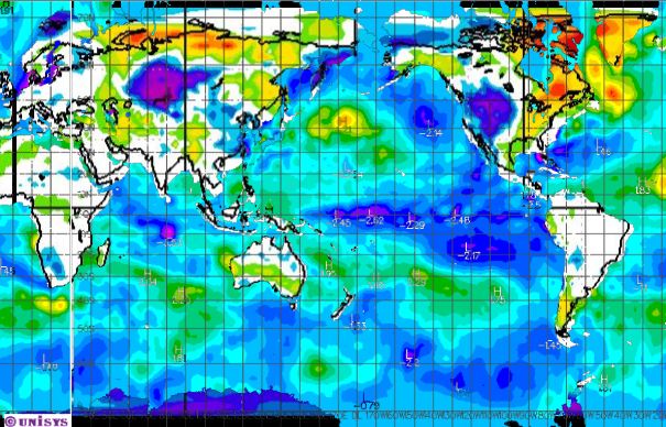
The map above combines the NOAA temperature anomaly map with the UNISYS SST anomaly map. There is a lot of anomalously cold air and water right now.
But we know this is impossible for the following reasons.
- Hansen tells us that the oceans have been gaining heat at an unprecedented rate for the last 50 years. This raises the humidity and amplifies the greenhouse effect.
- The Arctic has warmed 4-8 degrees. As a result, incursions of Arctic air are much warmer than they used to be.
- Arctic Sea ice is at the lowest level in a million years. This further amplifies Arctic warming.
- Snow cover has been declining for 40 years. This allows sunlight to warm the ground and further aggravate global warming.
- The Antarctic Peninsula is the fastest warming place on the planet, due to all the hot water in the Southern Oceans.
This leaves only two options.
- You are imagining all the cold.
- Climate science is defined by a spectacular disinformation campaign, needed to maintain the $2.5 billion in funding.


Jim, there’s not enough RED, please adjust.
Actually this isn’t funny. The Pacific Ocean is supposed to gain heat during the SH summer. If that one patch of green in the middle of the sth pacific disappears over the next 2 weeks, we’re stuffed.
By the way, the Oz BoM still reporting Ts below the sea surface up to 4DegC lower than usual.
What do you mean by “stuffed”? Are we in for a mild summer? Woohoo! I expect that also means we’re in for a harsh winter; not so good.
That’s interesting re: below surface temps; supposedly the on-surface temps are in a “death spiral” (upwards):
http://www.bom.gov.au/announcements/media_releases/climate/change/20110105.shtml
(Refer to the sea surface temps graph towards the bottom. I’m looking forward to Warwick Hughes’ comments, if any, on the whole article)
Meanwhile, I’m off to LA tomorrow.. I’m not liking the look of that purple and blue in that area..
I call BS on that map.
I know it’s summer in Patagonia. I have friends that have been there for over a month and all they have done is complain about how unusually cold it is.
I saw the same map posted by some Washington Post meteorologist and it was color coded in such a way that the map looked much warmer. Apparently they will go to any lengths to deny the reality of the cold. They are the deniers, not us.
Blue is the new Red…
Andy Weiss… Why do you assume the chart presented here is correct?
Rob,
Good question.
There is tremendous misinformation being put out from both sides. While Steve obviously has his own point of view, in the time I’ve followed his blog, to the best of my knowledge, he has not put out any factual misinformation. Do you know of any such cases? If so, I’d be interested.
Just follow the links to the two source maps and the question is answered – the merging looks ok to me.
Pingback: Shock The World is cooling
It cost me much less than a billion to plot this data. I’m making bacon right now in a Teflon pan, naked. I drank too much to sleep but not enough to crash. And as it cooks I find more crap in the news about a falling sky. http://oi49.tinypic.com/rc93fa.jpg
You do realize that these on are a daily timescale, right?
If the oceans were heating, it would be impossible to have even one day below normal.